Subaru Logo
The Japanese car brand Subaru belongs to the Fuji Heavy Industries industrial group. Subaru vehicles are renowned for their reliability. Also, a distinctive feature of this brand is its commitment to all-wheel drive vehicles. Subaru owns nine manufacturing sites, with the majority of them in Japan. In the world of motorsport, the brand is best known as the manufacturer of the successful Impreza WRX rally model.
Meaning and History
The word Subaru is translated as “Pleiades”. If you do not use a telescope, you can see six stars in this constellation. Concern FHI was formed just after the merger of six companies. The first Subaru was produced in 1954. A new period in the history of Subaru began in 1990, the Subaru Concern decided to participate in motorsport competitions. In 1999, General Motors acquired a 20% stake in FHI, which was then sold to Toyota. Subaru has become the automotive brand of this major concern. The concern itself not only produces cars but also engages in many other activities.
What is Subaru?
Subaru is a Japanese company specializing in the production of cars and trucks. The brand is known for the excellence and the highest quality of cars that demonstrate outstanding performance, both in motorsport and in everyday use.
1953 – 1980
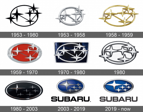
Six stars of different sizes were interconnected similarly to the way a constellation is depicted. They are placed in an oval shape, with some stars going beyond its border, to give the emblem a cohesive appearance. The logo is done in black.
1953 – 1958
Although the update did not change the position or size of the stars, the emblem looked a lot more modern and luxurious. This was achieved by using metallic silver instead of black and adding volume to every single element.
1958 – 1959
This version looks stretched out horizontally. The silver was also replaced by golden color, which added warmth and positivity while preserving an elegant appearance.
1959 – 1970
More color was brought to the emblem. It looked more powerful thanks to the red used for the base. The oval shape, along with the stars, was metallic silver and had a 3D appearance. It looked more exciting and reflected the brand’s strong desire to develop and bring something new to the industry.
1970 – 1980
This version looks very sophisticated and luxurious ad it features a very dark background in the form of a rectangle. It allows the silver stars and oval frame to stand out. There is an impression that one is looking at the night sky.
1980
A simple, yet professional-looking emblem was used during this year, while the designers were coming up with a version that will look much more impressive. There was no background. The emblem was white with dark grey and black being used for the outline and to add the elements some volume.
1980 – 2003
Modifications of this version have been used for close to half a century. The most noticeable change was the repositioning of the stars with a larger star on the left and five smaller ones of the same size lining up on the right. The constellation and the oval shape were silver, while the center was done in a very dark blue. It looked powerful and instilled trust.
2003 – 2019
The blue background was kept by the brand to reflect its reliability and trustworthiness. However, it was a lighter shade with a highlight radiating from the larger star. The stars appear flatter although they still have some volume. The whole logo is stretched out horizontally.
2019 – Today
This was the first time that the company decided to add a brand name. The word “Subaru” was placed underneath it. It was done in black and featured all uppercase, large letters with smooth lines.
Font and Color
The company did not use any inscriptions for a very long time, but that changed in 2003. The logo featured a brand name done in sans-serif font with bold, smooth lines. it was “Square 721 Std Bold Extended. Silver and blue were the predominant colors used by the brand. They gave it a modern, powerful appearance while reflecting the reliability, trustworthiness, and stability of the brand. There was also red and gold used in some versions. These colors added boldness and made the logo look sophisticated.

