SunChips Logo
Sun Chips are whole-grain snacks that look like wavy chips. In addition to their prominent flavors—Harvest Cheddar, Garden Salsa, French Onion, and Original—they are renowned for their unique texture and wavy appearance. Often, Sun Chips are promoted as a more healthful substitute for potato chips, utilizing terms such as “100% whole grain” and “no artificial flavors or preservatives”.
Meaning and History
![]()
When Sun Chips were first introduced, attitudes toward health consciousness were changing. After being released to the market in 1991, Sun Chips quickly established themselves as a mainstay in Frito-Lay’s product range. Despite technological disruption, economic ups and downs, and shifting consumer preferences, the brand has managed to maintain its cultural relevance by staying true to its roots while constantly evolving. A successful rebranding of SunChips as a snack brand that is better for the environment and for health occurred in 2007. The company also created a stir in 2008 when it unveiled a bag composed only of plants.
What is Sun Chips?
Sun Chips are a brand of fried multigrain chips that are manufactured by Frito-Lay. Although the staple tastes of Sun Chips haven’t changed in decades, the company has regularly experimented with seasonal blends made in small batches to get consumers excited.
1991 – 2000
![]()
A characteristic, rounded font as well as a white and yellow color palette has been used by the company from the very start. The earliest logo shows the company name stacked in two lines with the upper line being white and the bottom featuring a yellow that instantly reminded of the sunny, fun days. This version has elongated stroke ends for a more stylish look. The package also featured an actual drawing of a sun in the upper left corner, which seemed very appropriate.
2000 – 2016, 2000 – 2007 (Europe and United States)
![]()
This version shows an earlier logo that has been worked on to create a more defined image. The designers added some highlights to give the letters an appearance of volume. They also added a relatively thick black outline, which made the logo not only bolder but also more visible. At the same time, the font itself has undergone minimal changes. There is no sun accompanying the inscription.
2007 – 2016 (Europe and United States)
![]()
A dark black outline has been replaced by a thinner and lighter blue line. This update alone created a brighter and happier impression. The designers also enlarged the top line, although it was still slightly tucked behind the bottom one. The inscription acquired an even rounder and smoother appearance. The overall update made an association with something comfortable, relaxing, and enjoyable.
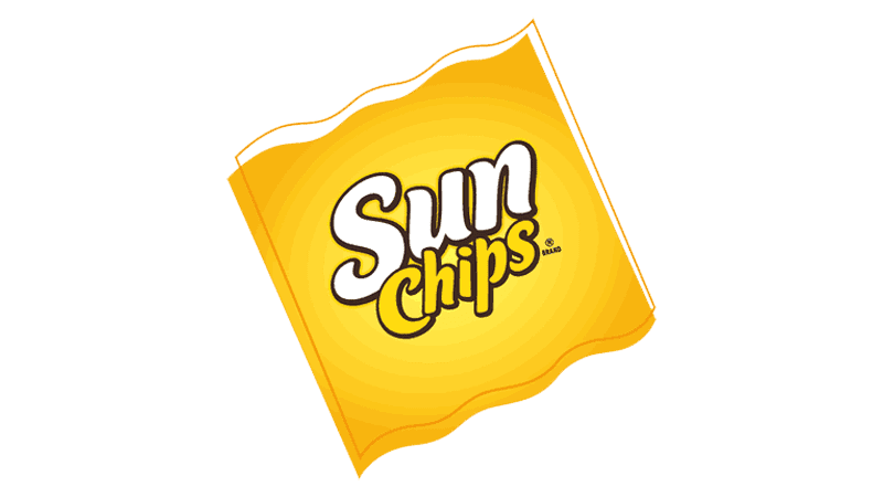
2016 – Today
![]()
A modern spin was given to the logo in 2016. For the first time, the inscription was no longer placed on a diagonal. However, there was still a feeling of movement thanks to the elongated curve of the letter “n”. It curved up to create an illustration of a sun with the addition of thick rays and yellow coloring. It was a playful and fun logo that presented the brand from a completely different angle. The designers wanted to reflect all the exciting and enjoyable moments that the Sun Chips are part of. It is also worth noting the replacement of a cool blue with a warm maroon color, which created a friendlier atmosphere.
Font and Color
The white and yellow colors have been with the brand since its inception. These colors, especially yellow, create a relaxing and happy atmosphere. At the same time, the yellow color is energizing and motivates consumers to buy the product. For some period the company also had blue in its logo. It was supposed to create an association with the blue sky where the sun is shining. Relatively recently, it was replaced by a warm maroon color to better suit the new brand image.
The custom font has been altered throughout the years. The earlier versions featured smooth, rounded strokes with slightly pointed ends, which created a friendly and relaxing brand image. In 2007, the European and American versions presented a font that was modified to feature fuller and even more rounded characters. In 2016, the inscription acquired a more standard-looking design with straight strokes and letters that had the same height.