Super Bowl Logo
The Super Bowl, an iconic American football championship game, marks the culmination of the National Football League (NFL) season. It emerged from a 1966 merger agreement between the NFL and its then-rival, the American Football League (AFL). Conceived as a high-stakes finale between the champions of both leagues, it symbolizes the pinnacle of American football prowess. Hosted annually in various U.S. cities, it has evolved into a cultural phenomenon, celebrated for its athletic spectacle, halftime shows, and commercials.
Meaning and history
The Super Bowl’s story begins in 1966, born from NFL and AFL’s merger. Initially a championship game, it quickly became an American cultural staple. The first Super Bowl was in 1967, showcasing NFL-AFL rivalry. Over the years, it transformed into an NFL-only event. Its grandeur lies beyond sports; halftime shows and ads are iconic. Cities across the U.S. annually host this spectacular event. Evolving, it became a global sports phenomenon. Viewership skyrocketed, making it a television landmark. Advertisers pay premium prices for commercial spots. Musical legends grace its halftime stage, adding entertainment value. The Vince Lombardi Trophy, named for a coaching legend, symbolizes victory. Super Bowl Sunday turned into an unofficial American holiday. Its impact extends to sports, culture, and economics. Today, the Super Bowl remains a testament to American football’s enduring appeal.
What is Super Bowl?
The Super Bowl, a grand finale in American football, is the climactic showdown concluding the NFL season. Esteemed for its athletic excellence and cultural spectacle, it blends high-stakes sports with entertainment, featuring renowned halftime performances and sought-after commercials.
Super Bowl I (1967)
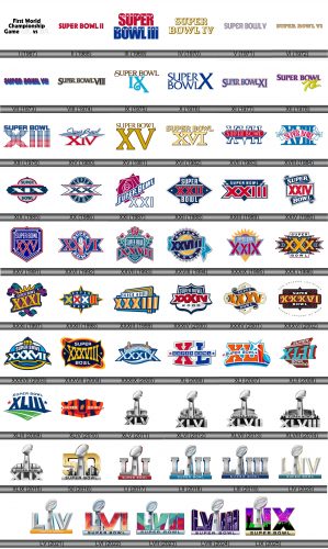
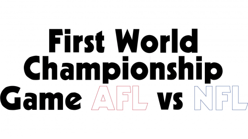
The logo ist a bold typographic, spelling out “First World Championship Game AFL vs NFL.” The letters are stark, with varying styles; “First Game” and “World Championship” in a solid sans-serif, and “AFL vs NFL” in outlined capitals. The design is minimalistic, devoid of images or embellishments, focusing solely on the historic significance of the event—the precursor to what would become the Super Bowl. The contrasting fonts capture the clash of the leagues, symbolizing a pivotal moment in American sports history.
Super Bowl II (1968)
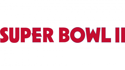
The logo evolves to “SUPER BOWL II,” reflecting a shift to Roman numerals, a tradition for the event. The typeface is bold and filled, without outlines, exuding confidence and a forward-moving spirit. Red is the dominant color, conveying passion and energy. This design is simpler, yet it carries an air of establishment, suggesting the event’s growing prominence. It stands as a more focused brand identity, highlighting the Super Bowl’s increasing significance in sports culture.
Super Bowl III (1969)
This iteration of the logo introduces patriotic stars into the mix, with red and blue hues symbolizing American pride. The stars atop the bold, red “SUPER” and the blue “BOWL” reflect the flag’s imagery, infusing a sense of national spirit. The logo’s evolution brings a more decorative and thematic feel, echoing the grandeur and American roots of the event.
Super Bowl IV (1970)
Transitioning from the previous design, this logo adopts a singular gold color scheme, exuding a classic, timeless quality. The bold, block letters of “SUPER BOWL IV” stand out with a shadow effect, suggesting depth and dimension. The design eschews the patriotic stars and stripes, opting for a cleaner and more streamlined appearance that focuses purely on the text. This minimalist approach reflects a matured identity for the event, emphasizing its enduring legacy and prestige in the realm of American sports.
Super Bowl V (1971)
This logo reintroduces color, with red and blue outlines encapsulating the “SUPER BOWL V” text, giving a nod to American colors. The typography has shifted to a sleek, modern font with wavy underlining, a creative departure from the previous solid and shadowed design. This fluid underlining could symbolize the dynamic nature of the event, while the triple outline offers a visual echo, perhaps alluding to the reverberating impact of the Super Bowl in sports and beyond. The overall effect is vibrant and resonant, reflecting the game’s excitement and energy.
Super Bowl VI (1972)
The logo for “SUPER BOWL VI” exhibits a dramatic shift to an ornate style, with intricate details reminiscent of vintage Western fonts. Each letter is embellished with elaborate flourishes and shadows, creating a sense of depth and craftsmanship. This baroque-like approach contrasts sharply with the previous logo’s modern simplicity, suggesting a nod to tradition and perhaps a celebration of the game’s historical significance. The choice of a monochromatic gold color adds a touch of sophistication and luxury.
Super Bowl VII (1973)
This logo for “SUPER BOWL VII” returns to a more contemporary style with a three-dimensional, layered effect. The letters are in a solid blue with red outlines, which creates an optical illusion of depth. It’s a significant departure from the intricate, ornate details of its predecessor, leaning towards a look that’s both modern and bold. The style suggests movement and vibrancy, aligning with the dynamic energy of the Super Bowl event itself. The design is both eye-catching and symbolic, reflecting the layered complexity and excitement of the championship game.
Super Bowl VIII (1974)
The logo for “SUPER BOWL VIII” adopts a more refined aesthetic with a classic touch. Der Text ist für einen eleganten Look in sanftem Beige eingerahmt. This design forgoes the previous logo’s multilayered, vibrant approach for a sleek and stylized appearance. The letters are bolder, with serifs that add a sense of formality and tradition. The Roman numerals are prominently featured, underscoring the event’s history and significance. This logo suggests a blend of modern design with a nod to the event’s storied past.
Super Bowl IX (1975)
The “SUPER BOWL IX” logo introduces a striking contrast with a warm brown for “SUPER BOWL” and a vibrant teal for “IX”. The Roman numerals are stylized with a flourish, adding an artistic touch. This design contrasts from the previous uniform color scheme, opting for a dual-tone palette that’s both refreshing and modern. The numerals’ elaborate swirl suggests a fusion of tradition with contemporary flair, and the bold, sans-serif font of “SUPER BOWL” grounds the logo with a sense of solidity. This logo balances heritage with a fresh, energetic look, fitting for a high-profile event.
Super Bowl X (1976)
The “SUPER BOWL X” logo presents a stark shift to a clean, blue monochrome. The letters and Roman numeral “X” feature a strong, sans-serif font with a subtle shadow effect, giving a sense of depth. This design discards the previous logo’s color contrast and ornate flourishes for a straightforward and bold look. The uniformity of color and the simplicity of the design convey a modern, no-frills approach, focusing entirely on the name and the significant milestone number, “X”, marking the event’s tenth iteration.
Super Bowl XI (1977)
The “SUPER BOWL XI” logo reintroduces the patriotic color scheme with a dominant blue and striking red outlines. The letters and numerals exhibit a bold, serif typeface, with the red contour providing a three-dimensional look. This design abandons the monochromatic style of its predecessor for a more vivid and layered appearance. The contrast between the blue and red is eye-catching, symbolizing the event’s American heritage while the serif font adds a traditional touch, blending classic and contemporary elements. The logo is both impactful and visually cohesive, encapsulating the spirit of the championship.
Super Bowl XII (1978)
The “SUPER BOWL XII” logo leaps into a bright palette, with purple text and yellow-green numerals. The font for “SUPER BOWL” is a playful, rounded serif, edged with a light shadow, giving it depth. Contrasting with the previous logo’s classic look, “XII” is rendered in a flowing, ribbon-like design, suggesting motion and celebration. This design breaks from the traditional, adopting a more festive and casual style. The colors are vibrant and the numeral’s design adds a sense of whimsy, reflecting the event’s blend of competitive sports and entertainment.
Super Bowl XIII (1979)
The “SUPER BOWL XIII” logo stands out with a creative dot matrix design forming the Roman numerals “XIII” in red beneath the blue “SUPER BOWL” text. The numerals, depicted in a lower-resolution grid pattern, contrast with the solid, bold letters above, creating a visual interplay between the traditional and the innovative. This logo departs from the previous logo’s fluidity and colorfulness for a graphic approach that combines modernity with a digital-age aesthetic. It represents a unique blend of simplicity and complexity, mirroring the multifaceted nature of the event itself.
Super Bowl XIV (1980)
The “Super Bowl XIV” logo features cursive, flowing text in blue, overlaid on a bold, red Roman numeral “XIV” with a white and blue outline. This design steps away from the dot matrix style, favoring a blend of elegance and strength. The cursive “Super Bowl” suggests fluidity and movement, while the solid numerals convey stability and tradition. The contrasting colors and mixed fonts create a dynamic and visually engaging logo that captures the excitement and pageantry of the event.
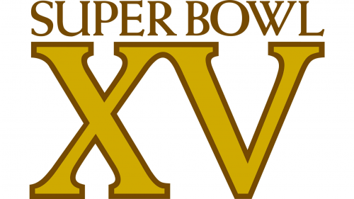
Super Bowl XV (1981)
The “Super Bowl XV” logo features a stately, gold serif font for “Super Bowl” above a large, golden “XV”. The numerals stand out with a solid, regal presence, underscored by a subtle shadow for a three-dimensional effect. This design moves away from the previous logo’s fluid script and patriotic colors, opting for a single, metallic hue that suggests prestige and a milestone celebration. The use of shadow and the serif font combine to give the logo a classic and somewhat luxurious appearance, fitting for the grandeur of the event.
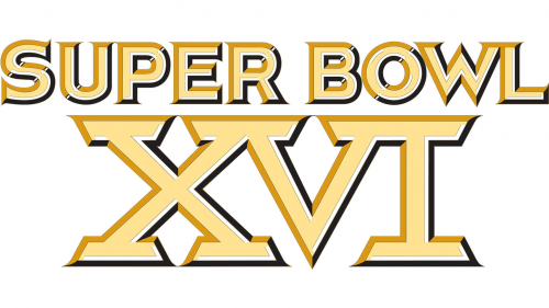
Super Bowl XVI (1982)
The “Super Bowl XVI” logo exhibits a bold, golden serif typography with a prominent three-dimensional outline in black and white. The large “XVI” numerals anchor the design, towering under the “Super Bowl” text. The shadows and outlines add depth, suggesting a prestigious event of significant scale. This evolution maintains the luxurious feel of its predecessor but enhances visibility and impact through increased contrast and sharper outlines. The logo’s grandiosity aligns with the Super Bowl’s status as a major sports spectacle.
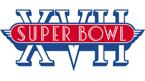
Super Bowl XVII (1983)
The “Super Bowl XVII” logo features bold, blue Roman numerals “XVII” with a central red oval containing the words “SUPER BOWL” in white. The design harkens back to classic American football aesthetics, with a wing-like adornment on either side of the oval, suggesting speed and flight. The color scheme is a patriotic red, white, and blue, a departure from the previous logo’s gold emphasis. The numerals have a strong, architectural presence, while the winged oval adds dynamism, symbolizing the soaring spirit of the game.
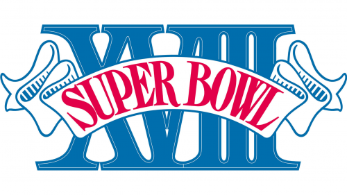
Super Bowl XVIII (1984)
The “Super Bowl XVIII” logo boasts a dynamic banner style, with “SUPER BOWL” in vibrant red, curved across a classic blue Roman numeral “XVIII”. This design departs from the previous logo’s winged motif, embracing a more ceremonial banner look that suggests a festive and grand occasion. The numerals hold a strong presence, serving as a foundation for the draped banner, which adds a sense of movement and celebration. This logo marries the tradition of ancient Roman lettering with the jubilant energy of modern sports events.
Super Bowl XIX (1985)
The “Super Bowl XIX” logo adopts a centralized design with “SUPER” and “BOWL” flanking a bold “XIX”, encapsulated within a horizontal band. The color scheme is a classic navy blue and red with a circular grey backdrop, exuding a sense of Americana. The geometric sharpness of the numerals, combined with the circular and horizontal elements, gives the logo a balanced, emblem-like quality. This contrasts with the previous logo’s flowing banner style, favoring a more symmetrical and heraldic approach that conveys a sense of established tradition and formality associated with this storied sports event.
Super Bowl XX (1986)
The “Super Bowl XX” logo is a creative overlay of elements, with the navy blue “XX” prominently set atop a circular backdrop that encases the words “SUPER BOWL”. This circular motif contrasts with the more linear style of the previous logo, suggesting unity and completion. The central placement of the numerals “XX” signifies the importance of this milestone, while the encircling text creates a cohesive, emblem-like design. The color scheme remains classic with red accents, maintaining the event’s patriotic essence.
Super Bowl XXI (1987)
The “Super Bowl XXI” logo features a geometric rose in maroon and white, overlaid by bold, blue lettering and the numeral “XXI” in a contrasting, modern font. The “Super Bowl XXI” logo introduces a multi-layered star design, with the event’s name in a bold, diagonal banner across the center. The angular, overlapping elements create a dynamic and layered visual, symbolizing complexity and excitement. This logo marries the traditional floral symbol with a contemporary touch to celebrate the 21st edition of the Super Bowl.
Super Bowl XXII (1988)
The “Super Bowl XXII” logo features a diamond-shaped outline with “SUPER BOWL” at the top and bottom, framing the bold “XXII” in the center. This design departs from the star motif of the previous logo, opting for a more angular and symmetrical form. The color palette remains patriotic with deep blue and red, while white accents provide contrast and clarity. The stylized lettering of “XXII” gives a modern touch to the logo, which combines classic elements with a fresh presentation, symbolizing the event’s grandeur and its place in contemporary sports culture.
Super Bowl XXIII (1989)
The “Super Bowl XXIII” logo showcases a strong, angular design with a prominent red “XXIII” set against a navy backdrop. “SUPER BOWL” is written above in a matching navy hue, contained within sharp, upward-pointing chevrons that add to the logo’s dynamic feel. This iteration abandons the diamond motif of the previous year for a more assertive, arrow-like geometry that conveys forward momentum and excitement. The color scheme remains patriotic, but the contrast is heightened, emphasizing the logo’s boldness and the grandeur of the event.
Super Bowl XXIV (1990)
The “Super Bowl XXIV” logo features a banner-like design with a deep blue “SUPER BOWL” atop and a bold red “XXIV” in the center. This layout contrasts sharply with the previous logo’s sharp angles, opting for a more flowing, scroll-like feel. The numerals “XXIV” are prominently displayed in the center, indicating the 24th edition of the event, framed by the curvature of the text above and below, creating a cohesive emblem. The use of classic red, white, and blue continues, emphasizing the event’s patriotic theme.
Super Bowl XXV (1991)
The “Super Bowl XXV” logo features a shield-like crest with a layered design, incorporating “SUPER BOWL” at the top and a large “XXV” below. The use of red, white, and blue continues, with the numerals prominently outlined in red, drawing the eye to the event’s milestone 25th anniversary. The crest’s shape gives a nod to the sport’s competitive nature and its resemblance to team logos, suggesting a blend of tradition and modernity. This design is a departure from the previous logo’s softer banner style, opting for a more structured and bold statement.
Super Bowl XXVI (1992)
The “Super Bowl XXVI” logo presents a striking combination of patriotic colors with a central football motif encapsulated in a circular cog-like design. The “SUPER BOWL” text curves above the football, with the Roman numerals “XXVI” boldly sitting below. This design departs from the previous crest-like appearance, offering instead a more industrial and mechanical aesthetic that perhaps hints at the precise, strategic nature of the game. The cog design also adds a sense of unity and interlocking teamwork, which are key aspects of the sport.
Super Bowl XXVII (1993)
The “Super Bowl XXVII” logo displays a prominent shield silhouette, with the “SUPER BOWL” banner sitting above the large “XXVII” numerals. Flourishing rose motifs cap the design, lending a decorative, celebratory feel. This logo marks a shift from the mechanical cog-like theme of its predecessor, opting instead for an organic and ornate touch with the roses, possibly alluding to the Rose Bowl’s heritage. The color palette is refined to deep burgundy, navy, and subtle green highlights, giving the logo a more sophisticated appearance that speaks to the event’s prestige.
Super Bowl XXVIII (1994)
The “Super Bowl XXVIII” logo features a vibrant circular badge with “SUPER BOWL” arching over the top. The Roman numerals “XXVIII” are boldly set within the badge, underscored by a stylized football shape that echoes the curves of the text. The design is accented by a single orange-hued football at the top, with two green leaves adding a splash of color. This logo departs from the previous year’s shield and rose elements, presenting a simpler, yet dynamic aesthetic with a clean, clear font that enhances readability and impact. The design encapsulates the energy and forward motion of the game.
Super Bowl XXIX (1995)
The Super Bowl XXIX logo presents a starburst motif, symbolizing excitement and grandeur. “SUPER BOWL” is prominently displayed atop the central element, with the Roman numeral “XXIX” beneath it, all encased within a stylized shield-like shape. The color palette is a classic combination of navy blue, red, and a golden yellow, providing a vibrant contrast that signifies the event’s prestige and vitality. The design suggests movement and celebration, with the sunburst expanding outward, indicating the event’s radiant impact. This logo shifts from the previous year’s more traditional emblem, embracing a dynamic, modern design that captures the essence of the championship’s energy.
Super Bowl XXX (1996)
The Super Bowl XXX logo features a striking Native American-inspired design with bold geometric shapes and a rich color palette. Central to the logo are the letters “SUPER BOWL” and the Roman numerals “XXX,” prominently layered over a stylized diamond pattern. This pattern showcases an intricate series of diamonds and zigzagging lines, evoking the artistry of traditional Southwestern textiles. The use of earthy reds, calm blues, and golden yellows creates a warm and inviting visual that captures the spirit of the region’s cultural heritage. This departure from the previous logo’s brighter, sunburst design brings a sense of depth and tradition, highlighting the event’s location and the milestone of its 30th iteration.
Super Bowl XXXI (1997)
The Super Bowl XXXII logo combines traditional American elements with contemporary flair, displaying “SUPER BOWL” in an arch above. Centered “XXXII” numerals, framed by red and gold stripes, invoke the American flag. A navy blue backdrop with outline shapes gives a badge-like appearance. This logo fuses patriotic icons with the vitality of football, embodying the event’s splendor and American ethos. Shifting from the previous southwestern theme, it embraces a representation of national pride and the competitive essence of football.
Super Bowl XXXII (1998)
The Super Bowl XXXII logo is a dynamic blend of classic Americana with a modern twist. It features a star-spangled theme with the “SUPER BOWL” lettering prominently displayed in a semi-circle atop. The Roman numerals “XXXII” are boldly placed in the center, flanked by red and gold vertical stripes, reminiscent of the American flag’s colors. This design incorporates a navy blue background that is accented by the outlining shapes, suggesting a badge-like quality. The logo’s composition represents a fusion of traditional patriotic symbols with the energetic spirit of America’s favorite sport, reflecting the event’s grandeur and the nation’s cultural identity. The overall design departs from the southwestern motif of its predecessor, moving towards a more symbolic representation of national pride and football’s competitive spirit.
Super Bowl XXXIII (1999)
The Super Bowl XXXIII logo deviates significantly from its predecessor with a fresh, vibrant aesthetic. A prominent ocean blue sets the backdrop for the “SUPER BOWL” banner, underscoring the Roman numerals “XXXIII” that are vividly colored in a triad of orange, blue, and yellow hues, symbolizing the warmth and spirit of the host city. The logo’s dynamic composition, with its overlapping lettering, gives the impression of movement and festivity. The entire design is encased within an outline resembling a stadium or an architectural structure, lending a sense of grandeur and anticipation to the event. This logo marks a shift from the traditional to a more contemporary and abstract representation, reflecting the progressive evolution of the game and its brand.
Super Bowl XXXIV (2000)
The Super Bowl XXXIV logo presents a distinctive evolution from its forerunner, featuring a bold, shield-like shape that conveys a sense of tradition and strength. The central elements are the oversized Roman numerals “XXXIV” in a striking red, creating a dramatic contrast against the deep navy blue backdrop. “SUPER BOWL” is prominently displayed at the top in a clean, sans-serif typeface, emphasizing the event’s prestige. Below, the year “2000” is subtly incorporated on a stylized football graphic, marking the turn of the millennium. This design marries classic elements with a modern sensibility, reflecting both the heritage of the event and the excitement of entering a new century of American football.
Super Bowl XXXV (2001)
The Super Bowl XXXV logo is markedly ornate, adopting a shield-like crest that heralds a regal aura. Center stage, the Roman numerals “XXXV” stand out in vibrant orange and navy hues, flanked by white and yellow accents that create a striking 3D effect. This is encapsulated by a cream border, adding a touch of elegance. The word “SUPER BOWL” is elegantly draped across the top in a dark blue scroll, with a similar scroll at the bottom, bringing a balanced and classic look to the logo. This design departs from the previous year’s streamlined aesthetic, opting for a more intricate and layered approach, symbolizing the grandeur and historical significance of the event.
Super Bowl XXXVI (2002)
The Super Bowl XXXVI logo presents a departure from the previous design’s shield motif, opting for a banner style. Central to the logo is the “SUPER BOWL” text, prominently displayed with bold, white lettering against a classic black banner background. The Roman numerals “XXXVI” are vividly highlighted in a golden yellow, creating a dynamic contrast with the red accents. This ensemble is bordered by ornate, swirling patterns in red, adding a festive and somewhat baroque feel to the overall design. The date and location – “SUNDAY JANUARY 27 2002” and “NEW ORLEANS LOUISIANA” – are tastefully incorporated at the top and bottom, framing the logo in a tradition-evoking style that aptly reflects the historical and cultural richness of the event’s setting.
Super Bowl XXXVII (2003)
The Super Bowl XXXVII logo boasts a nautical theme, reflecting its San Diego location. It features a dark blue anchor-like shape cradling the “SUPER BOWL” text in white, set against a lighter blue background, suggesting the sea and sky. The Roman numerals “XXXVII” are prominently placed in the center in white with a bold red outline, contrasting sharply with the blue. Above, a stylized representation of a lighthouse with yellow windows, conveys the maritime spirit of the logo, while yellow lines beneath the text give an impression of the lighthouse’s shining light. This design cleverly combines the event’s branding with a local touch, evoking the coastal vibe of the host city.
Super Bowl XXXVIII (2004)
The logo for Super Bowl XXXVIII showcases a patriotic palette and a distinctive celestial theme. It features a dark blue shield-like background with “SUPER BOWL” emblazoned at the top in white lettering. The Roman numerals “XXXVIII” are rendered in bold yellow, taking center stage. This central motif is framed by a swooping red ribbon, adding dynamism to the design. One notable element is the star, which now appears on the left side of the shield, a new addition compared to the previous logo. The overall composition of this logo reflects a blend of traditional Americana with a modern, energetic flair, symbolizing the grandeur and excitement of one of the biggest sporting events in America.
Super Bowl XXXIX (2005)
The Super Bowl XXXIX logo presents a nautical theme, reflecting a likely coastal venue. The iconic Vince Lombardi Trophy is absent, a notable shift from the previous year’s design. Instead, a stylized bridge is featured prominently at the top, symbolizing connection and perhaps a specific local landmark. The “SUPER BOWL” text curves along a banner reminiscent of a ship’s hull, reinforcing the maritime motif. The Roman numerals “XXXIX” are presented in the central shield area, with a wave pattern below suggesting an aquatic setting. The color scheme remains patriotic with deep blues and accentuating light blues, maintaining the event’s traditional American spirit. This logo design captures the essence of the Super Bowl while paying homage to the host city’s unique characteristics.
Super Bowl XL (2006)
The Super Bowl XL logo diverges significantly from the previous year’s design. It features a more geometric and abstract representation of the Roman numerals “XL” in bold red and blue, with sharp angles and blocky styling. The words “SUPER BOWL” are centered in a horizontal band, accented by a single star on each side, reinforcing the event’s patriotic theme. TThis design departs from the traditional shield and crest motifs of the past, offering a fresh take on the Super Bowl’s visual identity. It reflects a contemporary approach, potentially signifying a new era for the event’s branding.
Super Bowl XLI (2007)
The Super Bowl XLI logo combines orange, blue, and white, with “XLI” in bold style and a white star suggesting a pinnacle achievement. Moving away from the hexagon, it features sharp angles and a wavelike base, alluding to a coastal host city, with a lively, energetic feel.
Super Bowl XLII (2008)
The Super Bowl XLII logo adopts a futuristic look with teal and red “XLII” against a white and navy backdrop. Its slanted design and swoosh symbolize motion, with stars for an American touch. The prestigious “SUPER BOWL” is highlighted by a metallic underline, conveying speed and modernity.
Super Bowl XLIII (2009)
The Super Bowl XLIII logo features a refreshing design that conveys both motion and legacy. The numerals ‘XLIII’ stand boldly in navy blue, with a forward tilt suggesting momentum. They are crowned with the words ‘SUPER BOWL’ in a contrasting white, which creates a striking visual hierarchy. Two stars, one red and one white, flank the central design, adding a celebratory flair. Below, the impression of a green football field with yard lines introduces a direct reference to the game itself. This logo merges traditional elements with a sense of dynamic action, encapsulating the spirit of one of the most anticipated sports events in a clean, modern aesthetic.
Super Bowl XLIV (2010)
The logo displays a bold, stylized depiction of the words “SUPER BOWL” with a football icon in the center. The design embraces a striking contrast of navy blue, vivid orange, and white, creating a three-dimensional effect. Angled stripes in orange and navy flank the football, enhancing the dynamic feel. A solitary white star punctuates the design, adding a touch of Americana. The use of shadowing gives the impression of the elements leaping off the canvas, suggesting excitement and action associated with the event. The typography is modern and assertive, with sharp angles that convey competitiveness and strength. Overall, the logo radiates energy and a distinctly American spirit of sporting competition.
Super Bowl XLV (2011)
This logo presents a sleek, metallic trophy design with the football at the pinnacle, symbolizing the Vince Lombardi Trophy awarded at the Super Bowl. Below the trophy, the NFL shield is displayed, signifying the league’s endorsement. The text “SUPER BOWL” sits prominently at the base of the trophy, with the Roman numerals “XLV” beneath, denoting the 45th annual event. The design employs a monochromatic color scheme, creating a modern, sophisticated aesthetic. Shadows and highlights on the trophy suggest a reflective silver surface, while the bold, block letters of the text provide a strong visual anchor. This logo differs from the previous by focusing on the trophy rather than the event’s name and football imagery, emphasizing the ultimate prize in American football.
Super Bowl XLVI (2012)
This iteration of the Super Bowl logo retains the metallic trophy design with a central football but updates the Roman numerals to “XLVI,” indicating the 46th edition of the event. The logo maintains the monochromatic silver theme, with a mirrored effect on the trophy, signifying prestige and the high stakes of the game. Architectural elements are subtly integrated at the trophy’s base, hinting at the host stadium’s structure. The NFL shield remains a focal point just below the football, emphasizing the league’s authority. Shadows and highlights are strategically used to give the trophy a three-dimensional appearance, while the text “SUPER BOWL” is bold and directly anchors the bottom of the logo, ensuring immediate recognition of the event.
Super Bowl XLVII (2013)
Continuing the theme, this logo updates the Roman numerals to “XLVII,” signaling the 47th Super Bowl. The design retains the metallic look with a trophy-like appearance, featuring the football at the top, and a mirrored effect giving the impression of gleaming silver. The NFL shield is again placed just below the football, underscoring the league’s presence. The base of the trophy incorporates broader architectural elements, perhaps reflecting the design of the hosting stadium. The text “SUPER BOWL” is bold and straightforward, acting as the foundation of the logo. The use of light and shadow creates a three-dimensional visual, suggesting the logo could almost be a tangible object. This logo’s primary change lies in the updated numerals and the possible subtle alterations to the trophy base design to reflect the specific Super Bowl event.
Super Bowl XLVIII (2014)
The Super Bowl XLVIII logo unveils a detailed cityscape at the trophy’s base, mirroring the host city’s unique skyline. The central Vince Lombardi Trophy and football, just above the NFL shield, anchor the design. Boldly displayed at the base, the “XLVIII” numerals enlarge to mark the event’s 48th occurrence. A monochromatic silver palette endures, enhancing the logo’s sleek, metallic look. Strategic lighting and shadows add dimension to the urban silhouette, and the trophy shines, highlighting the event’s majesty. “SUPER BOWL” text commands the bottom, ensuring instant recognition. This refreshed design anchors the logo to its locale, infusing a sense of place while preserving its classic aesthetic.
Super Bowl XLIX (2015)
In this Super Bowl XLIX logo, the skyline has been replaced with what appears to be stadium-like structures flanking the trophy. The Roman numerals “XLIX” are given prominence at the bottom, indicating the 49th Super Bowl. The consistent metallic and monochromatic scheme is maintained, offering a sleek and modern visual. The Vince Lombardi Trophy stands tall in the center with the football perched atop, and the NFL shield directly beneath it, maintaining the league’s branding. The light play and reflective surfaces continue to suggest a three-dimensional, tangible quality. The text “SUPER BOWL” grounds the image with solid, bold lettering. This logo variation subtly shifts focus from the host city to the event’s venue itself, while continuing the tradition of a sophisticated and stylized design language.
Super Bowl 50 (2016)
The Super Bowl 50 logo departs from the monochromatic scheme, introducing a golden numeral “50” which replaces the Roman numerals, a nod to the event’s golden anniversary. The metallic silver trophy and football remain, but with a vibrant golden backdrop that highlights the milestone. The NFL shield is situated just below the football, maintaining brand continuity. This design incorporates detailed silhouettes of landmark buildings within the golden “50,” suggesting the host city’s identity. The text “SUPER BOWL” is rendered in a sleek, silver font at the logo’s base, providing a sharp contrast to the golden elements. This special edition logo signifies a celebration of the Super Bowl’s history and significance with a more luxurious and festive palette.
Super Bowl LI (2017)
The logo for Super Bowl LI returns to the metallic and monochromatic theme, with the Roman numerals “LI” on either side of the Vince Lombardi Trophy. The numerals are stylized with angular cuts and shadowing, creating a bold and modern look. The trophy, centered between the numerals, features the football at the top, with the NFL shield just below, signifying the league’s imprimatur. A subtle red accent is introduced within the inner edges of the numerals, adding a touch of color to the design. The text “SUPER BOWL” is prominently displayed on a red banner below the trophy and numerals, providing a striking contrast. This design simplifies the logo compared to the golden celebration of Super Bowl 50, focusing on the futuristic and sleek appearance that aligns with the event’s forward-looking brand.
Super Bowl LII (2018)
The Super Bowl LII logo maintains the metallic theme but introduces a cool blue accent within the Roman numerals “LII,” which stand boldly on either side of the Vince Lombardi Trophy. The numerals are designed with a modern, angular style and are infused with a subtle blue inner glow, adding a fresh visual element. The trophy, with its iconic football at the top, remains the centerpiece, backed by the NFL shield emblem, symbolizing the league’s endorsement. The text “SUPER BOWL” is displayed on a blue banner below, harmonizing with the blue accents. This logo evolution suggests a continuity in branding while giving a nod to possibly the host city’s colors or the celebratory nature of the 52nd iteration of the game, infusing tradition with a new vibrancy.
Super Bowl LIII (2019)
The Super Bowl LIII logo retains the sleek, metallic design, updating the Roman numerals to “LIII” to reflect the 53rd edition of the event. The numerals flank the Vince Lombardi Trophy, which remains the central element, complete with the NFL shield beneath the football. The metallic sheen and angularity of the numerals are consistent with the previous design, but the blue accent has been altered to a more subdued stripe that lines the inner edges of the numerals. The text “SUPER BOWL” is again featured on a bold blue banner beneath the trophy and numerals, contributing to the logo’s cohesive look. The design’s continuity suggests a strong brand identity, with minimal but notable changes emphasizing the progression of the Super Bowl series.
Super Bowl LIV (2020)
The Super Bowl LIV logo transitions to a lighter color scheme, incorporating gold accents into the Roman numerals “LIV,” signifying the 54th event. The Vince Lombardi Trophy is central, with the NFL shield displayed below the football. This logo eschews the prior blue highlights for gold, perhaps to signify the event’s prestige or anniversary significance. The numerals exhibit a softer gray gradient, giving a more three-dimensional effect compared to the stark metallic of previous logos. The text “SUPER BOWL” is presented on a teal banner, a new color introduction that could hint at the host city’s palette. Overall, the logo offers a more subdued and elegant appearance while maintaining the established form of the Super Bowl branding.
Super Bowl LV (2021)
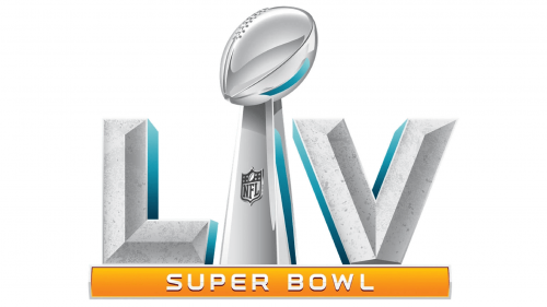
The Super Bowl LV logo presents a textured look with the Roman numerals “LV” prominently displayed in a stone-like finish, suggesting durability and resilience. The numerals are accented with a crisp teal stripe, providing a refreshing visual contrast to the rough texture. The Vince Lombardi Trophy stands between the numerals, with the NFL shield beneath the football, aligning with the series’ branding. Unlike the previous logo, which featured smooth gradients and gold accents, this design opts for a more rugged and tactile appearance. The text “SUPER BOWL” is set against a bold orange banner below, introducing a warm color that energizes the logo. This design shift may reflect the host city’s climate or the event’s unique character for the 55th Super Bowl.
Super Bowl LVI (2022)
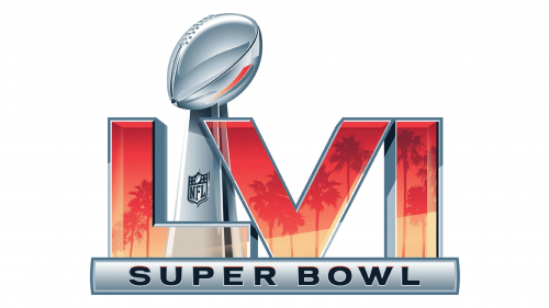
The Super Bowl LVI logo introduces vibrant sunset hues with palm silhouettes within the Roman numerals “LVI,” evoking the host city’s tropical ambiance. The Vince Lombardi Trophy remains central, with the NFL shield directly below the football. This iteration departs from the previous logo’s textured gray and orange theme, opting for a gradient of warm colors that capture the essence of a coastal sunset. The numerals are outlined in a deep blue, which transitions to a lighter shade, harmonizing with the sunset motif. The text “SUPER BOWL” is displayed in a sleek, metallic finish on a banner beneath the design, grounding the logo with a modern touch. This design shift celebrates the event’s location with a more thematic and visually engaging approach.
Super Bowl LVII (2023)
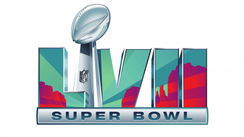
The Super Bowl LVII logo showcases vibrant, abstract landscapes within “LVII,” differing from the prior sunset imagery. Geometric shapes in teal, purple, and red within the numerals “LVII” evoke the host city’s dynamic vibe. The Vince Lombardi Trophy, with the NFL shield, remains the centerpiece. Shifting from a tropical theme, the logo adopts a diverse, contemporary color scheme reflecting the host’s culture or geography. The trophy and numerals’ silver hue contrasts with bold new colors for visual impact. “SUPER BOWL” text is accented with a metallic banner, blending tradition with modern graphic updates.
Super Bowl LVIII (2024)
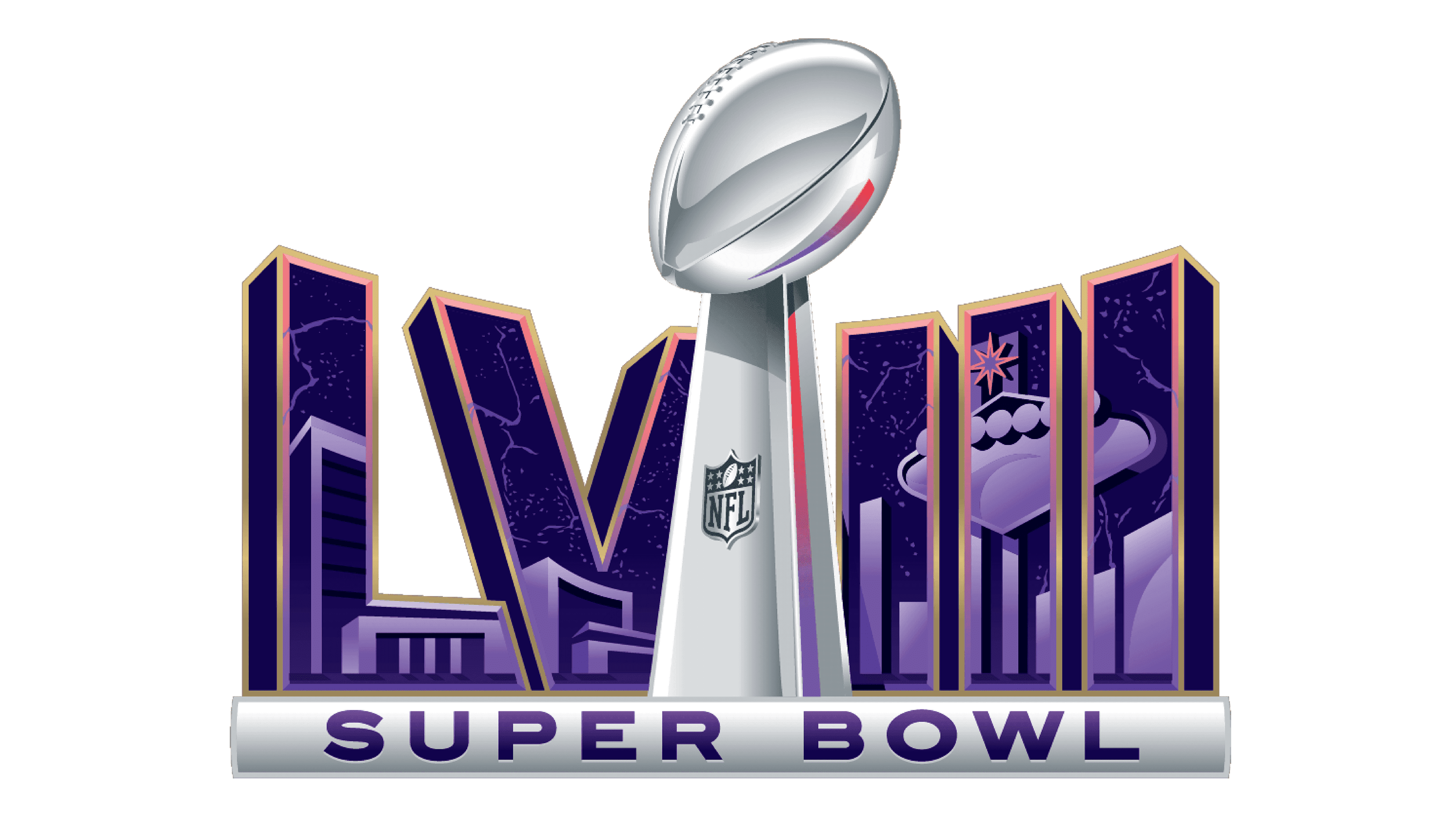
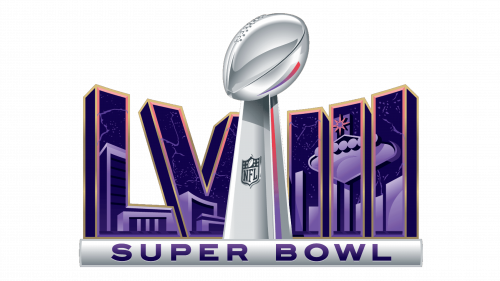
The Super Bowl LVIII logo features the Roman numerals “LVIII” against a night sky, adorned with stars and a city skyline silhouette. The design shifts from abstract landscapes to a more illustrative style, with the numerals outlined in gold, enhancing the logo’s elegance and grandeur. The Vince Lombardi Trophy stands between the numerals, its silver sheen and NFL shield below the football consistent with previous logos. This iteration introduces a deep purple hue, evoking the mystery and excitement of an evening event. The text “SUPER BOWL” is displayed on a metallic banner, remaining a steadfast element of the design. This logo suggests a more localized experience, potentially connecting with the host city’s identity and nightlife.
Super Bowl LIX (2025)
The logo features a striking juxtaposition of vibrant purple and green hues, with a silhouette of a trumpet player set against a radiant backdrop. The Roman numerals “XXXIX,” flanking the Vince Lombardi Trophy, are adorned with artistic swirls, infusing the design with a festive, Mardi Gras-like flair. The trophy, with its gleaming football, is the focal point, underscored by the NFL shield. “SUPER BOWL” is boldly inscribed on a golden banner below, evoking the event’s prestige and grandeur. The entire composition marries the vivacity of New Orleans culture with the intense spirit of football’s biggest night.
Super Bowl LX (2026)
The Super Bowl LX logo for 2026 is a vibrant and dynamic design that captures the excitement and energy of the event. At the center stands the iconic Vince Lombardi Trophy, rendered in a sleek silver finish, symbolizing the pinnacle of achievement in American football. Behind the trophy, a colorful and abstract representation of a cityscape unfolds, featuring landmarks such as the Golden Gate Bridge, which suggests a connection to San Francisco. The background is filled with bright, gradient colors, including shades of pink, blue, and green, creating a lively and modern aesthetic. The words “SUPER BOWL” are prominently displayed in bold, silver lettering at the base of the logo, anchoring the design. This logo effectively conveys the grandeur and anticipation associated with one of the world’s most-watched sporting events.
