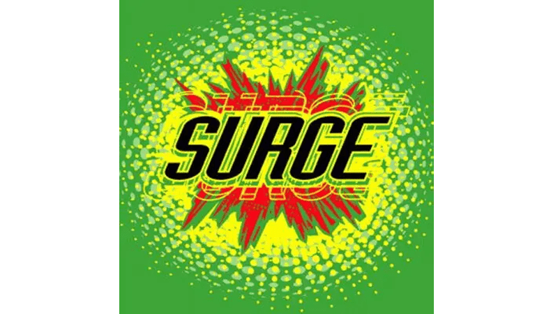
Surge Logo
Surge soda drinks have been enjoyed long before other big names appeared on the market. This is a citrus-flavored soda that tastes similar to an energy drink. It contains maltodextrin, an ingredient that many athletes take as a dietary supplement. The drink was especially popular among youth and was even available in schools. Although its sales went down and the Coca-Cola Co. discontinued the brand, its loyal fan base brought it back to life.
Meaning and History
Released in 1997, Surge appeared as another Coca-Cola Co. brand. The brand was presented during a Super Bowl, tying the drink to exciting and fun times. At first, soda was available in slightly more than half the country; by early 1998, that number had risen to 90%. It soon gained popularity and became a cult classic for many. Unfortunately, it ceased operation in 2003. The company was resurrected in 2014 thanks to a whole Surge movement. It has existed ever since, which proved that there is still a good market for the Surge drink. Its growth and success are still supported by the Surge movement.
What is Surge?
Surge is a citrus soft drink produced by The Coca-Cola Company. Although this beverage has seen many years of terminated production, it resurrected stronger than ever.
1996 – 1999, 2014 – Today
This logo was created by Tom Cox Design. It has a powerful and energetic look. The logo appears to be exploding thanks to a red, neon, and darker green background with sharply cut lines. The name itself was written in black using a bold, handwritten font. It is obvious that the target audience was the youth of the 90s who saw the rise of underground alternative rock and hip hop. This iconic logo was used by the brand when it started operating again in 2014.
1999 – 2003
The updated logo features an updated font. It is also done using bold strokes of a black color, but the font no longer looks handwritten. The letters are all capitalized and italicized for extra dynamics. The designers kept the red explosion but complemented it with a neon green base that matched the color of the actual drink. In addition, the inscription was doubled with a thin yellow outline to create a layered, mesmerizing, and impressive final image.
Font and Color
The color palette of the logo stayed consistent over the years. A powerful, daring red was initially the key color, but later the bright and vibrant neon green took the lead. The latter is often associated with vitality, health, youth, and excitement. It makes people feel more happy, cheerful, and optimistic. There is also a black that reflects the brand’s strength and confidence.
The original logo features a handwritten inscription. The strokes are thick, rounded, and somewhat uneven, which gives the logo some charm and a friendly appearance. The other version uses a stylish, italicized font with clean strokes and even letter positioning. It looks like a modified version of House Sans or Belgia fonts.


