Taco Bell Logo
Taco Bell is an American chain of the fast food restaurants founded by Glen Bell in 1962 and headquartered in Irvine, California. Taco Bell serves Mexican-inspired food such as tacos, burritos, nachos, etc. Restaurants are placed mostly in the USA, but you can find them in other countries across the Globe.
Meaning and History
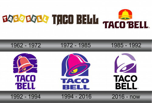
The bell in the current logo refers to the fact that you’ll be notified when your order is up by a ringing of a small bell in each of the restaurants in the chain. This concept was relayed first by the 1985 logo, although there were also other designs before that – they were mostly text.
1962 – 1972
The initial logo of the brand represented the multicolored toy blocks with the letters inside them. These blocks were tilted into various shapes, too, so the entire emblem was pretty childish. The typeface of the lettering was executed in the simple white sans-serif style.
1972 – 1985
The redesign took place in 1972. The typeface was changed to the brown-colored Gothic style. It was pretty mean-looking, but it still retained fluidness and carelessness of the previous incarnation. The background was removed, so there was only the inscription.
1985 – 1992
The logo was changed again in 1985. It had the well-known bell made in yellow and green color with the lines on it and placed above the inscription, on the bright red background. The lettering was changed as well, having the brown and bold rounded typeface.
1992 – 1994
In the year 1992 Taco Bell changed its logo once again. The emblem had almost purple bell with a violet color inside it. The background was violet too, and had a few solid lines on it.
As for the inscription, it wasn’t changed, but it switched its palette according to the background and was placed below the emblem.
1994 – 2016
In 1994 restaurant’s logo was changed once again. Its emblem had the pink bell bordered from the dark purple background with a white outline. The bell also had the gold tongue.
As to the inscription, placed under the emblem, it hadn’t changed except of the switching its color according to the background
2016 – Today
In 2016 brand endured another redesign with changing the inscription, which turned to the black sans-serif simple style and color palette of the bell, which gained the white color outside and the purple color inside. The background also had a little changing: its color brightened.
Emblem and Symbol
The latest logo is also used as an icon for the app the brand has set up for mobile devices. The app also uses the now-iconic purple coloring of the chain in everything from icons to menus to simple plaques with text on them.
