TD Bank Logo
TD Bank, a subsidiary of Toronto-Dominion Bank, is a prominent North American financial institution. Presently, it offers a broad range of banking services, from personal and business banking to wealth management. Predominantly active in Canada and the U.S., it’s one of the top 10 banks in North America. Its strong market presence is a testament to its commitment to customer service, innovation, and sustainability. Owned by Toronto-Dominion Bank, TD Bank’s continual growth emphasizes its dedication to meeting the evolving financial needs of its diverse clientele.
Meaning and history
TD Bank’s journey began in 1855 when the Bank of Toronto was established by a group of millers and merchants. Later, in 1871, another significant institution, The Dominion Bank, was founded. These two banks independently expanded their services and footprints in Canada over the next century.
As the banking landscape evolved and competition grew fiercer, a strategic merger between the Bank of Toronto and The Dominion Bank occurred in 1955, giving birth to the Toronto-Dominion Bank (TD Bank). This union capitalized on their combined strengths, resulting in more significant market reach and operational efficiencies.
Throughout the latter half of the 20th century, TD Bank expanded its services, introducing innovative products and increasing its presence across Canada. Notably, in the 1980s and 1990s, it began to extend its footprint internationally, particularly into the U.S. market.
A pivotal moment in TD Bank’s history was its acquisition of Portland, Maine-based Banknorth in 2005. This move marked its significant entry into the U.S. banking sector. Later, in 2008, TD Bank further expanded its U.S. presence by acquiring New Jersey-based Commerce Bank. This solidified TD Bank’s position as a key player in the North American banking scene.
Over the years, TD Bank has embraced digital transformation, offering advanced online and mobile banking services to meet the changing needs of its clients. Throughout its history, the bank has seen various leadership changes, but its core principles of customer service, innovation, and community involvement have remained consistent.
Today, as a subsidiary of Toronto-Dominion Bank, TD Bank stands as a testament to strategic growth, mergers, and adaptation in a continuously changing financial landscape.
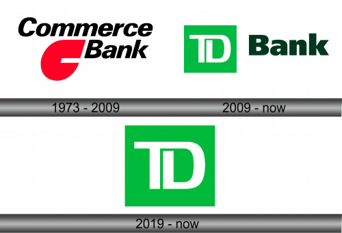
1973 – 2009
Prior to its integration into TD Banknorth, Commerce Bank showcased a logo prominently featuring a bold red “C.” This uppercase character bore a resemblance to a soaring teardrop. Positioned above it was the institution’s title, scripted in sleek, italicized black lettering without serifs. Interestingly, this design choice reflected the bank’s vision of dynamism and growth. The unique combination of the teardrop-shaped “C” and the distinct typography was emblematic of the bank’s commitment to service and innovation. The colors chosen, red and black, were not just aesthetically pleasing but also represented passion and strength, values that the bank held in high regard. This design remained significant in the bank’s branding until its eventual merger.
2009 – Today
Following the union of Commerce Bank and TD Banknorth, a wholly distinct brand emerged: TD Bank. Here, TD is an acronym for Toronto-Dominion. This consolidation led to the abandonment of the familiar “C” emblem in favor of an alternative color palette. Consequently, the institution showcased a pale green square logo featuring the white alphabets “T” and “D.” The term “Bank,” rendered in a bold, dark green hue, sits slightly offset to the right. In various promotional materials and on their website, this may be paired with a catchy tagline.
The crafting and conceptualization of TD’s brand identity were entrusted to the adept hands of the Canadian agency, Shikatani Lacroix. They faced a unique task: forging a cohesive visual representation resonating with both the overarching corporation and its individual branches.
2019 – Today
The emblem featuring the initials “TD” resonated so profoundly and became so iconic that the bank chose to showcase it independently from its accompanying wordmark. The verdant square stands firm on its own, underpinning the brand’s visual essence.
Craftsmen intricately wove visual allegories into the TD Bank insignia. The four-sided form itself is an emblem of steadfastness and organization; every side of a square is equally balanced, denoting stability. The unifying white line that intertwines the letters speaks volumes of unity and interconnectedness. Thus, both the emblem’s precise geometrical framework and its distinct letter linkage carry layered significances.


