Telegram Logo
Telegram, a widely-recognized messaging app, is primarily owned by Nikolai and Pavel Durov, Russian entrepreneurs. The app is renowned for its robust emphasis on privacy and security, offering end-to-end encryption and self-destructing messages. It serves as a multifunctional platform, allowing users to send messages, create groups, and share various file types. Launched in 2013, Telegram has evolved extensively, becoming a significant player in the realm of instant messaging, emphasizing user-friendliness and data protection. The Durovs’ dedication to privacy continues to steer Telegram’s innovative trajectory.
Meaning and history
Born out of the Durovs’ passion for privacy, it was conceived as a robust response to the growing demands for user confidentiality. It quickly gained traction due to its distinctive features like end-to-end encryption and self-destructing messages, setting it apart in the competitive messaging app market.
Telegram’s journey is marked by its continual evolution and innovation. It introduced several user-friendly features such as supergroups, bots, channels, and stickers, enriching user interaction and experience, and solidifying its standing in the realm of instant messaging.
The app has faced numerous challenges, including bans in several countries due to its steadfast commitment to user privacy. However, its resilience and adaptability have enabled it to overcome these hurdles, continuously expanding its user base globally. Pavel Durov, the driving force behind Telegram, remains devoted to maintaining the app’s foundational principles, ensuring its sustained growth and relevance in the ever-evolving digital landscape.
Despite controversies and confrontations, Telegram persists in its mission, prioritizing user privacy and freedom of expression, and it continues to be a pivotal platform in the world of messaging apps, echoing the Durovs’ vision and dedication to a secure and private communication space.
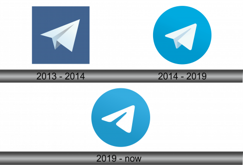
2013 – 2014
In its inaugural year, the emblem of Telegram sported a square silhouette, a stark contrast to the familiar rounded appearance seen predominantly. Nevertheless, it retained a blue backdrop, significantly more intense in shade, and embodied a white paper airplane. This airplane adhered to the square’s sharp contours, showcasing pronounced edges. It served as an apt representation for an application centered around communication, symbolizing swift and unhindered exchange of information. The geometric rigidity and darker tone of the initial design hinted at a fundamental essence of reliability and security, core principles inherent to the application’s philosophy. The incorporation of these elements delineated the foundational identity of Telegram, subtly reflecting its mission to provide a seamless and secure communication platform.
2014 – 2019
The inaugural emblem is constructed from an intricate array of geometric forms. Its foundational element is a substantial blue sphere, which houses the remaining components within its bounds. Centralized in the emblem is a white, arrowhead-shaped polygon, its extremities rounded, segmented by a sharp, light grey band, exhibiting a curvature at its base. At the bend, a minute grey triangle is strategically positioned in the extreme angle. The amalgamation of polygons visually interprets a paper aeroplane, while the encompassing sphere serves as a backdrop, framing the intricate symbol within. The choice of simplistic elements and shapes showcases a profound yet understated design philosophy, emphasizing the essence of movement and direction inherent to the paper aeroplane. This iconic representation is enriched with subtle details and nuances, embodying the essence of the brand’s identity and values, all the while maintaining a sense of elegance and sophistication in its visual expression. The amalgamation of distinct geometrical elements, each meticulously placed, converges to create a symbol that is not only visually appealing but also rich in symbolism and meaning.
2019 – Today
In 2019, a revamped iteration of the logo surfaced. The design purists simplified the emblem’s composition, distilling it to a mere two fundamental forms: a soft blue orb and a white, arrow-reminiscent feature, symbolizing the wings of the plane. The grey polygons were omitted; however, a singular indent persists in the stretched band, currently partitioning the triangle into two harmonious halves. This minimalistic approach to design embraces a cleaner, more streamlined aesthetic, focusing on essential elements that convey the brand’s core identity and values, removing any superfluous details and prioritizing clarity and recognizability. The refined logo resonates with an evolved sense of purpose and direction, reflective of the brand’s continual progression and adaptation in the dynamic landscape it navigates. The restrained use of shapes and colors symbolizes a maturation in design thinking, aligning with contemporary tastes and preferences, whilst maintaining a timeless appeal.


