Texas Rangers Logo
The Texas Rangers are a professional baseball team based in Arlington, Texas. Founded in 1961 as the Washington Senators, they relocated to Texas in 1972, adopting their current name in honor of the state’s iconic law enforcement agency. Competing in Major League Baseball’s American League West Division, they’ve made multiple playoff appearances, capturing division titles and reaching the World Series twice, although a championship has eluded them. With a spirited fan base, the Rangers play their home games at the state-of-the-art Globe Life Field. The team’s rich history includes legendary players and memorable moments that have cemented their place in baseball lore.
Meaning and history
The Texas Rangers, an esteemed Major League Baseball team, trace their origins back to 1961 as the Washington Senators. The team’s genesis was a result of the original Senators relocating to Minnesota. But by 1972, after a decade in Washington, the franchise made its move to Arlington, Texas, adopting the Texas Rangers name in tribute to the legendary state law enforcement unit.
Ownership and management shifts have been part of the Rangers’ narrative. Bob Short, who moved the team to Texas, sold it in 1974 to Brad Corbett. During Corbett’s reign, the team saw various ups and downs but didn’t secure any titles. In 1980, oil tycoon Eddie Chiles purchased the Rangers, introducing new energy. Nolan Ryan, one of baseball’s most iconic pitchers, joined the roster during this period, cementing his legacy with the Rangers.
In the late 1980s, George W. Bush, who would later become the U.S. President, became a co-owner, heralding a new era of management. The team underwent significant transformations during the 1990s, making strategic acquisitions and enhancing its roster. Tom Hicks took over the reins in 1998, ushering in a period of financial turbulence, despite signing notable players like Alex Rodriguez.
The 2010s marked another turning point. In 2010, an ownership group led by Nolan Ryan and Chuck Greenberg acquired the team. Under their guidance, the Rangers clinched two consecutive American League pennants in 2010 and 2011, although a World Series victory remained elusive.
Ray Davis and Bob Simpson later became the primary owners, and their tenure has been marked by consistent efforts to make the Rangers contenders in the league. A monumental moment for the franchise was the inauguration of Globe Life Field in 2020, a testament to the team’s enduring legacy and commitment to its fanbase.
Throughout its existence, the Texas Rangers have faced trials and tribulations, management shifts, and roster changes. Yet, the team’s spirit remains undaunted, reflecting the resilience and passion synonymous with the state of Texas itself.
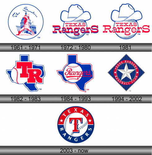
1961 – 1971
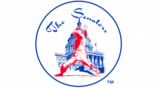
In the initial emblematic representation of the Washington franchise, spanning a decade before its relocation to Texas in 1972, there was a pristine circular design. At its heart was the iconic White House, depicted with blue contours, accompanied by an athlete poised to pitch a baseball, delineated in vibrant red. Floating above the architectural marvel, one could find the words “The Senators” elegantly scripted. This imagery not only showcased the sport but also subtly encapsulated the political significance of the city it represented. The fusion of politics and sports was unmistakable, telling a tale of a team deeply rooted in the nation’s capital.
1972 – 1980
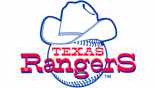
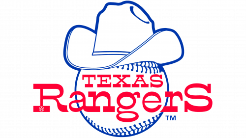
Upon transitioning to Texas, the team underwent a rebranding, adopting the Texas Rangers as their new identity. This shift prompted a fresh logo design. The revamped emblem showcased a pristine white baseball, adorned with a cowboy hat, symbolizing the region’s rich Western heritage. Hovering over this imagery, the team’s moniker is displayed in a striking shade of red. The entire illustration is framed with a deep blue border, echoing the team’s colors and reflecting their renewed spirit and connection to Texas. This redesign was more than just aesthetics; it was an embrace of the team’s new home and legacy.
1981
In 1981, a refreshed rendition of the prior emblem emerged. Creatives finetuned the design intricacies, especially accentuating the baseball and the cowboy hat—iconic symbols representing the Texan cowboy spirit. The “Texas Rangers” label retained its original position, albeit with a subtle transformation in its typography. This evolution was a harmonious blend of retaining the team’s identity while introducing modern touches, capturing both the history and the forward momentum of the Rangers in their visual branding. The redesign evoked both nostalgia and progression, embodying the essence of Texas and its cherished baseball legacy.
1982 – 1983
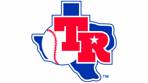
Using the shape of Texas for the updated Rangers emblem was a deliberate choice, emphasizing the deep-rooted connection between the state and the team. Set against a vibrant blue backdrop of the state’s outline, prominent red initials “TR” dominate the design. Within these bold letters, a petite white star is artfully embedded, echoing Texas’s moniker as the “Lone Star State.” Furthermore, a white baseball subtly integrated into the design serves as a nod to the sport and the team’s rich history. This emblem, in its entirety, is a visual celebration of the union between the state of Texas and its beloved baseball team, the Rangers.
1984 – 1993
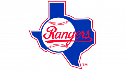
The emblem introduced in 1984 carries forward elements from its predecessor, most notably the blue depiction of Texas. However, new elements breathe fresh life into the design. A striking red and white border now embellishes the state’s silhouette, adding depth and distinction. Instead of the “TR” initials, the word “Rangers” elegantly flows across the state’s representation in a slanted, italicized font, accentuating dynamism and movement. In keeping with tradition and to honor the sport’s essence, a baseball is subtly integrated into this revamped design, reinforcing the team’s deep-rooted connection with the game. This iteration of the logo captures the evolving spirit of the team while preserving its foundational elements.
1994 – 2002
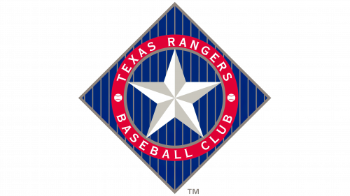
The latest emblem boasts a distinctive diamond form, accentuated by slender vertical lines. At its core, a lustrous five-pointed star shines prominently. Encircling this star is a deep crimson band, elegantly bearing the inscriptions “Texas Rangers” and “Baseball Club.” These textual elements are symmetrically divided by two miniature baseballs, adding both balance and a nod to the sport itself. This refined design reflects the team’s rich history while introducing modern elements, embodying both the team’s legacy and its forward-looking vision.
2003 – Today
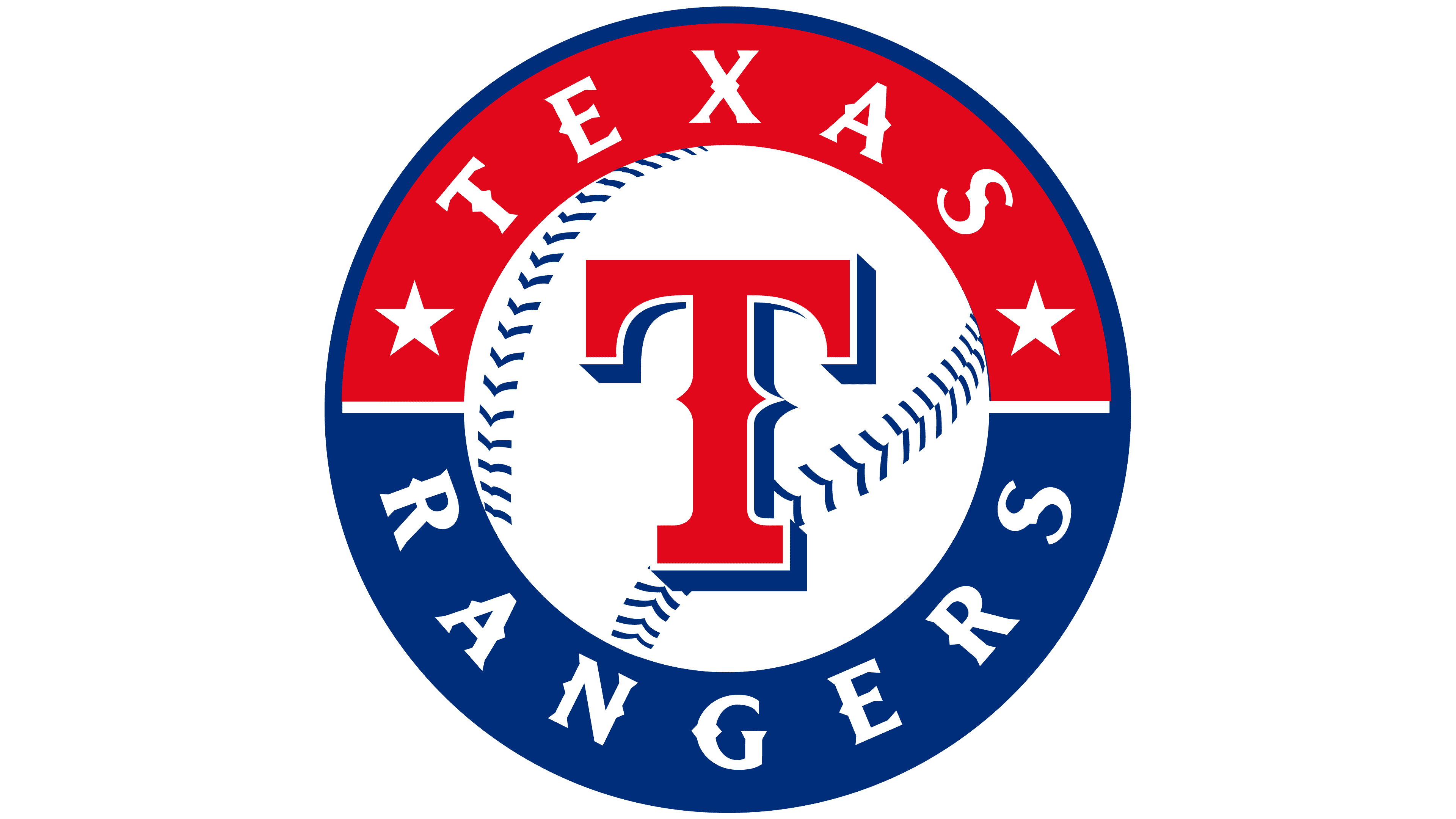
The contemporary design, crafted by New York’s renowned Skilo Brands in collaboration with the Rangers Baseball Express and endorsed by Major League Baseball, came into play in 2003, taking inspiration from its predecessor. This emblem, reminiscent of a classic seal or badge, boasts a prominent central feature surrounded by a broad circular band inscribed with words.
At its heart lies a baseball, marked by two distinctive crisscross stitches. This serves as a canvas for the prominent “T,” styled in an ornate Old English font with spiky extensions. Encircling this is a dual-toned ribbon, neatly segmented into red and blue sections by a delicate divider. Twin stars adorn the top, while the words “Texas” and “Rangers” find their home above and below, respectively. A slender outline adds the finishing touch to the periphery.
