Toronto Blue Jays Logo
The Toronto Blue Jays, a Canadian gem in Major League Baseball (MLB), emerged in 1977 as the second MLB franchise outside the U.S. Representing Toronto, Ontario, they’ve clinched two World Series titles in 1992 and 1993. Known for their iconic blue bird emblem, they’ve showcased standout players, boosting the sport’s popularity in Canada. Competing in the American League East division, they play at the Rogers Centre. The Jays, as fans affectionately call them, are not just a team but a symbol of national pride in the realm of baseball.
Meaning and history
The Toronto Blue Jays, Canada’s proud representation in Major League Baseball (MLB), took flight in 1977. Born as MLB’s second venture outside the U.S., this Toronto-based team rapidly gained a dedicated fan base. Navigating initial challenges, they found their stride in the late 1980s and early 1990s, marking a golden era for the Jays. In 1992, they became the first team outside the U.S. to win the World Series, only to repeat this feat in 1993.
Toronto has hosted numerous baseball greats, including Roberto Alomar and Joe Carter, both leaving indelible marks on the franchise’s legacy. The iconic blue bird logo became synonymous with excellence in Canadian baseball.
The 2000s brought challenges; however, the 2015 and 2016 seasons rekindled hope, with the Jays returning to the playoffs. Key players like José Bautista and Josh Donaldson brought fresh energy and unforgettable moments, like Bautista’s bat flip in the 2015 ALDS.
The Rogers Centre, their home since 1989, has witnessed countless historic moments. With a retractable roof, it’s a modern marvel and a baseball haven.
Today, the Jays are more than just a sports team. They signify Canadian grit and passion, uniting fans from coast to coast. As they soar into the future, the Toronto Blue Jays continue to be a symbol of Canada’s enduring love for baseball.
1977 – 1996
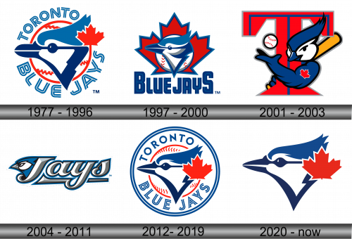
During that era, the Toronto Blue Jays stood proudly as the sole representation of Canada in the Major League Baseball arena. Birthed during the MLB expansion of 1977, their brand identity was masterfully crafted by the Toronto-based firm, Savage Sloan Ltd. This initial design resonated with classic vibes, intertwining iconic text and symbolic graphics. Central to the logo was a baseball adorned with red seams, from which a vivid red maple leaf emerged. This was artfully complemented by the depiction of a blue jay, rendered in a unique style. The integration of the maple leaf served as a deliberate nod to the team’s Canadian roots, emphasizing their status as “Canada’s Team.” Encircling this emblematic image was the elegantly scripted “Toronto Blue Jays” title, which further solidified the team’s identity in the baseball world.
1997 – 2000
Two decades post their MLB initiation in 1977, the Toronto Blue Jays introduced a revamped emblem in 1997. Dominating the design was a majestic blue jay, perched elegantly atop a pristine white baseball stitched with striking red seams. Playing a pivotal role in the background was the vibrant red maple leaf, an enduring symbol of the team’s Canadian identity. The blue jay itself was adorned with intricate texturing, adding depth to the visual. Accompanying this detailed imagery, the words “Blue Jays” were inscribed in a bold, navy blue typeface, showcasing a fresh and contemporary block-lettered style.
2001 – 2003
2003 saw the Toronto Blue Jays incorporate an additional emblem into their branding arsenal. This fresh design showcased a lively depiction of the team’s cherished mascot, Ace, playfully coiled around a distinctively designed letter “T”. In one talon, Ace firmly grasped a baseball, pristine white with striking red stitches, while the other held a vibrant yellow bat. The bold red “T” was a clear nod to the city of Toronto. However, a subtle addition was the maple leaf tattoo, discreetly placed on the Blue Jay’s left bicep, which felt like a last-minute addition, subtly reinforcing the team’s Canadian connection.
2004 – 2011
The era of the enraged avian had dawned. In 2004, the creative minds at Brandid, a firm rooted in Toronto, breathed life into a revamped logo for the Toronto Blue Jays. This rendition spotlighted a vividly three-dimensional Blue Jay, exuding an undeniable fierceness, positioned left of the word “Jays.” Notably absent was the iconic maple leaf, and the rich shade of red vanished altogether from the palette. Instead, harmonious shades of metallic blue, cool grey, and crisp white took center stage. Furthermore, the word “Blue” was strategically omitted, streamlining the team’s identity.
2012 – 2019
Embracing a minimalistic approach, and drawing inspiration from the team’s golden era, a refreshed emblem for the Toronto Blue Jays was born. This modern-day insignia had the creative touch of MLB Design Services under the leadership of Anne Occi, the Vice President of Design. Echoing the sentiments of the iconic 1977 design, it showcases a fusion of blue and navy for the Blue Jay’s head, accentuated by a vivid red maple leaf situated to its right, all set against the backdrop of a baseball. This contemporary Jay boasts more defined attributes. The red leaf’s integration is distinct, separating from the baseball’s red stitching. “Toronto” and “Blue Jays” are etched in a deep blue hue, gracefully arching within an inner white circle. The emblem communicates a message to the fans and competitors alike: the Blue Jays are in it to clinch victories for the long haul.
2020 – Today
Now, the team proudly displays an emblem, a contemporary take on their original insignia from their initial sporting journey, redesigned in 2012. The earlier emblem, a creation of Major League Baseball’s design team under the guidance of Anne Occi, retained only the iconic blue maple-leaf jay that was once centrally positioned on the emblem.
Today’s design prominently exhibits a bird’s face, directed towards the left. A singular horizontal stroke seamlessly links the top of its beak and eyes. The bird’s lower beak gracefully flows into the encompassing silhouette, crafting the neck’s form. The blue jay, characterized by its pronounced crest, is complemented by a dignified, bold red maple leaf nearby. This logo epitomizes the franchise’s rich heritage and its forward-looking vision in the world of sports.

