Toyota Logo
Toyota is one of the big Japanese car brands, and it’s simultaneously amongst the oldest names in this field. They are also amongst the chief manufacturers of electric and hybrid cars. So, if you’d like to drive in something friendlier to the environment, this might be your choice.
Meaning and History
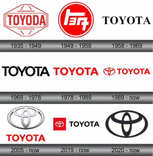
Like many other Japanese brands, the name belongs to the family that founded and still runs the company to this day. They started making cars back in 1933, although the family business is even older than that. The first logo, however, didn’t appear until 1935. Back then, the brand was called ‘Toyoda’, however.
1935 – 1949
The very first logo was a dark red gem shape with a fairly wide middle part. The insides were almost completely white, save for several strokes of red and a rectangular shape that also held the name ‘Toyoda’ inside. The letters weren’t too different from contemporary design – they were uppercase, thick and just a bit narrower.
1949 – 1958
This one was meant more for a home market, which is why they used the name written in Japanese glyphs. It was also this stage that first saw the name change to ‘Toyota’, even if in just in Japanese. The reason is simple – the bosses simply liked how ‘Toyota’ sounds in speech.
The glyphs themselves were styled to better fit a confined space, which meant they were angular, strict, blocky and rather compressed. The name was colored white and placed into a red circle – a common image for the Japanese companies that basically just means the rising sun.
1958 – 1969
By 1958, the company started entering the international market, which is why they decided to return the Latin spelling of the name. They took the basic typographic font (much like Times New Roman), painted the letters black and just typed ‘Toyota’, all in uppercase.
1969 – 1978
With 1969 design, we enter the realm of contemporary Toyota style. It’s not yet the same look as now, but this time they wrote the name in a different font – the letters have smaller intervals and some smaller details on this one.
1978 – 1989
This time, they basically took the previous design, made the letters more proportioned and rather wider, and then spaced them out a bit further. Oh, and the color changed to scarlet red. The resulting look is very similar to the modern take on the Toyota logo.
1989 – today
The 1989 design saw the addition of the iconic Toyota badge onto the logo. They pretty much took the writing from the previous iteration and added this symbol to the left of it.
The symbol is just three ovals – one normal and three narrower shapes. The resulting structure resembles the letter ‘T’. But in addition, it also consists of the three almost identical parts, which is a lucky number in this country.
2005 – today
For this design, they took the same writing and the same badge, but put the latter on top of the brand name and made it larger. What’s more, they also chromed it heavily and added a lot of glint and illumination.
2019 – today
In 2019, Toyota decided to add another logo they’d use simultaneously with the other 3. It’s pretty much the 1989 style, but with black letters and a large red square around the badge. Obviously, they had to repaint the symbol white because of it, as well as make it smaller.
2020 – today
Another addition, this time it’s just the badge itself. They got rid of the writing for this one and painted the badge black instead of red, as before.
Emblem and Symbol
Since 1989, the Toyota badge also appeared on almost all of the cars made by this company. It has very fast become an internationally accepted symbol for this brand. There are many interpretations as to why they used the ovals, and it’s partially because it resembles all the letters in the name simultaneously, among other things.

