Truist Logo
Truist is a prominent financial services company that operates predominantly in the banking sector, offering a range of services including loans, insurance, and asset management. It’s a product of a merger between BB&T and SunTrust Banks, targeting diverse markets across the United States. It’s publicly traded, so ownership is distributed among shareholders, with institutional investors holding significant stakes. The company strives to combine traditional banking values with innovative solutions to meet contemporary financial needs.
Meaning and history
Truist Financial Corporation, a significant entity in the financial services sector, is the culmination of a merger between BB&T and SunTrust Banks, finalized in December 2019. This union spawned the sixth-largest U.S. commercial bank, with both precursor entities boasting rich histories dating back to the 19th century. BB&T’s roots trace back to 1872 when it was established as Branch and Hadley, while SunTrust Banks originated in 1891 as Commercial Travelers’ Savings Bank.
The two banks independently underwent various transformations, mergers, and rebrandings over the decades, reinforcing their market positions and expanding their footprint across multiple states. The collaborative decision to merge marked a strategic endeavor to consolidate assets and leverage combined strengths to foster innovation and enhance service delivery in the banking sector.
Ownership of Truist is shared among numerous shareholders, featuring a mix of individual and institutional investors, with the latter holding substantial stakes. The stock is publicly traded, ensuring a diverse ownership structure, and the consolidation aimed at increasing the competitive edge in providing comprehensive financial solutions, reinforcing commitment to communities, and bolstering innovation.
Today, Truist continues to build on its legacy, integrating the robust values of its predecessors with modern, technology-driven solutions to cater to the diverse financial needs of individuals and businesses across the United States. The company navigates the evolving financial landscape with a focus on community development, customer-centric services, and forward-thinking strategies, reflecting the combined heritage and unified vision of the melded entities.
Before 2020
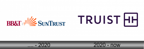
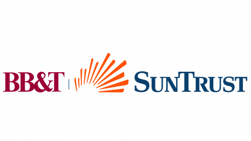
The fusion of BB&T Corporation and SunTrust Banks, Inc. initiated in February 2019, reached fruition in December of the same year. January 2020 saw the introduction of the official insignia for the nascent holding entity. Throughout the interim phase, a blend of the identifying marks from the two antecedent organizations represented Truist.
The left segment displayed the BB&T insignia, rendered in a robust Times New Roman Bold typeface and imbued with a deep burgundy hue (#8A0025). Conversely, the SunTrust designation, created from block letters adorned with prominent serifs, adorned the right, bathed in a blue shade. Intersecting the dual nomenclatures was a distinctly fashioned sun: it boasted twelve uneven orange beams, their pointed terminations converging inward. This design served as a visual liaison between the corporations, emblematic of their vibrancy and developmental trajectory.
The amalgamation symbolized a convergence of values, aspirations, and legacy, weaving a tapestry of shared commitment to innovation and excellence. It was a meticulous intertwining of identities to forge a unified front, leveraging collective strengths to navigate the dynamic financial landscape and cater to the evolving needs of their diverse clientele. This visual confluence not only epitomized the synergy of the merged entities but also underscored their revitalized vision and relentless pursuit of growth and transformative solutions in the financial sector.
2020 – Today
The incorporation of the Truist brand was executed incrementally within the public and corporate domain, allowing for a gradual acclimatization. Consequently, the logo initiated its presence on affiliated entities of SunTrust and BB&T, permeated digital platforms, made appearances in advertising initiatives, and manifested on placards at SunTrust Park. The nomenclature, akin to the financial conglomerate’s moniker, is the brainchild of the maestros at Interbrand. The minimalist inscription of “TRUIST” was amalgamated with a square encapsulating two ‘T’s, each rotated 90 degrees. Public response to this emblem has been variegated, with some perceiving it as reminiscent of a belt buckle or an electronic circuit, expressing their approval.
This courageous branding endeavors to reverently acknowledge the legacies of both SunTrust and BB&T. Despite its seemingly straightforward design, the revamped appearance is laden with symbolism. The dual “Ts,” mirrored within the bounded square, signify the union of two titans within the fiscal sphere. The uniform dimension of the letters accentuates the mutual respect and equivalent significance of the amalgamated entities. Concurrently, the square embodies reliability and assurance, its softened edges conveying approachability. The emblematic monogram subtly alludes to Touch+ technology, embodying a bespoke approach to client interactions.
The modern representation seamlessly intertwines the historic roots of the merged institutions, highlighting a mutual pursuit of innovation, client-centric solutions, and a harmonized vision. The logo, in its refined simplicity, acts as a beacon of unified strength and shared aspirations, emphasizing the transformative journey embarked upon by the newly integrated financial behemoth. The symbolic intertwining of elements within the logo reinforces the cohesive values and synergistic collaboration that characterize Truist’s renewed approach to financial services and client relationships.
