Volkswagen Logo
The Volkswagen brand (translated as “people’s car”) belongs to the Volkswagen AG concern, along with Audi, Bugatti, Porsche, Bentley, SEAT, and other brands. The German company is one of the leaders in the global car market. Volkswagen cars are associated by many with unsurpassed German quality and reliability. The ideal price of Volkswagen, its stylish design, as well as impressive technical characteristics, make this brand one of the most sought-after in the world.
Meaning and History
The founder of the German brand Volkswagen is the great engineer Ferdinand Porsche. It all started in 1934 when Ferdinand received a government order to develop a passenger car for the middle class. The plant, founded in 1938, became the largest in all of Europe. In 1960, the German government sold most of the concern’s shares to private buyers, thanks to which Volkswagen began to develop even more intensively and acquired the Audi trademark. Today, it is a huge concern that owns many well-known auto brands, such as Bentley, SEAT, Porsche, Audi, and Skoda.
What is Volkswagen?
Volkswagen is one of the leaders in the global automotive industry. It has numerous fans in various parts of the world and annually sells a huge number of cars under its own brand.
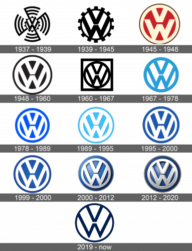
1937 – 1939
At the center of the emblem, there are the brand’s initials – “VW”. A round frame that featured a blend of cogwheel and swastika symbols was enclosing the initials.
1939 – 1945
The swastika symbol was removed, leaving only a cogwheel as a border for the initials. This made the logo look bolder and brought more accent to the initials.
1945 – 1948
The initials now looked slightly different although still stacked one on top of the other. The “W” was not going all the way to the border, though. The center was a red color which allowed the off-white letters and border around it to pop. The whole emblem had a thin brown outline.
1948 – 1960
With a few exceptions, the new version looked very similar to the previous one. The most noticeable difference was the colors, which was changed back to black and white.
1960 – 1967
The company went with a new design again, while still keeping the original idea. It featured black initials on a white background taken into a circle. The whole emblem then was framed by a black square border. It looked bold and confident.
1967 – 1978
This was the first time the company introduced blue. It used this color instead of black for the initials and the round border around them. There was no more square frame.
1978 – 1989
The logo designers inverted the color, so now the letters were white while the background was blue. The logo also featured a double border with white being inside and blue outside. A brighter blue along with double frame gave the logo a more eye-catching appearance.
1989 – 1995
A lighter shade was used for the emblem. The outer border also looked thinner. This version appeared elegant and airy.
1995 – 2000
After a while, the color of the logo was changed again. It was still blue, but a different shade.
1999 – 2000
The logo did not look much different, but some modifications made it appear stylish and impressive. The key change was the addition of darker shades that made the white elements pop. The letters also looked more elegant as the lines got thinner in the center.
2000 – 2012
 The logo acquired some depth and the silver elements stood out thanks to the addition of some gradients. This update made the emblem look sophisticated and masculine.
2012 – 2020
A daring appearance was achieved thanks to the addition of some depth and edginess. The highlights along with a thin 3D border around the emblem gave it a bold, modern, and energetic feel.
2019 – Today
This version resembles the logo seen back in 1967. Besides the color difference, which was now a dark blue, it had the bottom of the “W” not touching the round frame. The lines also got slightly thinner. The emblem looks stylish and minimalistic.
Font and Color
Although there is not a lot written in the Volkswagen logos, its initials are quite recognizable. The brand has a custom-designed font for its logo. It was designed by Hannes von Dohren. The color scheme was predominantly black and white until 1967. The exception was the period from 1945 until 1948.


