Foot Locker Logo
Foot Locker, a prominent retail giant, specializes in athletic footwear, apparel, and accessories, catering to the needs of sports enthusiasts and fashion-forward individuals alike. With a significant presence in North America, Europe, Asia, and the Middle East, the company has successfully penetrated diverse markets, catering to a global clientele. The business operates through a myriad of formats, including physical stores and an e-commerce platform, ensuring accessibility and convenience for its customers. As a publicly traded company, Foot Locker is owned by its shareholders, with the stock traded on the New York Stock Exchange under the symbol FL. This dynamic retail powerhouse continuously evolves, solidifying its position in the competitive retail landscape.
Meaning and history
The inception of Foot Locker is an intricate tapestry woven from the threads of various acquisitions and business maneuvers. Originally a part of the Woolworth Corporation, a retail giant that pioneered the five-and-dime store concept, Foot Locker was conceived as a specialized athletic footwear division in 1974.
As time marched on, the landscape of retail shifted significantly, and Woolworth found itself grappling with the changing tides. This prompted a transformation from a general merchandise retailer to a specialized athletic retailer. By 2001, Foot Locker, Inc. was established as an independent company following the closure of the Woolworth brand.
The years that followed saw Foot Locker solidifying its foothold in the market through strategic expansions and acquisitions. It wasn’t just a retailer; it was a hub that connected the worlds of sports, culture, and fashion. The acquisition of Eastbay in 1997 was a testament to this strategic vision, providing a direct-to-customer segment that catered to high school athletes.
The succeeding years were marked by further expansions, notably in Europe and Asia, ensuring that the Foot Locker brand was recognized and respected worldwide. The company has also been at the forefront of embracing digital transformation, integrating technology to enhance customer experiences both in-store and online.
Today, Foot Locker, Inc. is a powerhouse in the athletic footwear and apparel industry, with over 3,000 retail stores spanning the globe. Its position as a publicly traded company means that it is owned by the shareholders who hold its stock, traded on the New York Stock Exchange under the symbol FL.
The journey of Foot Locker is a testament to the brand’s resilience and adaptability, as it evolved from a small division within a retail conglomerate to a global leader in athletic retail, continuously shaping and being shaped by the dynamic landscape of the retail world.
1974 – 1988
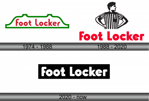
Back in 1974, F.W. Woolworth Company took ownership of the pivotal Foot Locker brand, positioning its name squarely at the logo’s nucleus. The creatives involved opted for a rich red hue and a bespoke sans-serif typeface for its design, closely resembling the ITC Bauhaus Heavy. An intriguing detail was the rounding of all letters save for “k”. The horizontal bar of “e” took on a slanted orientation, while the terminus of “c” was graced with unconventional angled cuts. The entire inscription was set against a pristine white canvas, enclosed by an emerald green line that crafted a unique inverted bathtub silhouette.
Over the years, this emblem has become synonymous with quality and style, reflecting Foot Locker’s commitment to delivering top-notch athletic footwear and apparel. It stands as a testament to the brand’s rich heritage and its evolution in tandem with the dynamic world of fashion and sports. The green and red color palette encapsulates the vibrancy and energy that Foot Locker brings to the athletic retail scene, while the unique font and design elements showcase the brand’s attention to detail and creative flair. Today, the Foot Locker logo is not just a symbol of the brand; it is a representation of the company’s legacy, its values, and its unwavering dedication to its customers.
1988 – 2020
In the pivotal year of 1988, the umbrella organization spawned a specialized division within the Woolworth Corporation, solely dedicated to steering the Foot Locker brand. Concurrently, Foot Locker underwent a significant metamorphosis in its visual identity, trading its green periphery for a distinctive new feature. The logo was rejuvenated with the inclusion of a referee, bedecked in a traditional black and white vertically striped jersey, complete with a petite black pouch adorning the right side, poised above the brand’s moniker.
Simultaneously, the typeface underwent a transformation, morphing from gentle curves to robust rounded right angles, although its fundamental essence of geometric grotesque remained intact. The red hue experienced a slight alteration, emerging as a shade that was both lighter and more vivid than its predecessor.
This marked a pivotal juncture in the brand’s history, as the logo wasn’t just a mere emblem; it was a visual narrative encapsulating Foot Locker’s essence. The referee symbolized the brand’s authority and commitment to fair play in the competitive athletic retail market, while the revamped font and brighter red color reflected the brand’s confidence and vibrancy. This logo became a visual representation of Foot Locker’s dedication to quality, innovation, and customer satisfaction, cementing its place as a leading player in the world of athletic apparel and footwear.
2020 – Today
In the pivotal year of 2020, Foot Locker, once known as Woolworth Corporation and later as Venator Group, Inc. from 1998 to 2001, embarked on a transformative journey to revamp its brand philosophy. The agency Jones Knowles Ritchie lent their creative expertise to craft a refreshed strategy and brand identity, specifically targeted at women with a penchant for athletic footwear.
The design mavens opted for a classic and understated black and white palette to forge a connection with their intended demographic. Concurrently, the quintessential sports referee, a longstanding fixture of the logo, was omitted from its primary iteration. Now, the logo is distilled to its essence – a stark white inscription nestled within a black rectangle. The font underwent minimal alterations, retaining its foundational letter shapes to uphold the brand’s unmistakable and iconic identity.
This reimagined logo is not just a testament to Foot Locker’s adaptive nature, but also a clear reflection of its commitment to inclusivity and diversity. It embodies the brand’s dedication to cater to the evolving preferences of its diverse clientele, ensuring that each customer, irrespective of their gender or style, feels represented and valued. The new logo serves as a visual proclamation of Foot Locker’s unyielding commitment to innovation, quality, and customer satisfaction.


