Bass Pro Shops Logo
Bass Pro Shops is a leading outdoor retailer, offering products for nature enthusiasts, anglers, hunters, and campers. Founded in 1972 by Johnny Morris, it began as a small fishing tackle shop in Springfield, Missouri, and has since grown into a prominent chain with over 170 stores and Tracker Marine Centers throughout North America. Their expansive showrooms, often combined with an immersive outdoor theme, showcase an array of gear, apparel, and even wildlife displays. The brand’s commitment to conservation and outdoor education has cemented its reputation as not just a retail destination but a hub for the outdoor community.
Meaning and history
Bass Pro Shops, the esteemed outdoor retail giant, originated as a humble fishing tackle shop founded by Johnny Morris in 1972, in Springfield, Missouri. Johnny’s passion for angling and nature fueled the venture, propelling it into a nationwide phenomenon.
The initial store, nestled in the back of his father’s liquor store, burgeoned as Johnny meticulously curated a selection of top-notch fishing gear. His keen insight and business acumen led him to develop partnerships and source products from renowned manufacturers. The business mushroomed, expanding its range to hunting, camping, and other outdoor gear, catering to a diverse clientele of outdoor enthusiasts.
In 1974, Johnny introduced the first Bass Tracker fishing boat, ingeniously combining boat, motor, and trailer in a ready-to-fish package, revolutionizing the fishing boat industry. This venture underscored Bass Pro’s innovation in catering to the needs of anglers.
The flagship store in Springfield became a tourist destination, synonymous with the outdoors. Visitors are greeted by sprawling displays, aquariums teeming with fish, and meticulously crafted wildlife dioramas, all set against a backdrop that echoes the grandeur of the outdoors.
Bass Pro Shops solidified its presence in the industry by acquiring Cabela’s, a competitor, in 2017, thereby creating a behemoth in the outdoor retail sector.
Bass Pro Shops, more than just a retail hub, is a testament to Johnny Morris’s commitment to conservation. The company actively supports initiatives aimed at wildlife conservation and education, ensuring that the splendors of nature endure for future generations.
Through innovation, commitment to quality, and an unwavering dedication to the outdoors, Bass Pro Shops has evolved from a small fishing tackle shop to a cornerstone in the outdoor retail industry, leaving an indelible mark on the landscape of outdoor adventures.
1971 – 1972
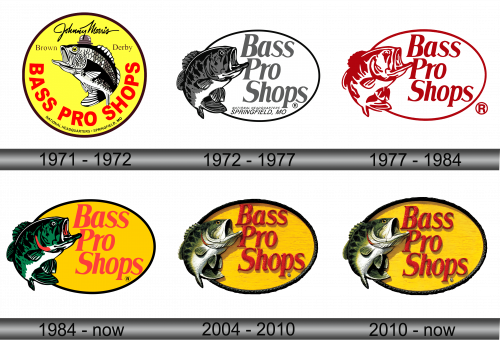
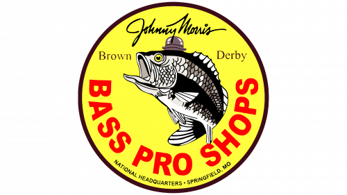
The inaugural emblem representing Morris’s burgeoning retail endeavor was meticulously crafted in the cellar of his father’s store, a space where he was allocated a few shelves. The insignia features a perch – a species Morris professionally angled for half a decade. Known as bass in America, this fish was synonymous with the products Morris initially offered, tailored for professional bass fishing. Hence, the moniker ‘Pro’ was prefixed, indicating gear meant for the professional angling fraternity.
As time progressed, the inventory expanded considerably, yet the bass imagery and store name remained consistent.
The logo’s charm lies in its unpretentiousness and succinctness. Encased within a yellow orb, the emblem prominently displays the proprietor’s name at the zenith. Central to the design is an illustration of a bass, its mouth agape, adorned with a brown Brown-Derby hat – a homage to Morris’s father’s liquor store chain. Flanking the hat are the inscriptions ‘Brown Derby,’ and anchored at the base in bold red letters is ‘Bass Pro Shops,’ with ‘Headquarters in Springfield’ etched beneath in diminutive typeface.
The emblem efficiently encapsulates the store’s offerings, its geographical roots, and its proprietor. It bears resemblance to a fisherman’s medallion, a semblance accentuated by the brown border and the fish illustration, mirroring the emblem used by the Bass Anglers Sport Society.
1972 – 1977
As time evolved, fishing and hunting equipment garnered more popularity than the wine and liquor offered by the father’s business. These items were still merchandised in the same locale, yet no longer necessitated the father’s store name on the insignia. Consequently, the logo underwent a transformation, discarding any semblance of Brown-Derby from its design.
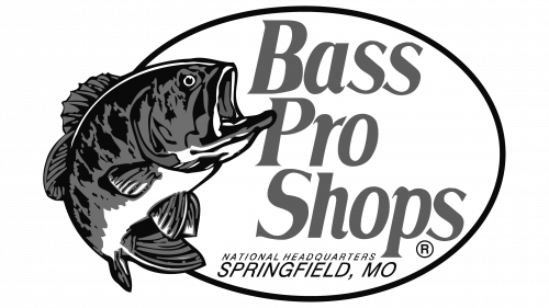
The emblem evolved, adopting an elongated oval silhouette. The perch motif found a new home on the emblem’s left, its curve now forming the logo’s perimeter. Centrally positioned within this medallion was the ‘Bass Pro Shops’ nomenclature, boasting its status as a duly registered trademark, complete with a distinct badge. Subtly placed beneath was an acknowledgment of the Springfield locale.
In terms of color scheme, the logo embraced a monochromatic palette, aligning more closely with the bass species depicted – Micropterus salmoides from the black bass family. Notably, the store, although having branched out, still operated under the umbrella of the father’s shop, a fact symbolically represented by the emblem’s black and white hues.
Adding to the narrative, the new logo signified a significant stride towards autonomy and distinct identity in the realm of outdoor retail. The emblem not only symbolized the store’s core offerings but also served as a testament to its growth and evolution. As a beacon of the outdoors lifestyle, the logo stood as a proud proclamation of the store’s commitment to equipping adventurers and enthusiasts alike, ensuring they are well-prepared to embrace the myriad wonders that nature has in store.
1977 – 1984
Rather than rushing to broaden his retail empire, the entrepreneur concentrated on establishing his ventures and moving beyond merely vending products from other brands. By 1978, Morris had inaugurated the inaugural shipyard dedicated to the construction of Tracker Boats. Concurrently, he was in the process of launching his inaugural standalone store. This pivot towards a more dynamic business approach and expansion was encapsulated in the emblem’s metamorphosis. The logo morphed, now brandishing a vivid red set against a muted light gray backdrop, with the previously included reference to the headquarters’ location omitted, given the boat manufacturing facility was situated in an alternate city.
The juxtaposition of light gray and red wasn’t merely aesthetic; it symbolized the vigour and assurance that characterized the brand’s ethos. This revamped emblem wasn’t just a mere visual upgrade, but a representation of the company’s forward momentum and diversification of its portfolio.
Moreover, this visual transformation marked a pivotal chapter in the brand’s narrative, encapsulating its transition from a regional player to a national powerhouse in the outdoor retail industry. The emblem became a beacon of the brand’s commitment to innovation and quality, symbolizing its readiness to take on new challenges and break new grounds in its quest to provide the best outdoor gear and experiences to its clientele. As the brand continues to evolve and expand its horizons, the emblem stands as a testament to its enduring legacy and unwavering commitment to excellence.
1984 – Today
In 1984, Morris unveiled his first comprehensive store in Springfield. With the enterprise now generating a steady revenue stream, he channeled these funds towards his foundational mission of conservation. This culminated in the establishment of the Big Cedar Lodge, a sprawling resort complex replete with caverns, a conservation-themed museum, and a lush nature park.
This environmental ethos was subsequently encapsulated in the refreshed brand logo, which now donned more earthy tones. The perch, now a vibrant green interspersed with streaks of red, black, and white, is emblematic of the taxidermy specimens adorning Morris’s stores, mirroring the fish’s natural coloration with its green-hued scales and dark lateral patterns. Furthermore, the emblem’s backdrop reverted to yellow, complementing the crimson hue of the company’s name.
The yellow background resonates with the insignia of the U.S. Fish and Wildlife Service, while the red symbolizes the vitality of blood, underscoring Morris’s commitment to wildlife conservation. This meticulous selection of colors and imagery is a testament to Morris’s unwavering dedication to preserving nature’s bounty, embodying the brand’s core values and its staunch advocacy for the great outdoors. It’s more than just an emblem; it’s a visual narrative that encapsulates the brand’s journey, ethos, and its pledge to safeguard the wilderness for future generations.
2004 – 2010
The entrepreneur continues to pour significant resources into preserving nature, transforming his stores into verdant oases that introduce patrons to the wondrous diversity and beauty of the natural world. His dedication culminated in the establishment of the largest wildlife sanctuary, supplemented by generous contributions to various conservation groups. The stores, while retailing gear, also serve as educational hubs, offering classes on wilderness survival and outdoor skills.
In recognition of his substantial contributions, Morris was honored with the Roosevelt Conservation Award in 1990, a prestigious accolade that subsequently influenced the brand’s logo. The emblem evolved to embody the essence of nature even more profoundly. In its current iteration, the logo boasts a three-dimensional design, with the perch’s coloration vividly mirroring that of its real-life counterpart. The letters of the company name cast shadows, adding a layer of depth, with their black trim and scale-like styling. These elements, together with the perch, seem to emerge from the yellow background, symbolically representing the company’s monumental achievements.
In a strategic move in 2017, Morris acquired his largest rival, Cabela’s, solidifying Bass Pro Shops’ position as the most authentic and unparalleled fishing and hunting store. This commitment to its mission was further acknowledged when the company was presented with the Audubon Medal in 2019, a testament to its unyielding dedication to conservation and its profound impact on the outdoor retail industry.
2010 – Today
This rendition of the Bass Pro Shops logo marks a significant enhancement, featuring nuanced shadows and a meticulously balanced composition of elements. The textual component has been subtly repositioned lower, ensuring it doesn’t encroach upon the dark periphery, while nestling comfortably in the midst of the orange ellipse. Although the lettering has undergone a slight reduction in size, this change is virtually imperceptible given the font remains unaltered.
The organization has judiciously preserved its quintessential emblem, a testament to its brand recognition and widespread acclaim. With the presence of a largemouth bass, a volumetric text, and a base imbued with a wood grain texture, the logo evokes a rustic tavern signage aesthetic. This, however, is a clever misdirection, as the brand bears no affiliation to the gastronomic realm.
Furthermore, this visual evolution signifies the brand’s commitment to innovation while honoring its roots. The integration of modern design elements, paired with classic symbolism, encapsulates the brand’s ethos – a fusion of tradition and contemporary sensibilities. This emblem is not merely a trademark; it’s a visual allegory of the brand’s journey, its steadfast principles, and its unwavering devotion to offering premier outdoor gear and experiences to its diverse clientele. The logo stands as a proud testament to the brand’s heritage, its achievements, and its vision for the future.
