Warsteiner Logo
Warsteiner is one of the less-known, and yet still major beer brands to come from Germany. This one in particular is located in the town of Warstein in the Rhein valley. Warsteiner mainly sells four types of beer, and it’s considered higher quality than most. The alcohol percentage in these is 4.8-5.5%.
Meaning and History
The history of the Warsteiner brand dates back to 1753, although the business can be even older than that. The first known owner is an entrepreneur named Cramer, and his family is still in possession of this valuable distillery. The name basically means ‘from Warstein’.
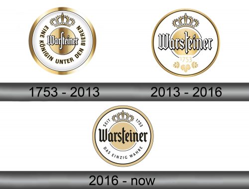
1753 – 2013
2013 -2016
2016 – present
There isn’t an accurate date of when the logo was adopted, so we can only assume it was like this since the inception.
The usual logo is a beige circle with an old-fashioned Gothic writing that said the company’s name in wide complex letters written in white and outlined in black. Above was the word ‘Marke’ (which means brand), and below were the words ‘Premium Verum’, which is unclear what it’s supposed to mean.
The logo was encircled by more text, as well as an image of a crown above. The text said ‘the queen among beer’. The crown above is a simplified golden image that resembles a crown.
Emblem and Symbol
The newer emblems feature a slightly different logo. The name in this one is slightly beyond boundaries, and the text outside is replaced by the motto ‘das Einzig wahre’ below the main emblem. It translates to ‘the only true [beer]’. The beige circle is also often made paler, but that can vary.
