Weezer Logo
The Weezer band has written a lot of pages in the history of American rock. Since 1993, when they signed with record label company Geffen Records, they have sold over 10 million albums in the US alone, while their worldwide sales exceeded 35 million.
Meaning and History
The first album was released in 1994. The album was titled after the band but was also called the Blue Album. In contrast to the debut album, their second release, Pinkerton (1996), was a failure, from the commercial point of view, but it eventually reached a cult status.
What is Weezer?
Weezer is an American rock band created in 1992 in Los Angeles, California. Since 2001, the band has included Rivers Cuomo, Patrick Wilson, Brian Bell, and Scott Shriner.
1992
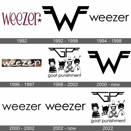
While 1994 was the year when the world really heard about Weezer, their work started long before that. One of the earliest wordmarks the band used can be seen on its second demo cover, The Kitchen Tape. The most notable part of the design is the shape of the letters “e,” which are hand-drawn. The star adds a memorable touch. The logo was designed by Karl Koch.
1992 – 1998; 2000 – Today
The Flying =W= has probably been the most recognizable visual symbol of the band ever since their first demo was released in 1992. There is nothing groundbreaking about the logo, yet it is edgy and recognizable enough.
The emblem author is Patrick Wilson. According to the official legend, he created it while he and Karl Koch were “drawing” by dispersing the fuzz that was present on the walls of the studio. Then, Koch “drew” the logo with the labeling tape on the back of Rivers Cuomo’s jacket. Cuomo then wore it until the tape fell off. According to the band, the Flying =W= is both an homage and spoof of Van Halen’s iconic emblem.
1994- 1998
The Blue Album features the full name of the band in a minimalist lowercase sans serif typeface. The wordmark was designed by Karl Koch. While it looks dramatically different from the 1992 wordmark printed on the cover of The Kitchen Tape, the very approach has remained the same: the “e’s” have an eye-catching and unique style. This time, it is obvious in the way the lower end of the letter is shaped.
1996 – 1997
For the cover of the single The Good Live (1996), a new wordmark was used. The band decided to go for a carefree handwritten style with cursive elements. Interestingly, each of the “e’s” looks slightly different, which emphasizes the handwritten effect. The same wordmark was used in promotional material for Pinkerton.
Goat Punishment: 1998 – 2002; 2022
Having finished the Pinkerton tour in the middle of 1997, the band went on hiatus. They would still do small life shows every now and then. During that time, they used the name “Goat punishment” and a different visual identity. Part of it was the abbreviation “GP” with the wings making it look similar to their iconic Flying =W= emblem. There was also a cartoon-style depiction of the band members with a lowercase lettering “goat punishment” in a minimalistic sans serif below. Although the logo was dropped when the band returned from the hiatus in 2002, it did resurface much later, for instance, in a live show in West Hollywood in 2022.
2000 – 2002 (after the hiatus)
While this logo might look the same as the one used for the Blue Album and the Pinkerton covers, if you put them side by side, you will notice quite a few differences. The most obvious one is that the “e” has lost its short end and is now more generic. The top end of the “r” is directed downwards. The letters are slightly bolder and better legible, and the proportions of the glyphs have changed. This design is said to be a result of a mistake at the recording company, which replaced the Weezer logo with a similar ready-made typeface.
2002 – Today
The unfortunate mistake was corrected, and the Maladroit (2002) album featured a logo that was similar to the original one.
Font and Color
Although the type resembles Futura PT Light, Karl Koch claimed he based his design on Futura Medium. He said that he cut the ends of the “e’s” so that the logo is more distinctive, he didn’t want it “to just be Futura Medium with nothing unique about it.”


