Van Halen Logo
Van Halen is one of the most iconic rock music bands to come from America. True, their glory days have long gone by, but they are still considered an absolute classic among hard rock fans, as well as the sole reason rock even enjoys its popularity even to this day. In 2020, they stopped writing music and performing altogether.
Meaning and History
![]()
Van Halen started as an amateur band back in 1972, although they weren’t called that back in the day. There were many alternative names, but they eventually settled on ‘Van Halen’ – the surname of the two brother founders. They’ve been performing under this name till 2020, when the lead guitarist Eddie Van Halen died of cancer.
1972 – 1978
![]()
For 6 initial years, Van Halen used this notebook-inspired logo. Most letters were normal and quite typical, but some like the ‘V’s and ‘A’s have been significantly lengthened and given the note dots on the ends of their tips. Therefore, the writing was taller than necessary and completely lowercase.
To fit the aesthetic, they used the color black with this logo almost exclusively.
1978 – 1986
![]()
That’s the iconic VH logo. It reflects their fondness of visual effects and love for colors. It’s basically a silvery plaque with the name ‘Van Halen’ on it written in black letters and wing-like attachments on both sides. Although the name was completely black, they put a lot of colors in the middle – blue being the main background material.
The logo also featured the letters ‘V’ and ‘H’ stitches to the back of the plaque but made from the same silvery material. These were long and extended far below the main part of the emblem.
1986 – 2012
![]()
This logo was used for most of the band’s existence. It used the ‘V’ and ‘H’ from the previous logo. Like there, the ‘V’ is longer than ‘H’, so that this combination would overall resemble a triangle. This time, however, they were tilted upwards a bit and given some volume, as well as repainted golden.
The letters sprouted three lines each from their sides. These lines whirled wide and them inwards to form a ring of sorts, but they didn’t really touch behind the letters to give them a clear and unsoiled look.
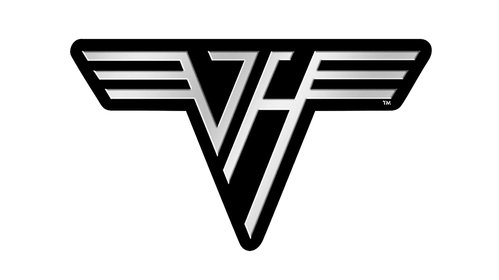
2012 – today
![]()
In 2012, the band basically returned to the 1978 logo with very few changes. The changes mostly affected the clarity and fidelity of some elements, but that’s about it.
Emblem and Symbol
The band was very often identified with a semi-official emblem that featured the 2012 logo without the plaque. It was basically two letters ‘VH’ with wing-like lines sprouting from the sides. It was very much like the 1986 logo, but without them turning into the ring behind the logo proper.


