Xbox Logo
Xbox is a brand launched of home video consoles designed by Microsoft in 2001. The brand family includes five consoles, as well as many game studios. Having a variety of different games and online services, Xbox console considered as one of the most successful console brand of all times.
Meaning and History
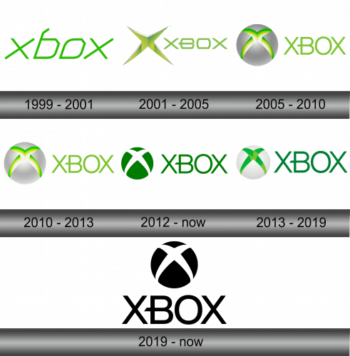
The logo of the popular brand had come through a lot of changes since the first version was introduced in 1999. However, the light green colour remained with the brand’s style throughout the years.
1999 – 2001
The initial Xbox emblem was being used during the development of the console. It had a bright green angular typeface depicted in thin lines with every letter written in cursive and quite wide style.
2001 – 2005
The redesign of the logo was introduced with the original console on the presentation in 2001. From now, it was a bold lime-green inscription made in futuristic style, having the watermark on the left side.
The watermark represented a volumetric letter ‘X’ in the same colour, with an optic illusion looked like it was formed out of the white background.
2005 – 2010
In 2005, Microsoft came up with one more logo. Now the inscription became bigger, losing its angular forms and having its colour brighter. The watermark was changed as well: from now, the dark green letter ‘X’ was cut in the big steel globe, which looked eye-catching and creative. One more interesting detail is an elegant tail of the ‘B’, which was accurately cut.
2010 – 2012
In 2010 the logo endured a little changing: its colour pattern was fully redesigned. The nameplate, steel globe and the cut ‘X’ became lighter, saving their colours. It symbolized the activeness of the brand, its success.
2012 – today
The signature had a major modification in 2012. The volumetric steel globe was replaced by its flat version with the same forest-green colour as the inscription, having the white ‘X’ in it and making an accent on the white background. This version is still used by the brand nowadays.
2013 – 2019
A year after, the three-dimensional globe returned in the white colour with the light-green ‘X’.
2019 – Today
In the year 2019 the brand’s visual identity had had another major redesign: the whole logo was depicted in black, contrasting with the white background. The inscription was placed under the signature, in which there is a white letter ‘X’, as it was in the logo of 2012.
This colour pattern style was motivated by the trend of the minimalism in the logotypes of the companies.
Emblem and Symbol
The reason why the consoles use green even to this day is comical. Basically, when the first draft was going to be made for the Microsoft bosses, the lead designers couldn’t find any markers save for a single lime one. That might be an anecdote, but it’s still pretty funny.
