AC/DC Logo
In November 1973, the history of a new band began in Sydney. The band was quite successful and sold over 150 million albums worldwide, including 68 million in the US. The Back in Black album alone sold over 22 million in the US and over 42 million outside. Overall, AC/DC is a band that reach a high level of success and was a well-known rock band from Australia.
Meaning and History
It was the year 1973 when Malcolm Young formed a band in Sydney, Australia. In December of the same year, the band began to rehearse. During that period, the band got its name – AC/DC. Young’s sister Margaret, who read this seemingly ordinary inscription on some household appliance, got an idea for the band’s name just like that.
What is AC/DC?
This is a musical group. The founders and main musicians of the AC/DC band are Malcolm and Angus Young, who were born in the UK and moved to Australia when they were children. Professionals believe the group belongs to hard rock, heavy metal, and blues-rock, but the group itself describes the genre in which it plays as rock and roll.
1974 – 1976
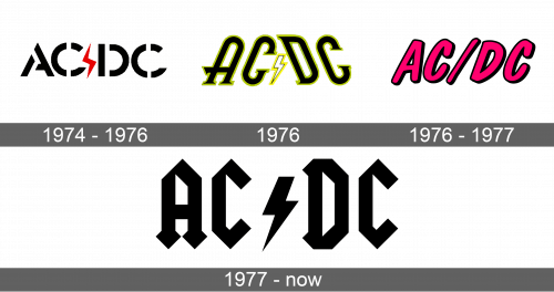
The first logo was created shortly after the band got its name. In fact, the logo had the name printed using sans-serif stencil font. The black in color letters were quite thick and relatively wide, so the “C” letter looked more like an unfinished circle. Between “AC” and “DC”, there was a thin, red lightning bolt with sharp ends going up and down.
1976
A couple of years later, the original logo was redrawn. It got a more elongated and smoothed look. A light green border was added around the letters, which now had tops slightly tilted to the center. The lightning bolt also changed. Now, it was pointing down and had white color with a thin black and yellow border.
1976 – 1977
A newly redesigned logo had one noticeable change. It was a slash sign instead of the familiar lightning bolt. The text was bright pink and had a black outline, which gave almost a 3D effect to the logo. An italicized rounded sans-serif font gave some movement and energy to it.
1977 – Today
The logo was completely redesigned once again. This time it acquired a more modern and powerful look. The whole logo was simply black in color and the sharp edges of the letters, as well as the lightning bolt, provided a feeling of determination and masculinity. One would even describe the logo as having a Gothic style, which went along with the songs of this band.
