American Express Logo
American Express is a global financial company, which was established in 1850 and is located in the United States. It’s widely recognized across the country for providing a set of online and offline payment system services as well as some of the bank functions. Now they make various charge cards, credit cards as well as traveler’s cheques. Now it’s one of the top global financial organizations. Their target market is the United States, where the company has many partners and customers, but their operations are also spread across the whole world.
Meaning and history
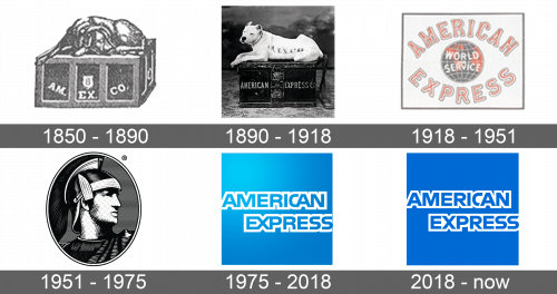
Initially, American Express was meant to be an organization that would take control and provides safety and quickness of the financial operations of the citizens and companies of the United States. That’s why American Express was called so – it provides a smooth, quick, and easy way to deliver money from one client to another. Their logotype reflects a principle of trustworthiness and verified the quality of services of the company. Throughout its history, the company didn’t change its logotype many times, rather they make small modifications to the already existing composition.
What is American Express?
American Express is a multinational organization that was established in New York, 1850. They offer a variety of financial, banking and payment services in many countries of the world, although their target audience in the United States, where the core segment of their customers, partners, and shareholders is located. Their main product is an electronic payment system, but they also produce charge cards, credit cards as well as traveler’s cheques.
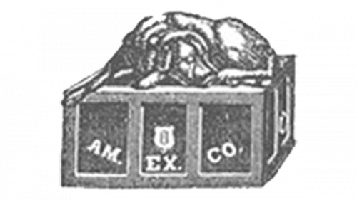
1850 – 1890
The original logo does not even look like a typical logo. It depicts a dog lying on a shipping box. The dog is meant to symbolize security, trust, and reliability. The box itself features an abbreviation of the name written in different sections of the box. It says “AM. EX. CO.” in a simple, serif font of white color.
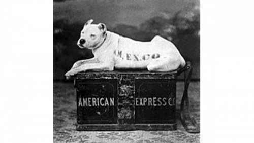
1890 – 1918
A few modifications have been introduced. The dog is now white instead of black and looks more alert with its head up. The initials have also been moved onto the dog’s body. The shipping box now has the full name spelled out in a straight line. The font is very similar to the one used in the original.
1918 – 1951
A complete redesign was done in 1918, presenting the name arching around the globe. “American Express” was printed in red. The lettering was without serifs and had a thin white, followed by a black outline. This added interest and volume. The globe featured a dark blue and red for continents, which was quite unusual. “World Service” was printed in white, sans-serif font using all uppercase letters. The whole emblem had a rectangular frame.
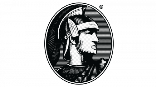
1951 – 1975
A profile of an ancient Roman soldier was decoration an oval medallion. It was very detailed and realistic despite the fact that the drawing was done in black and white. The drawing is meant to symbolize strength and power. The medallion had a white border that was outlined by black lines on both sides.
1975 – 2018
A very modern and stylish emblem consisted of the name on a sky-blue background with some gradients. The name was written in two lines. It looked very bold thanks to a thick white outline around the blue letters that matched the background. The designers chose a basic, sans serif font and added interest by indenting the second word.
2018 – today
Then, they removed the gradient shades from the background and darkened the whole logotype.
Font
The nameplate in the logotype of the brand uses a heavy sans-serif typeface with bold lines and a sharp uppercase style. One of the features of the font in the design of the ‘C’ character. In previous logotypes, it was merged with the following ‘A’ symbol, but in the 2018 version of the logotype, the ‘C’ letter has its lower tail shortened. It looks like a part of the tail was cut off.
Color
The main colors of the corporate identity didn’t change often throughout the company’s history: blue was always used to paint the square background and the name, while white stands for the outline of the inscription.


