Amway Logo
Amway offers elite products for maintaining beauty and health, as well as household goods, such as cleaning products and dinnerware. Its success story is so stunning that books are being written about it. In the first year of operation, a non-standard business model brought in more than half a million in profit. Today, it is a real business empire, which has not only hundreds of offices but also thousands of factories and research locations. The company actively fights for the conservation of nature. Charitable activities in many countries are also an important part of this business.
Meaning and History
Amway was founded in 1959 by two entrepreneurial friends, Rich DeVos and Jay Van Andel. Nutrilite was a forerunner company. It was organized in 1939 by Karl Rehnborg, who came up with a business model that allows anyone to start their own business by selling quality products. The two friends turned out to be so successful Nutrilite sellers. After ten years of work, they decided to start their own business called Amway (American Way). It copied the business model of Nutrilite. The first product was a biodegradable soap, which was followed by laundry detergent, perfume, cosmetics, and dinnerware. In 1972, Amway bought a majority stake in its parent company, Nutrilite, and began selling nutritional supplements. Since 1973, the company has been opening its representative offices in European countries.
What is Amway?
Amway Corporation established itself as one of the largest direct sales companies. It is mainly focused on eco-friendly cleaning products, cosmetics, and supplements. This company is based on clear corporate values and powerful principles.
1959 – 1964
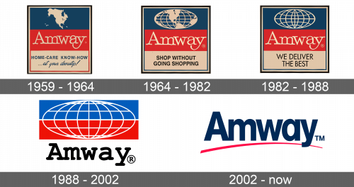
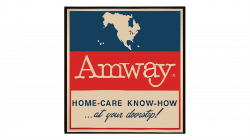
The logo had a base with three stripes that formed a square. They were using the same color palette as the American flag. The top portion was done in deep blue with a white silhouette of North America in the center. The middle red rectangle had the name done in white letters with serifs. The bottom portion states “Home-Care Know-How… at your doorstep!” in two lines with the upper having all uppercase letters and the lower featuring cursive writing. The slogan was done in blue on white background. The whole emblem had a thin white followed by a black border.
1964 – 1982
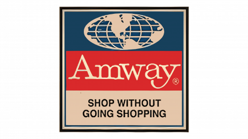
The company replaced the North American continent silhouette with an outline of the whole globe, which reflected its goal to reach all corners of the world. The slogan was changed to “Shop without going shopping”, written in all uppercase, bold, black letters.
1982 – 1988
This logo is also a modification of the original version. There were no more continents on the globe, only vertical and horizontal lines. The slogan was updated once more and featured a slimmer and bigger font. It stated “We deliver the best”
1988 – 2002
The white outline of the globe was placed on a rectangle that was half blue and half red. The name was done using a different typeface. It looked similar to the previous one with rectangular serifs and clean lines combined with nice curves. The name was black instead of white. There was no more slogan as the name of the brand was all people needed to hear.
2002 – Today
The new design was minimalistic and featured only the brand name. The typeface was very similar to the one used in the previous version but without serifs. To preserve the original color palette, the designers used blue for the name and added a red swoosh line underneath.
Font and Color
Throughout the years, the company kept the color palette true to the colors of the American flag. After all, it stands for the “American Way”. There was also some black, which served as a basic, classic color. When it comes to fonts, the brand used the same serif font that featured both straight/pointed and smooth curves from its foundation until the mid-80s. The “y” had an elegant swoosh line. The next font was given slab serifs which gave the wordmark a more sophisticated look. The last font was a bold sans-serif typeface that looked like AG Schoolbook Medium.
