Animal Crossing Logo
Animal Crossing is a series of sandbox games developed and released by Nintendo since 2001. The key point of the games is that you’re playing as a blank character (the Villager) and interact with other beings (mostly animals) around you, do errands for them, talk to them or simply perform activities with or without them.
Meaning and History
![]()
The series has been around since 2001, and the name clearly indicates the entire premise of the game. It’s supposed to be a relaxing experience where you don’t interact with other people like yourself but with personalities in the form of various animals instead. In Japanese, the name means something closer to ‘Animal Forest’.
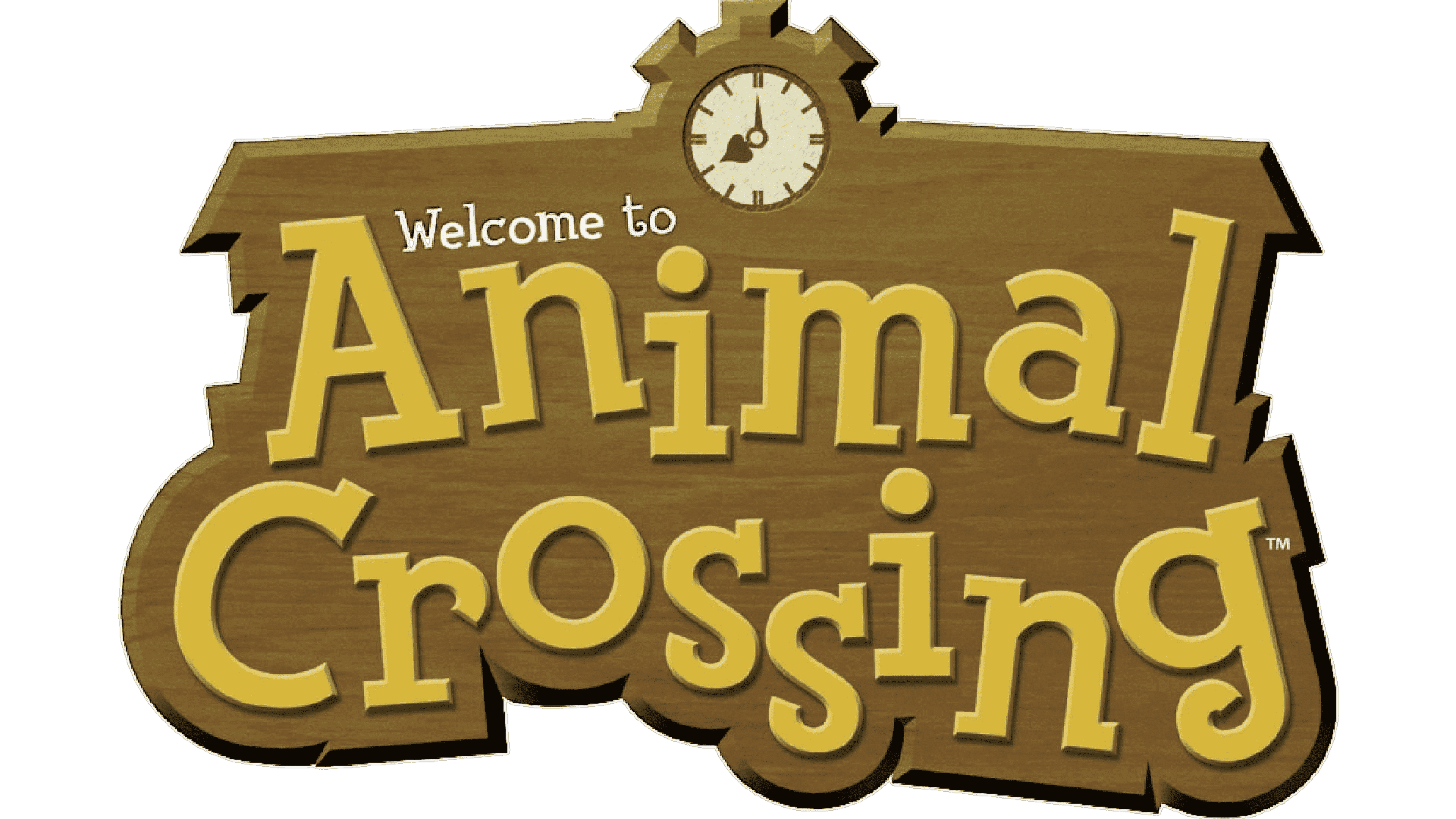
2001 – 2020
![]()
For the longest time, this was the main logo used by these games. In fact, it’s pretty much the same logo series employed afterwards.
The main logo was a wooden cutout shape. The lower parts of it are molded to meet the curves of the letters that sit here, but the entire upper side is in the form of a roof. Maintaining your house is a very important part of these games, and wood clearly hints at the nature-oriented part of the experience.
There is also an alarm clock right in the middle of the roof, just for good measure. The letters, meanwhile, are all over the place, but they generally have a common style – fluid characters with slight serif notches. They are also colored in bronze, but it’s probably supposed to be wood again.
Lastly – they added a small, more orderly ‘Welcome to’ inscription in white letters right above the main writing.
2015 – today
![]()
In 2015, the spin-off ‘Happy Home Designer’ game came out. Like many in the series, it first came out in Japan. Unlike them, however, the Japanese version was accompanied by a specifically Japanese logo, and it varied dramatically from the previous design.
The general premise is there – they took the wood cutouts and put bronze letters over them. This time, however, there are six distinct cutouts, each for a specific Japanese glyph. The first 4 are squares, the fifth one is a slightly smaller square, and the last one is a berry-shaped form that accommodates a complex last glyph.
The glyphs still mean the name of the franchise, more or less.
They also put the English name in brown colors below the main emblem. Notably, these letters have the same font as the ‘Welcome to’ inscription from the first variation. Between the words was also a leaf, just to give away the purpose of the game.
2020 – today
In 2020, the biggest game in the franchise yet came out. ‘New Horizons’ had pretty much the same logo they made for the first game, but with some changes. Notably, the illumination was introduced, which made the wood much brighter, as well as gave everything more shade, and, subsequently, volume.
The letters also grew in size a bit, but that’s about everything that happened.
Emblem and Symbol

Depending on the game, they also could add special additions to the emblem. Notably, the latest game in the franchise had a flight ticket with the name of the game on it. Other variations had leafs or just additional wooden plaques for the same purpose attached to some part of the logo.


