Minecraft Logo
Minecraft is one of the most successful videogames in history. It really can’t be undervalued, because it didn’t just inspire millions of people to create content about it on the Internet. The title also inspired countless of other games, and many of these new products don’t even have much to do with the survival genre of Minecraft.
Meaning and History
![]()
Minecraft was conceptualized back in 2009, and that’s when the first version of this block-based endless survival gameplay was created. The whole premise is that all of the blocks present in the world (except the very bottom layer) can be dismantled.
Because a lot of it involves digging through caves and making stuff out of the resources you found, the name was an obvious choice.
2009
![]()
The initial logo of Minecraft was developed when it was still deep in development. It featured a different style from today – the letters were tilted forwards, just like now, but they were also on different levels. And instead of the block-like letters, these were cartoony, fluid and round.
They overlapped each other and generally gave away a childish feeling. For instance, they were all painted light-green, azure and white from bottom to top – the usual landscape in the game.
2009 – 2011
![]()
For two years between the very first version and the release stage, Minecraft was a rapidly growing yet still a niche game. The developers didn’t care much about the branding – so the main logo was basically just the game title built in cobblestone (one of the most common blocks in the game) and tilted forwards a bit.
It’s likely not even an artistic product, the logo seems like it was built in their own game, and then the background was just cut. Suffice it to say, it does relay the purpose of the game well, the letters looked far from uniform – some ‘lines’ were thinner than needed, especially those that aren’t tilted.
2011 – 2015
![]()
In 2011, the devs decided to redraw the previous concept and make it look better and more impressive.
The letters were still seemingly made of stone and tilted forwards, but this time the characters, as well as lines, were sized better. Now, no one letter was wider than others simply because the game blocks work this way.
Stylistically, the new text was more cartoonish. It’s just a uniform grey color (with some black shading on the lower sides) with also some cracks all over the text. It’s also when they added a little Creeper face instead of the hole on the ‘A’ letter.
2013 – 2021
![]()
In 2013, Mojang (the company) introduced this new version. It’s basically the same as the one they made the year prior, but it’s not as heavily tilted now. Furthermore, they enhanced the outline which was previously slim. This time, it’s a thick black frame.
Both logos were used simultaneously for the longest time, although in different instances. By 2015, they changed all the remaining 2011 logos to look like this one.
2016 – 2023
![]()
This refined iteration became the standard for the Education Edition up until 2023. It showcased the brand’s commitment to offering an evolved, contemporary look, especially in an educational setting. By integrating this design, the company emphasized the importance of continual evolution and adaptation, ensuring that their platform remained engaging and relevant to students and educators alike. The subtle changes in this logo iteration mirrored the game’s commitment to blending innovation with its storied history, making it a fitting emblem for the educational variant. Through visual adaptations like this, Minecraft reinforced its dedication to not just gamers, but also to the broader educational community.
2019 – 2022
![]()
A further refined iteration, featuring a more subtle hue of gray, initially graced the branding for Minecraft Live and Minecraft Festival. This gentle modification in the color palette highlighted the brand’s continuous evolution, adapting to contemporary aesthetics while maintaining its core identity. By subtly tweaking their visual presence, Minecraft remains both fresh and familiar, bridging its iconic past with an innovative future. Events like Minecraft Live and Minecraft Festival serve as perfect platforms for the game to showcase these adjustments, offering a glimpse into its commitment to growth and adaptability.
2021 – Today
![]()
A refreshed design first emerged in the promotional branding for the Caves & Cliffs update, labeled as JE 1.18 and BE 1.18.0. This revamped version showcased several alterations. The gradient underwent an inversion, the text adopted a more rectangular form, and the slits displayed enhanced symmetry. This modernized emblem made its official debut in the Bedrock Edition 1.17.30, succeeding the previous 2013 emblem. Notably, this transition was a clear indication of the game’s commitment to staying current and evolving with the times, ensuring that it remains engaging and recognizable to both seasoned and new players.
Emblem and Symbol
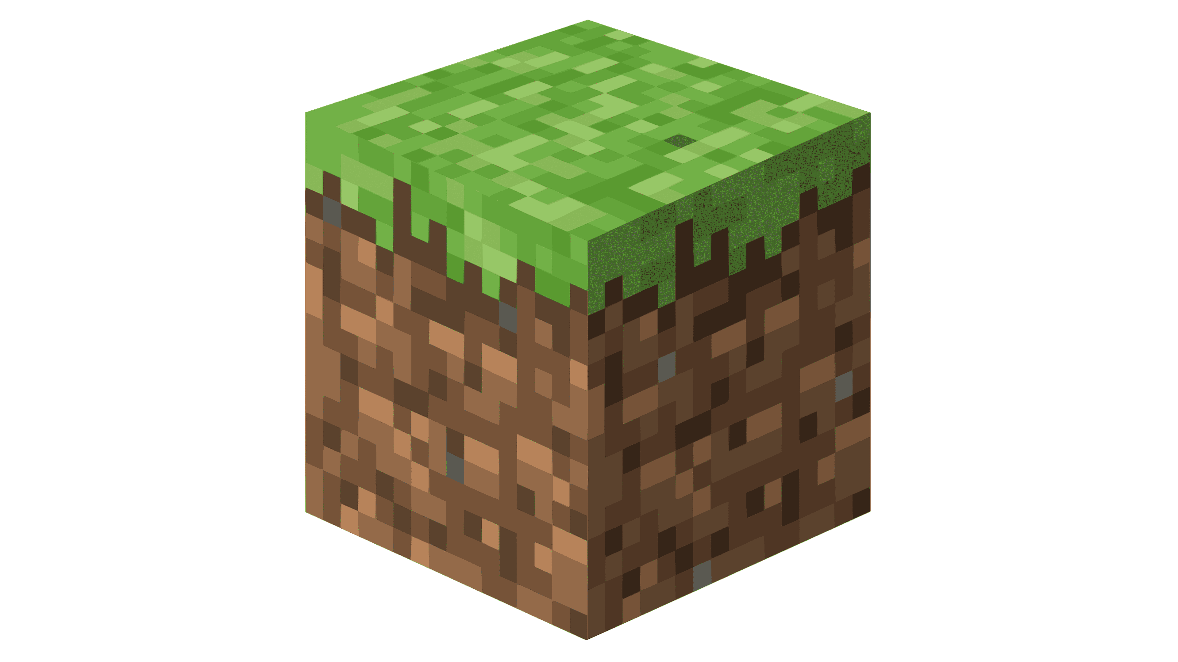
The symbol most commonly used alongside the main logo (or even sometimes independently of it) is the simply dirt block from the game. It stands in a perfect isometric projection towards the looker, which basically means it’s slightly clockwise and then 45° sideways.


