Animal Planet Logo
Animal Planet is a subsidiary of the Discovery Channel. The channel broadcasts films showing animals in their natural habitat and tells stories about species listed in the Red Book. Domestic animals are not forgotten either. Some of the popular programs include Animal Cops: Houston, The Life of Mammals, The Planet’s Funniest Animals, and others. The popular educational television channel is available in over 200 countries. The channel strives to be a leader in the segment and use the most diverse modern equipment for filming and editing.
Meaning and History
Animal Planet was founded on October 1, 1996. On January 1, 1997, the channel grew by purchasing advertising space from WOR EMI. It began broadcasting outside of North America the same year. Animal Planet is now an additional associate member of the Caribbean Cable Co-op. In all markets except the US, UK, and Italy, the channel is a joint venture with the BBC. To stay in line with the modern world, it also made its programs available online. In the spring of 2014, the channel switched to broadcasting in 16:9 format, and also launched an HD version.
What is Animal Planet?
Animal Planet, which is part of Discovery, Inc., is a channel about animals and their relationship with humans. Programs about various species in their natural habitat, stories about rare, endangered animals, documentaries, and entertainment shows are all part of Animal Planet.
1994 – 1996 (Pre-Launch)
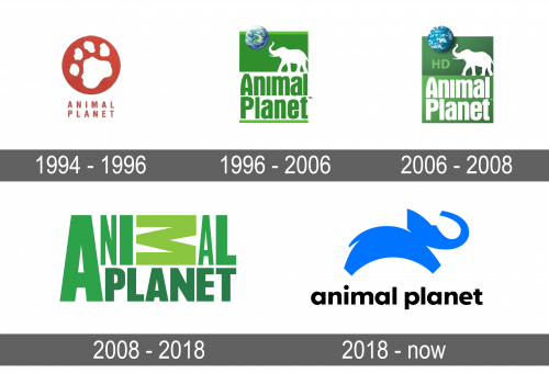
While the channel was being developed, the company used a red circle with a white wild cat paw print on it. Underneath, it had the name of the new channel printed in two lines. It used the same red and featured thin, all uppercase, sans-serif lettering. The logo was simple, yet easy to understand and remember.
1996 – 2006
The channel was launched with a new emblem. It was a vertical rectangle with the upper half being green and featuring white silhouettes of a sun and an elephant. The bottom half was white with only a thin green line at the bottom. It had the name of the channel printed in green with the first letters capitalized. The Troika Design Group, which created this emblem, used Aurora Bold Condensed for the inscription, which was done in two lines.
2006 – 2008
A few adjustments have been made after the logo was used for ten years. First of all, the planet now had a deep blue sky with white clouds filling the shape. In the bottom half, the colors were flipped, which made the base split into two different shades of green.
2008 – 2018
Along with the introduction of several new shows, which were aimed at a more adult audience, the channel changed its logo image with the help of Dunning Eley Jones. Despite an interesting letter arrangement, the logo looked balanced and reflected all the unexpected and curious things one can see on this channel. There were no other elements, including animals. The designer wanted to reflect the entertaining, exciting, and modern spirit of a brand that goes beyond traditional animal shows.
2018 – Today
Ten years after the last change, a new channel emblem was developed by the design agency Chermayeff & Geismar & Haviv, which previously made logos for NBC and National Geographic. Initially, the new image was presented to viewers from the US and the UK before introducing across the world. They brought back the elephant, which no longer looked realistic but rather a bright blue cartoon-style jumping animal. According to the developers, it is meant to represent the joy and energy of the brand. Under the image, it had the name printed in all lowercase, sans-serif letters of a black color.
Font and Color
The first logo Animal Planet launched with used Aurora Bold Condensed font. It was replaced by another sans-serif font that had a geometric feel to it. Then, the program was able to order a custom font for its logo, which it named Animal Planet Sans. Although the channel initially tested red, it stopped on the green, white, and blue color palette and used it for over ten years. The next ten years were marked by a predominantly black color scheme with a splash of green. These colors are very nature oriented. The blue color, which was featured in the latest logo, is also a good choice for a communications company.
