Harry Potter Logo
Harry Potter is an immensely popular series of books, as well as movies, initially meant for youths. The first book came out in 1997, and it was so outstandingly acclaimed that they decided to produce films just 4 years after it came out – the story wasn’t even close to finishing by that point.
Meaning and History
![]()
The franchise didn’t really have a full logo before 2001. The books had different styles and designs, but the brand wasn’t in motion until the first movie came out in that same year. That’s when the first real emblem officially surfaced, and it was a highly recognizable image ever since.
2001 – 2002
![]()
All of these are seen in the introduction to the movies, and you sometimes can’t discern certain features, such as colors, because of the special effects. The clean versions, however, are visible on the DVD cases, for instance.
This logo was used for the first two movies, and it was styled to look like gold – yellow and shining. The way the letters are arranged is supposed to give you a feel of bizarreness. These shapes are unlikely and almost impossible – there are no constant shapes, and everything is twirling and twisting.
They are also not at all proportioned or placed on the same line. It hints at how the world of the movies works – it also defies logic, seeing how it’s magical and different.
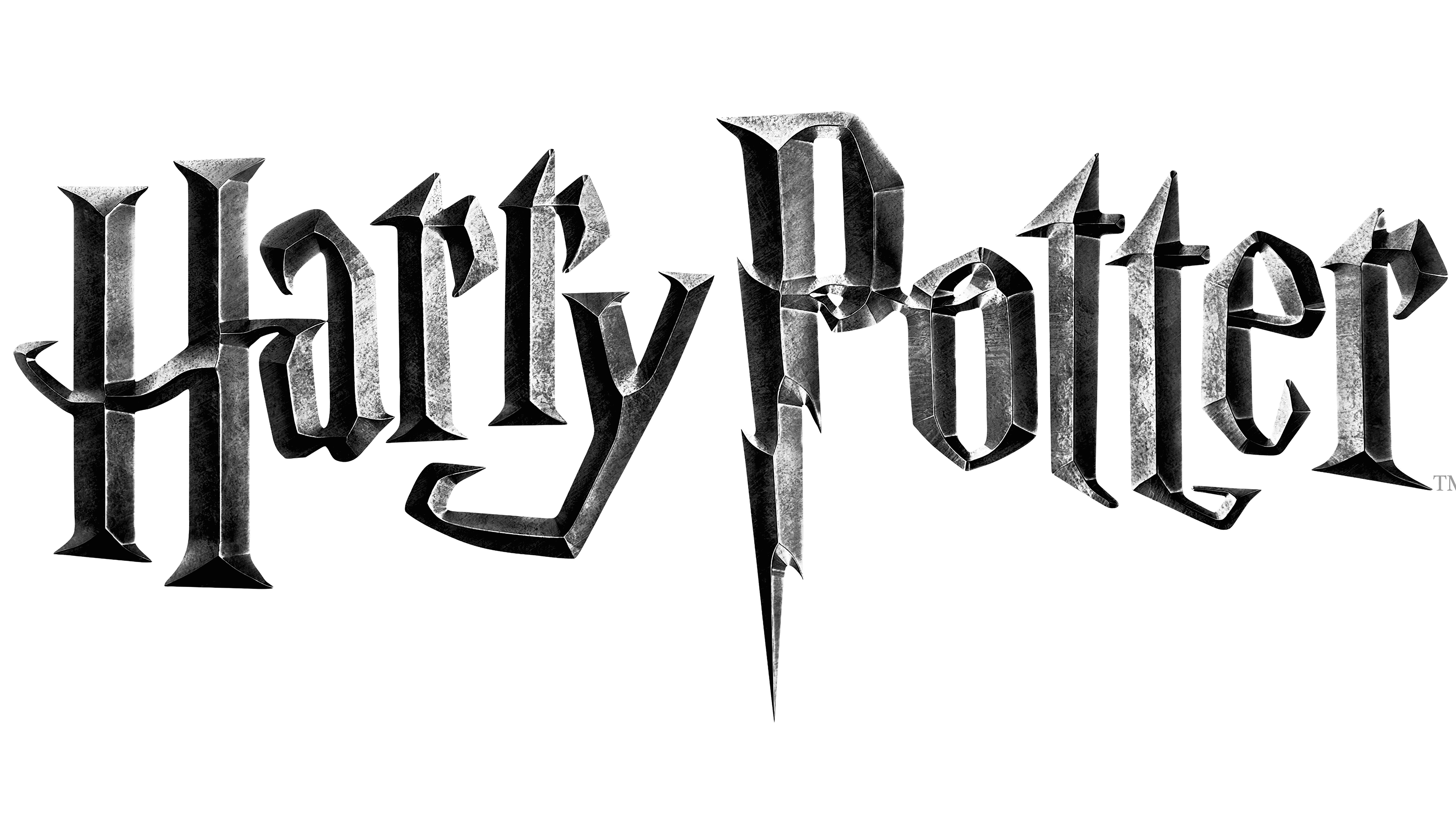
2004 – today
![]()
Since the ‘Prisoner of Azkaban’ (the third movie), the logo changed a bit. It did become gloomy to reflect the changes in the mood these films have taken past this point.
Instead of gold, the letters are now iron and much heavier. The color also could change depending on the situation, but it’s generally some sort of grey. And the letters themselves changed a bit – noticeably, the lightning on the ‘P’ and the tail of the ‘Y’ are now longer. But that’s about it.
Emblem and Symbol
This logo is being used even now – for instance, in the games or other official products. The colors usually change depending on what the designers want, but the look is almost always taken from the one used in the last movies. After that, they just stitch whatever other elements they want to the logo of the new product.


