ASDA Logo
ASDA, a UK-based retailer, predominantly operates in the supermarket sector. Renowned for its vast array of products spanning groceries, clothing, and general merchandise, the brand emphasizes affordability and customer-centricity. Once a subsidiary of Walmart, ASDA recently transitioned ownership to the Issa brothers and TDR Capital. Today, it continues its expansion within the UK, constantly enhancing its offerings, both in-store and online, to cater to evolving consumer needs. As a major player in the British retail landscape, ASDA stands as a household name, committed to delivering value and convenience.
Meaning and history
Established in 1949, ASDA’s origins trace back to the dairy farming groups of West Yorkshire. Originally named “Associated Dairies,” it began as a merger of dairy firms. The ASDA name, an abbreviation of “Asquith and Dairies,” was formed when the Asquith chain of supermarkets merged with Associated Dairies in 1965.
In its early years, ASDA expanded aggressively, acquiring various stores and introducing its own-label products. This expansion strategy aimed at cost-cutting, allowing them to pass savings onto customers, a philosophy that still stands today.
The 1980s saw ASDA facing financial turbulence due to rapid expansion and economic downturns. However, recovery ensued in the 1990s with a renewed focus on superstores and diversification into areas like clothing with the George line.
A pivotal moment in ASDA’s history was in 1999 when American retail behemoth, Walmart, acquired it for £6.7 billion, aiming to implant its low-price strategy in the UK. Under Walmart’s umbrella, ASDA grew, incorporating Walmart’s purchasing power and supply chain strategies to further strengthen its “value” proposition.
Yet, the UK market’s unique challenges, coupled with fierce competition, meant ASDA faced pressures on market share. To revitalize its approach, the company revamped store formats and introduced new technologies, aiming for a seamless blend of in-store and online shopping experiences.
The ownership chapter turned a page in 2020, when Walmart agreed to sell ASDA to the Issa brothers and TDR Capital, a private equity firm. The deal, valuing ASDA at £6.8 billion, marked a significant shift, with the new owners focusing on expanding ASDA’s convenience store presence and fuel stations.
From its dairy cooperative origins to being a pivotal player in the UK’s supermarket industry, ASDA’s journey illustrates adaptability and resilience in a dynamic retail landscape, with its focus on affordability remaining constant.
1965 – 1968
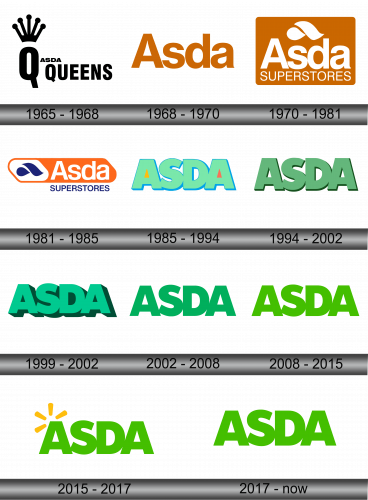
In 1965, the prominent firm GEM acquired ASDA Stores Ltd., rebranding it as ASDA Queens, a change mirrored in their emblem. The design showcased an extended “Q” adorned with a majestic crown, where each beam represented a store outlet, radiating from its core. Adjacently, “ASDA” was scribed in more delicate lettering, while “Queens” dominated in a bolder typeface. The visual aesthetic contrasted black typography against a pristine white backdrop, creating a striking and memorable impression. The revamped identity aimed to solidify the brand’s prominence in the market while paying homage to its partnership with GEM.
1968 – 1970
During the waning years of the previous century, specifically in the late 60s, the commercial establishment underwent a significant brand transformation. The outcome was a concise renaming, culminating in the succinct moniker “ASDA.” The creative minds behind this decision opted for simplicity, presenting just the singular word without any additional elements. Crafted in alignment with grammatical conventions, the name was stylized with an initial uppercase letter, followed by subsequent characters in lowercase, reflecting a blend of modernity and minimalistic elegance in the realm of branding. This streamlined approach aimed to bolster the brand’s recognition and appeal in an evolving marketplace.
1970 – 1981
The logo underwent a transformation, now featuring a rectangular canvas complemented by a droplet-like design and a fluid wave motif. Recognizing the evolution of the stores, the designers incorporated the descriptor “SUPERSTORES” to highlight their shift towards a larger supermarket format. In contrast to the main title, this additional wording was styled in a more delicate typeface. This redesign aimed to mirror the brand’s growth and adaptability, emphasizing their expanded offerings and the broader spectrum of products available for customers. The addition of the graphic elements also underscored the brand’s commitment to freshness and quality in a dynamically changing retail environment.
1981 – 1985
The creative team revamped the previous emblem, giving it a contemporary touch. Now, the design resembles a stretched diamond-like rectangle bathed in a vibrant orange hue. To its left stands a blue emblem, set against a pristine white backdrop. Adjacent to it, one finds the brand’s name “ASDA”, and just beneath it, the descriptor “SUPERSTORES” is positioned. Notably, the typography for both phrases has been refined to appear more slender and streamlined than in its preceding version. This renewed design aims to balance tradition with modern aesthetics, ensuring the brand’s relevance in the current market while paying homage to its roots.
1985 – 1994
In the year 1985, a trend emerged of expansive emblems characterized by closely interlinked designs. The openings within the letter “A” were distinctively tinted: the initial one showcased a sunny yellow hue, while the concluding character bore a fiery red shade. The surrounding palette embraced a refreshing mint green, setting a contrast against the highlighted “A” letters. This design approach not only reflected the contemporary tastes of that period but also introduced a splash of vibrant colors, enhancing the visual appeal and making it more memorable for the audience. The choice of colors was likely intended to capture attention and resonate with the dynamic spirit of the times.
1994 – 2002
The executive team chose to part ways with the previous design, embracing a fresher rendition devoid of multi-hued voids. The creative team transitioned from the mint green shade to a subtle light olive hue. This updated emblem was prominently featured on television broadcasts, specifically tailored for promotional endeavors. The shift in color palette aimed to present a more contemporary and sophisticated image. By prioritizing simplicity and elegance, the brand sought to appeal to a broader audience and reinforce its position in the market. The strategic use of this design in advertising campaigns emphasized its importance in shaping the company’s public perception during that period.
1999 – 2002
Concurrently with the preceding symbol, a distinct emblem was introduced, characterized by pronounced shadows and a three-dimensional aesthetic. This alternate design boasted a refreshing mint green hue. The incorporation of depth and the illusion of dimensionality gave the logo a contemporary feel, setting it apart from its counterparts. The choice to adopt a 3D element reflected the brand’s forward-thinking approach and its willingness to experiment with cutting-edge design techniques. By introducing this variant, the company aimed to capture the attention of a more modern audience, resonating with those who appreciate intricate details and innovative visuals. The cool mint color was also a nod to refreshing new beginnings and evolution.
2002 – 2008
During this particular phase, the primary alterations to the emblem revolved around its shadow elements: these were notably eliminated. The design team, aiming for a more streamlined and cleaner look, decided to do away with these shadowy aspects. This decision was perhaps influenced by a shift towards minimalism in the branding world, or maybe the company wanted its brand identity to be more direct and unembellished. By subtracting these details, the logo was transformed, exuding a more contemporary and straightforward appeal. The idea behind such a revision could be to ensure that the brand remained timeless and easily adaptable across various platforms, especially in an era where simplicity in design was gaining traction. This move highlighted the brand’s adaptability and its keen eye for evolving design trends.
2008 – 2015
The creative team introduced a vibrant shade of green to the typography. This fresh infusion of color was perhaps a nod to rejuvenation and growth. By incorporating such a lively and energetic tone, it breathed new life into the design, making it more eye-catching and memorable. This choice could be a strategic move to resonate better with the target audience or maybe to stand out in a competitive marketplace. The addition of this color also could signify the brand’s commitment to innovation and change. With just a simple modification in color, the whole persona of the text was transformed, showcasing the power of color in branding and its ability to evoke emotions and perceptions. The choice of bright green also symbolizes freshness, renewal, and vitality, aligning with the brand’s vision or the message they intend to convey.
2015 – 2017
In 2015, the retail giant ASDA unveiled a revamped logo, incorporating an emblematic symbol from its parent entity, Walmart. Atop the initial character, one can observe a radiant motif composed of brief tangerine beams, organized in a circular pattern. This incorporation not only showcases the synergy between ASDA and Walmart but also symbolizes a fusion of brand identities. By integrating such an emblem, ASDA perhaps aimed to highlight its global affiliations while emphasizing its commitment to quality and value, traits synonymous with Walmart. The choice of the luminous design accentuates a sense of vibrancy and innovation, positioning the brand as contemporary and attuned to the evolving market trends. This redesign serves as a testament to the brand’s dynamic evolution and its continuous endeavor to resonate with its customer base.
2017 – Today
Following the discontinuation of the “spark” emblem, the retail chain’s management reinstated the 2015 design iteration. This particular rendition is what’s currently in use. Reflecting upon this decision, it seems the organization recognizes the value of legacy and consistency in branding. The 2015 version, having garnered positive feedback and resonance with the audience in the past, was seen as a reliable symbol for the brand’s identity. Often, businesses circle back to previous designs, acknowledging their time-tested appeal and the trust they’ve built over the years. It’s evident that for this trading network, the familiarity and strength of the 2015 logo hold significance, making it a clear choice for their present and future branding endeavors.


