Michaels Logo
Michaels stands as a prominent retail chain, offering a diverse array of arts and crafts supplies. Dupey Enterprises, Inc., initiated by Michael J. Dupey, birthed Michaels in Dallas, Texas. The establishment aimed to serve as a one-stop-shop for craft enthusiasts and DIY project doers, providing materials for various creative endeavors.
Meaning and history
Michaels began its journey in 1973, rapidly evolving into a go-to destination for art and craft supplies. Expanding its footprint, the company went public in 1984, marking a significant milestone in its growth. Throughout the years, Michaels has embraced expansion, innovation, and adaptation to meet the changing needs of its customer base. By acquiring several smaller chains, Michaels extended its reach across the United States and Canada, ensuring a broad spectrum of products and inspirations for creators of all levels. Its history reflects a commitment to fostering creativity and providing the resources for individuals to bring their artistic visions to life.
What is Michaels?
Michaels is a leading North American arts and crafts retail chain. It offers a vast selection of products for crafting, decorating, and home décor projects. The stores serve as a creative hub for hobbyists, artists, and DIY enthusiasts seeking materials and inspiration for their work.
1973 – 1992
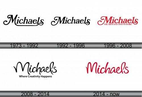
The logo depicts the name “Michaels” in a fluid, cursive script. Black strokes create elegant, swirling letters that suggest creativity and flair. The initial ‘M’ stands out with its grand loops, towering over the other characters. This design choice gives the impression of a brand that is both classic and approachable. Each letter connects seamlessly, symbolizing the interconnected nature of arts and crafts. Despite its simplicity, the logo conveys sophistication, catering to the artistic community it serves.
1992 – 1996
The logo presented maintains the brand’s iconic cursive script but with notable modifications. The ‘M’ remains dominant, yet now less elaborate, with reduced flourishes. This evolution reflects a modernized stance, aligning with contemporary aesthetics while preserving the brand’s heritage. The letters, while still connected, offer a cleaner look, suggesting a more streamlined and efficient approach to creativity. Overall, the updated design balances the elegance of tradition with the clarity of modernity, symbolizing a brand that evolves with its artistic audience.
1996 – 2008
The logo now features a vibrant red, exuding energy and passion. The tagline “THE ARTS AND CRAFTS STORE” situates Michaels firmly in its market, directly communicating its specialty. The cursive ‘M’ retains its prominence, yet the rest of the letters have shifted to a more standard, bold typeface. This contrast emphasizes the brand name while ensuring readability. The inclusion of a tagline signifies a strategic branding evolution, making the company’s purpose instantly clear and memorable. The red color not only grabs attention but also symbolizes the brand’s lively community of crafters.
2008 – 2014
In this iteration, the logo returns to a monochromatic theme, opting for a sleek black. The font is playful and fluid, echoing the movement of an artist’s brush. The ‘M’ and ‘s’ in “Michaels” stretch out with whimsical flair, embodying the spirit of creativity the brand champions. Below, the slogan “Where Creativity Happens” appears in a simple sans-serif font, inviting imagination and conveying the brand’s purpose as a catalyst for creative endeavors. This contrast between the logo’s main text and the slogan emphasizes the merger of playfulness with a clear, direct message.
2014 – Today
The logo takes on a warm, rich red, conveying enthusiasm and artistic passion. The script is fluid yet bold, suggesting confidence and a strong identity. The ‘M’ and ‘s’ curve dramatically, infusing the design with a sense of movement and creativity. Absent is the previous slogan, streamlining the focus solely to the brand name, which now speaks for itself. This minimalist approach resonates with a modern audience, favoring a clean and uncluttered aesthetic that highlights the brand’s essence without distraction.


