Burlington Logo
Burlington started as a small wholesaler of ladie’s coats and suits. Monroe Milstein, together with his father, founded it in Burlington, New Jersey. Initially, their aim was to provide quality clothing at low prices. This concept quickly caught on, and Burlington became known for its wide selection at affordable prices. Their approach was simple but revolutionary, making fashion accessible to everyone.
Meaning and history
Burlington Coat Factory opened its doors in 1972. The Milstein family’s venture into the retail world began with a single store, focusing on selling coats. The concept was a hit, leading to rapid expansion. By the 1980s, Burlington had diversified its inventory to include a variety of apparel. The year 2006 marked a significant milestone when Bain Capital acquired Burlington, propelling it into a new era of growth. Today, with over 740 stores across the U.S., Burlington continues to thrive as a go-to destination for affordable fashion.
What is Burlington?
Burlington is a national retail chain offering a wide selection of high-quality, brand-name merchandise at discounted prices. Specializing in clothing, accessories, and home goods, Burlington caters to budget-conscious shoppers looking for value without compromising on style.
1972 – 1984
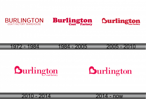
The logo displays the brand name “BURLINGTON” in bold, uppercase letters. The font is sans-serif, characterized by clean lines that suggest modernity and efficiency. Its color is a striking shade of red, which stands out with a sense of warmth and energy. The simplicity of the design underscores the brand’s straightforward approach to providing value. There is no emblem or intricate detail, just the name itself, asserting the brand’s confidence in its identity. This design choice reflects a focus on clarity and accessibility, much like the brand’s retail philosophy.
1984 – 2005
The logo transitions to a more fluid design with “Burlington Coat Factory” presented in a red, serif font. The text curves gently, creating a softer and more inviting appearance. The use of serif typeface adds a classic touch, hinting at reliability and established quality. The words “Coat Factory” are slightly smaller than “Burlington”, emphasizing the brand’s name. The absence of the word “Warehouse” signifies a shift in focus, possibly towards a more streamlined brand identity. The color remains a vivid red, maintaining brand recognition and vitality. This logo’s evolution reflects a brand staying current while retaining its core identity.
2005 – 2010
This rendition of the logo showcases “Burlington” in a playful, bold script with a heart-shaped flourish on the ‘B’. Below, “coat factory” appears in a simpler, lowercase sans-serif font. The contrast in styles draws attention to “Burlington”, now the brand’s focal point. The red hue remains vibrant, a consistent thread in the brand’s visual identity. The heart embodies a more approachable, friendly brand image, suggesting warmth and positive customer experiences. Overall, the logo balances playfulness with simplicity, reflecting a brand that values both fun and straightforwardness.
2010 – 2014
In this logo, “Burlington” is featured prominently, with the “coat factory” text now significantly diminished in size. The playful heart graphic from the previous design has been refined and placed before “Burlington”, symbolizing the brand’s commitment to warmth and care. The letters in “Burlington” are sleeker and more stylized, reflecting a modern and fashionable image. The color remains a consistent, striking shade of pink-red, reinforcing the brand’s energetic and accessible persona. This evolution signifies a streamlined brand focus, with a nod to customer affection and loyalty.
2014 – Today
The latest logo iteration emphasizes “Burlington” more than ever, completely omitting “coat factory” from its visual branding. The heart graphic now stands alone, leading the eye to the brand name, which unfolds in a bold, pinkish-red script. Each letter in “Burlington” connects fluidly, signifying a seamless and cohesive shopping experience. The font is modern and stylized yet maintains a friendly approachability. This minimalist approach reflects a contemporary trend in branding, focusing on a clean and easily recognizable image that resonates with a broad audience. The logo embodies the brand’s evolution, prioritizing its core identity.
