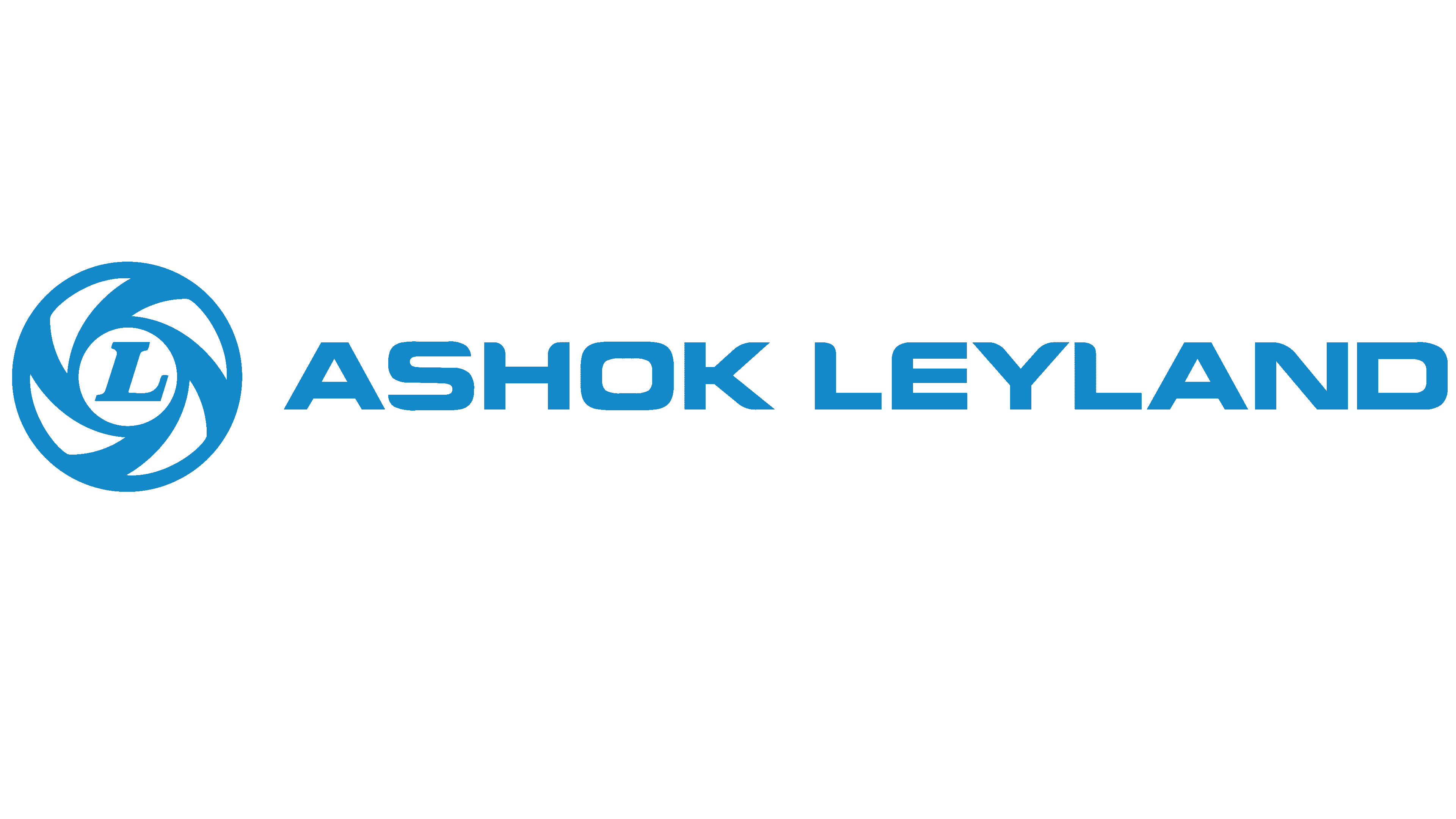
Ashok Leyland Logo
Ashok Leyland, an Indian automotive giant, primarily focuses on commercial vehicles, including buses, trucks, and light vehicles. Having a significant presence in India, it’s also penetrating international markets in the Middle East, Africa, and South Asia. A flagship of the Hinduja Group, the firm constantly innovates, venturing into electric vehicle domains. With its rich legacy, it remains a major player in India’s transportation landscape.
Meaning and history
Ashok Leyland’s journey began in 1948 when it was founded as Ashok Motors in Madras (now Chennai), India. It was initially set up to assemble Austin cars, but in 1950, recognizing a market need, the focus shifted to commercial vehicles. A collaboration with British Leyland, a UK-based company, was formed in 1955, leading to the company being renamed Ashok Leyland in 1955.
This alliance enabled Ashok Leyland to introduce modern British technology, making it a frontrunner in India’s commercial vehicle sector. Over the decades, the company expanded its product range, introducing buses, trucks, and specialized vehicles.
Ownership dynamics evolved in the late 1980s when the collaboration with British Leyland ended. The Hinduja Group, a global conglomerate, began acquiring stakes in the company, and by 2007, they became the major shareholder, marking a new era for Ashok Leyland. With Hinduja’s backing, the company ventured into global markets, setting up plants outside India and acquiring other brands.
Innovation became a hallmark. The 21st century saw Ashok Leyland expanding its offerings with hybrid technology, electric vehicles, and state-of-the-art Euro VI engines.
From a humble assembler of cars in the 1940s to a dominant force in the commercial vehicle sector, Ashok Leyland’s legacy is intertwined with India’s industrial evolution, making it a key player in the nation’s transport narrative.
1896 – 1962
In 1896, the enterprise entered into a strategic partnership with Leyland from the UK.
The initial emblem of Leyland Motors was encased in an elliptical design, with the brand’s moniker gracefully tracing its periphery. Centrally positioned, one could find the phrase “Creators and Innovators,” signifying their pioneering spirit and ingenuity in design. As the company continued to evolve, this symbol became an integral part of their identity, reflecting their commitment to excellence and their strong ties with their British counterpart. The design not only showcased their brand name but also their foundational ethos as inventors and trailblazers in the industry.
1962 – 1968
The emblem experienced a total transformation. The refreshed insignia prominently displayed “Leyland” in a refined font, punctuated by atypical serifs. These serifs terminated in a boxy design, whereas the journey from a letter’s conclusion to its serif was characterized by a sleek, curvilinear transition.
An intriguing facet of this typography was the elongated tail of the “y.” This tail gracefully curved, forming a loop and extending beneath the entirety of the brand’s moniker, adding an artful touch to the overall design.
1952 – 1968
The updated emblem echoes more of a commendation insignia than a traditional logo. A crimson circular symbol is adorned with a banner showcasing nationalistic hues. Additionally, there are multiple slender golden stripes framing this central motif. Dominating the heart of the circle is the brand’s abbreviated moniker, rendered in a prominent, serif typography in a sunlit yellow shade. Surrounding this, one can observe the company’s revised official title, ‘The British Motor Corporation Ltd.’, meticulously inscribed along the emblem’s circumference, highlighting the brand’s evolving identity and commitment to excellence in the automotive sector.
1968 – 1986
After the union of British Motors and Leyland Motors, a revamped emblem emerged.
Drawing parallels to the contemporary logo, its core showcases an artistically crafted spinning wheel embracing the letter “L.”
This central figure sits within a bordered square of a delicate blue hue. Atop, a slim rectangle bears the inscription “British,” and a similar structure below it reads “Leyland.” Together, these components form a collective rectangular outline.
The company’s name is presented in an understated sans serif style. These expansive, airy characters seamlessly align with the emblem’s overall geometry. Notably, the “A” is characterized by its distinctively sheared apex. Aside from this subtle deviation, the typography remains fairly standard, offering clarity and ease of recognition.
Contrastingly, the central “L” ensconced within the wheel adopts a distinct design. Its prominent serifs and italic stance set it apart. This slanted orientation not only grants dynamism but also accentuates the sense of movement, harmonizing with the wheel’s inherent suggestion of rotation.
1986 – Today
The prevailing emblem of Ashok Leyland prominently features a revolving wheel encasing a pronounced “L.” Beneath this graphic element, the firm’s moniker stretches across. While the font may seem familiar at first glance, subtle tweaks distinguish it. One can observe the refined curvature of the “L” and the gentle arch on the upper left corner of the “E.” Furthermore, the company’s name adopts a heftier weight in its design, enhancing its readability and making it stand out more prominently. This meticulous attention to detail underscores the brand’s commitment to evolving while maintaining its core identity.
