Assassin’s Creed Logo
This is an action-packed game series. When the first installment of the Assassin’s Creed series of games came out, few could have predicted that the franchise would have such a huge success and impact today. In the first game, the player is immersed in the events of the third crusade, which lasted from 1189 to 1192. The main goal of Altair ibn La-Ahad, the assassin, is to uncover the conspiracy and stop the third crusade.
Meaning and History
Ubisoft Montreal began publishing the Assassin’s Creed game back in 2007, after the first part, a sequel was immediately announced. Although new parts came out quite often, their quality did not fall. Each game added something new to the story. One way or another, all major releases, numerous spin-offs, and over 100 million copies of Assassin’s Creed sold have had a significant impact on the video game industry.
What is Assassin’s Creed?
Assassin’s Creed is one of the most played action game series of the last decade. Various add-ons, which help to reveal the whole world of the game, have been released for the game.
2007 – 2010
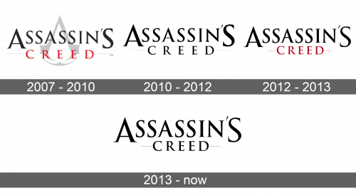
The first emblem featured the name of the game series written in two lines. The word “Assassin’s” was done in a larger black serif typeface. All the letters are uppercase. At the same time, the first and last letters are enlarged. The word “Creed” is done in red and has more spacing between the letters. In the background, the logo has a gray metronome icon along with two thin lines to the left and right of the second word.
2010 – 2012
Several years later, the logo was transformed to a completely black one without changing the typeface. The metronome icon in the background was no longer there. However, the designers kept the two lines framing the second word, which gave the logo a more professional and complete look.
2012 – 2013
It was not long before the designers brought back the red color, although it was darker than in the original version. It was added to the second word and the lines framing it. The “Creed” also had less spacing between the letters. Otherwise, the logo stayed true to its origins.
2013 – Today
The red did not stay for long and was replaced by black again. The lines, though, were in light gray. Nothing new was introduced, so the logo was very recognizable and easily associated with the game series.


