Philadelphia Phillies Logo
The Philadelphia Phillies are a professional baseball team competing in MLB’s National League. Currently, the franchise is owned by John Middleton, a businessman with a profound love for baseball. The Phillies actively participate in numerous games and continue to be a formidable competitor in the baseball landscape, with a strong focus on honing skills and team dynamics. They hold their games at Citizens Bank Park, their official home, and maintain a loyal fan base, showcasing resilience and dedication to the sport.
Meaning and history
The Philadelphia Phillies, a distinguished team in Major League Baseball, have a rich history marked by varied ownerships and significant transformations. Founded in 1883, they hold the distinction of being the oldest one-name, one-city franchise in American professional sports.
Throughout their existence, the Phillies have experienced several shifts in ownership, each bringing a unique perspective and approach to the team. The team’s inception was under Al Reach, a sporting goods magnate, who played a crucial role in establishing its foundational ethos.
Over the years, changes in proprietorship have influenced the team’s direction and strategy. The Carpenter family’s ownership from 1943 to 1981 was pivotal, spearheading numerous enhancements and fortifying the team’s presence in the league. Under their stewardship, the Phillies clinched their first World Series title in 1980.
Post the Carpenter era, the team underwent multiple transitions, with varying degrees of success and challenges. In 1981, the ownership shifted to a group led by Bill Giles, marking a new phase in the team’s evolution. The franchise continued its pursuit of excellence, adapting to the evolving dynamics of the game.
The current proprietor, John Middleton, acquired the Phillies with a commitment to uphold its legacy and foster its growth. Under his leadership, the Phillies strive to reinforce their competitive edge, staying true to their heritage while embracing innovation.
Throughout their journey, the Philadelphia Phillies have navigated the ebbs and flows of the baseball world, shaped by different visions from their diverse proprietors, and continue to be a symbol of enduring spirit and passion in the world of baseball.
1900
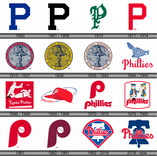
The inaugural logo of the Phillies featured a typical block letter “P” in blue, representing the city of Philadelphia. This simplistic initial design symbolized the roots and the origin of the team, emphasizing the connection between the city and its new baseball franchise.
1901 – 1909
During this period, the color of the pivotal letter “P” underwent a transformation from blue to a more stark and bold black, indicating a shift in the visual identity of the club while retaining the foundational design element.
1910
In 1910, the emblem experienced a redesign, where the letter “P” was revamped in an Old English style and colored in green. This adjustment, coming after a decade of the club’s existence, showcased a nuanced aesthetic approach, incorporating a traditional typeface to emphasize the team’s evolving identity.
1911 – 1914
Subsequently, the club decided to revert to featuring a large, bold, red letter “P,” marking a return to a more pronounced and vibrant depiction of the team’s symbol. This period highlighted a preference for a visually striking representation, emphasizing the club’s prominence.
1915 – 1937
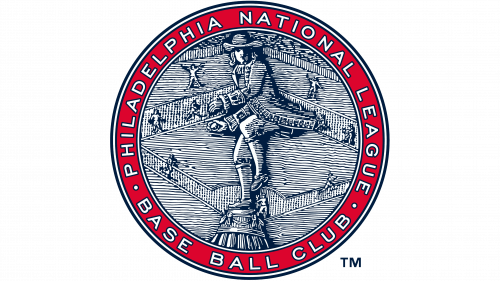
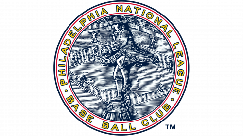
In 1915, the logo evolved to feature a graphical representation of a Philadelphia resident, positioned amidst a dark blue baseball field, encompassed within a vibrant red ring, with the words “Philadelphia National League. Baseball Club” etched in white. This intricate design symbolized a more holistic depiction of the team’s identity, incorporating various elements to project a comprehensive image of the club’s ethos and locale.
1938
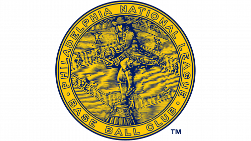
After twenty-two years, the emblem saw a color transformation, with yellow dominating the design, accented by delicate blue outlines. Despite these color modifications, the fundamental image and signature maintained their original integrity, sustaining the established visual identity of the team.
1939 – 1943
Once again, the emblem underwent a revamp, this time altering the color scheme. The principal design adopted shades of gray and silver, contrasted by a pristine white ring and the team’s name depicted in yellow, bordered by a sleek black outline. This period marked an exploration of different hues to represent the team’s evolving aesthetics.
1944 – 1945
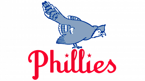
This era brought forth a logo illustrating a blue jay perched above the Phillies inscription. The manifestation of the team’s name was in a vibrant red, and the customary dots above the letters “i” were creatively replaced with red stars, adding a unique and innovative touch to the overall design.
1946 – 1949
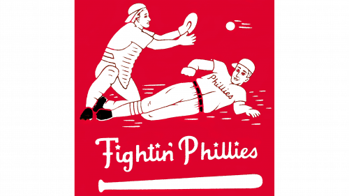
In 1946, a significant redesign occurred. The logo portrayed two baseball players against a red backdrop, engaged in dynamic action, with one catching a flying baseball and the other attempting to position a bandwagon for a fellow player. Below this vivid imagery, the phrase “Fighting Phyllis” was prominently displayed along with a white baseball bat, emphasizing the team’s combative spirit and relentless pursuit of victory.
1950 – 1969
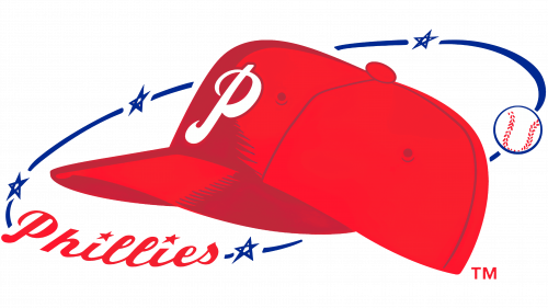
The Phyllis logo underwent another transformation. The predominant feature was a red cap emblazoned with a white letter “P,” encircled by a slender blue ring adorned with stars, a white baseball, and a subtle inscription “Phillies” in red. This design retained elements of the team’s history while incorporating new visual components to depict the team’s evolving identity.
1970 – 1975
The eleventh iteration of the club’s logo presented the red letter “P,” centrally housing a white baseball, accompanied by the full name of the team below. This minimalist design focused on combining essential elements, representing a more streamlined visual approach while maintaining the connection with the team’s heritage.
1976 – 1980
In 1976, new mascots, Phil and Phyllis, adorned the logo, portrayed in colonial blue attire. Phil is depicted in a baseball-throwing stance, holding a bat, while Phyllis is equipped with a playing glove. Below this, the word “Phillies” in red retains its traditional design from the preceding logo, emphasizing continuity amidst change.
1981
This year marked the return of the red letter “p” to the logo, symbolizing the team’s name, encasing a baseball in its center, a nod to the team’s enduring symbolism and a continuation of the traditional design narrative.
1982 – 1991
During this period, the pivotal letter “p” experienced another color modification, transitioning from red to brown, indicating a subtle but significant alteration in the team’s visual representation.
1992 – 2018
1992 saw a complete conceptual overhaul of the logo. A white silhouette of the Liberty Bell was highlighted against a blue background with a red contour, foregrounded by the word “Phillies” in red, with the letters “i” embellished with blue stars. This new conceptual design reflected a deep connection with the city’s historical heritage, presenting a blend of tradition and modernity.
2019 – Today
Currently, the franchise opts for a simplistic logo, consisting solely of the word “Phillies” juxtaposed before a depiction of the Liberty Bell. This rendition, extracted from the previous version, focuses on essential elements, excluding additional details like the stadium and the red edging. This contemporary choice embodies the national ethos of the team and a precise reflection of their roots, enabling a seamless connection with the past while forging confidently into the future. The emblem’s unique feature is the two stars substituting the dots at the letters “i,” effectively
