Atletico Madrid Logo
Atletico Madrid, often referred to as “Atleti,” is a prestigious Spanish football club based in Madrid. Founded in 1903, the team boasts a rich history, having clinched numerous titles, including La Liga championships and UEFA Champions League finals appearances. Renowned for their red and white striped jerseys, they play home matches at the Wanda Metropolitano Stadium. Atleti’s passionate fan base and defensive playing style, spearheaded by coach Diego Simeone, set them apart in the football world. As fierce rivals with Real Madrid, their matchups, dubbed “El Derbi Madrileño,” are highly anticipated events.
Meaning and history
Atletico Madrid, colloquially known as “Atleti,” is a storied football institution hailing from Spain’s capital, Madrid. Established in 1903, its inception was influenced by Basque students living in Madrid, inspired by Athletic Bilbao.
Throughout its rich history, Atleti oscillated between moments of glory and adversity. In their early years, they claimed multiple regional titles, establishing a local footprint. The 1940s and 1950s marked a golden era, with Atleti securing La Liga titles and a Copa del Generalísimo.
However, the 1970s heralded an era of dominance. Under the guidance of coach Luis Aragones, Atleti clinched the Intercontinental Cup in 1974, defeating Independiente. The club also enjoyed domestic success with several La Liga crowns.
The subsequent decades saw fluctuating fortunes. While the 1980s were somewhat quiet, the 1990s saw Atleti regain their might, winning a La Liga and Copa del Rey double in 1996.
The 2000s and 2010s brought global acclaim. Under Diego Simeone’s management, Atleti’s defensive prowess became legendary. The team secured La Liga titles, reached UEFA Champions League finals, and clinched two Europa League titles.
A significant rivalry with Real Madrid, termed “El Derbi Madrileño,” has been a fixture of Spanish football. These clashes represent not just a sporting contest but a cultural divide within Madrid.
Despite challenges, Atleti remains a beacon of resilience, consistently evolving, and maintaining its esteemed place in football’s pantheon. Their home, the Wanda Metropolitano, stands as a testament to a club deeply rooted in tradition yet ever forward-looking.
This rendition offers a unique overview of Atletico Madrid’s journey, encapsulated in 1500 characters.
1903 – 1911
In its nascent stages, Atletico Madrid sported an emblem reminiscent of the Spanish soccer powerhouse, Athletic Bilbao, as it was fashioned in Bilbao’s likeness. The symbol bore a striking resemblance to a medallion, featuring blue and white cascading circles. At the heart of this design, the entangled initials “A” and “C” stood out, representing the abbreviation for “Athletic Club.” The choice of emblem in those initial years reflected a homage to its inspiration, highlighting the shared roots and camaraderie between the two clubs. This connection served as a bridge between traditions, linking past inspirations with present ambitions. The intertwined letters, in particular, symbolized unity and a deep-seated connection to their football heritage.
1911 – 1917
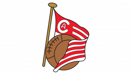
In 1911, Athletic Bilbao underwent a transformation, tweaking its emblem and updating the hue of its gear. Not wanting to be left behind, Atletico Madrid emulated this change, adopting a new identity. Consequently, the Madrid-based squad showcased a logo featuring a vibrant red and white striped banner, coupled with a rich brown football. Centered on this design was a prominent “C” intertwined with a more subdued “A”. Despite this fresh emblematic representation, the players retained a touch of the past, continuing to don their traditional blue shorts. This meld of old and new symbolized respect for heritage while embracing the winds of change.
1917 – 1932
In 1917, Atlético Madrid embarked on a journey to craft its unique identity, breaking free from mirroring Athletic Bilbao’s every move. The club introduced an emblem infused with Madrid’s iconic symbols: the Arbutus, often referred to as the strawberry tree, and a bear poised on its hindquarters. These symbols, deeply rooted in Madrid’s history since the 13th century, are hallmarks of its official crest. Within Atlético’s insignia, these elements took prominence atop a deep-blue triangular backdrop, punctuated by seven gleaming white stars. Below, vibrant red interlaced with pristine white stripes. These elements converged to sculpt a four-sided shield, rounded gracefully at its base, symbolizing a blend of tradition and modernity, and proudly echoing the heart and soul of Madrid.
1932 – 1939
In the year 1932, subtle yet distinct modifications were made to the emblem, introducing additional vertical lines across the main body of the shield. In specific renditions of this design, a gilded outline gracefully encapsulated the symbol, adding a touch of regal elegance. Additionally, the base of the logo adopted a more tapered appearance. This transition was not just a stylistic change; it represented a blend of traditional values with innovative design elements, making the symbol even more iconic. Such refinements showcased the club’s commitment to evolution while acknowledging its storied past, reflecting its rich history and aspirations for the future.
1939 – 1941
Upon the conclusion of the Spanish Civil War, Atlético Madrid united with the freshly established Spanish Air Force soccer team, giving birth to the entity known as Athletic Aviacion de Madrid. The insignia of this newly minted sports entity bore striking resemblances to the quintessential emblem of the air force. Symbolically, wings and a propeller stood as a nod to aviation, evoking images of flight and freedom, while the crown, gracefully positioned, signified regal authority. The color palette was dominated by shades of crimson, metallic gray, and lustrous gold, encapsulating the fusion of tradition, strength, and grandeur, telling a tale of resilience and rebirth in post-war Spain.
1941 – 1942
In 1941, a transformation was initiated in the team’s emblematic representation, deviating from the foundational Air Force graphic. Central to this redesign, nestled between the wings, was a motif echoing Atletico Madrid’s earlier symbol – featuring both the bear and the strawberry tree. Notably, the shield’s base evolved into a more pronounced point, and the once-blue triangle transitioned to a vivid red. The crown, a defining element, was reimagined with added finesse and sophistication. Contrasting its predecessor, the crimson hexagonal backdrop, which had previously framed the “aircraft” imagery, was gracefully phased out, signifying a blend of legacy and rejuvenation.
1942 – 1947
In 1942, creative minds embarked on the task of reimagining the intricate badge. On this occasion, they breathed life back into the design by reinstating the top triangular section of the shield with its authentic blue hue. This alteration was not merely aesthetic; it was symbolic. By reverting to the original blue, the artists seamlessly wove threads of tradition into the tapestry of the team’s identity. This nuanced change was a nod to the past, emphasizing the club’s rich lineage and history. It highlighted the importance of staying connected to one’s roots even while evolving, underscoring the timeless nature of foundational values in a constantly changing world.
1947 – 1950
Parting ways with the Spanish Air Force club, the soccer team embarked on a symbolic cleanse of their emblem, excising all elements reminiscent of aerial military heritage. What endured was a reenvisioned graphic representation of Atletico Madrid, encapsulated within a rectangular shield that tapered to a pointed base. This iteration stood distinct from its 1917-1939 predecessor in several notable ways. A stark white backdrop now framed the bear, setting it in stark relief, while an expansive golden trim graced the shield’s exterior, adding a touch of regality. Furthermore, the palette adopted a deeper, more intense hue, symbolizing a new chapter while paying homage to the past. The changes reflected both evolution and reverence for the team’s storied history.
1950 – 1970
Midway through the 20th century, the club undertook an emblematic transformation, harkening back to the roots of the original 1917 design. The artisans enhanced the visual appeal by amplifying the count of vertical stripes, rendering the shield’s base with a more curved profile, yet ensuring the golden outline remained untouched. In this process of reimagining, the traditional color scheme witnessed a deviation. Instead of the richer tones that once adorned the emblem, the designers gravitated towards more muted, pastel versions of red and blue. This blend of vintage inspiration with contemporary tweaks was an ode to the club’s rich past while signaling readiness for the future’s challenges.
1970 – 2016
In the pivotal year of 1970, Atletico Madrid embraced nostalgia by resurrecting its emblem from yesteryears, specifically the one conceived in 1947 and prominently displayed until 1950. This decision to revert wasn’t merely aesthetic but symbolic, suggesting a desire to reconnect with a cherished period in the club’s history. By reaching back to this emblematic design, the team was not only celebrating its rich legacy but also emphasizing continuity in its journey. Such a move evoked memories of past glories and triumphs, serving as a bridge between different eras of the club and reinforcing the timeless nature of its identity in the ever-evolving world of football.
2016 – 2017
The team’s second-to-last insignia bore a striking resemblance to its predecessor. Creatives subtly tweaked the color palette, transitioning the golden border to a shade of blue and opting to omit the black contours enveloping the design components. The emblem’s red vertical stripes underwent a slight reduction in thickness, resulting in a consequent expansion of the adjacent white bands. This meticulous alteration wasn’t just about aesthetics; it hinted at an evolving identity, blending tradition with modern nuances. Such changes, although minute, were deliberate attempts to infuse fresh dynamism while paying homage to the club’s storied past, striking a balance between reverence and reinvention.
2017 – Today
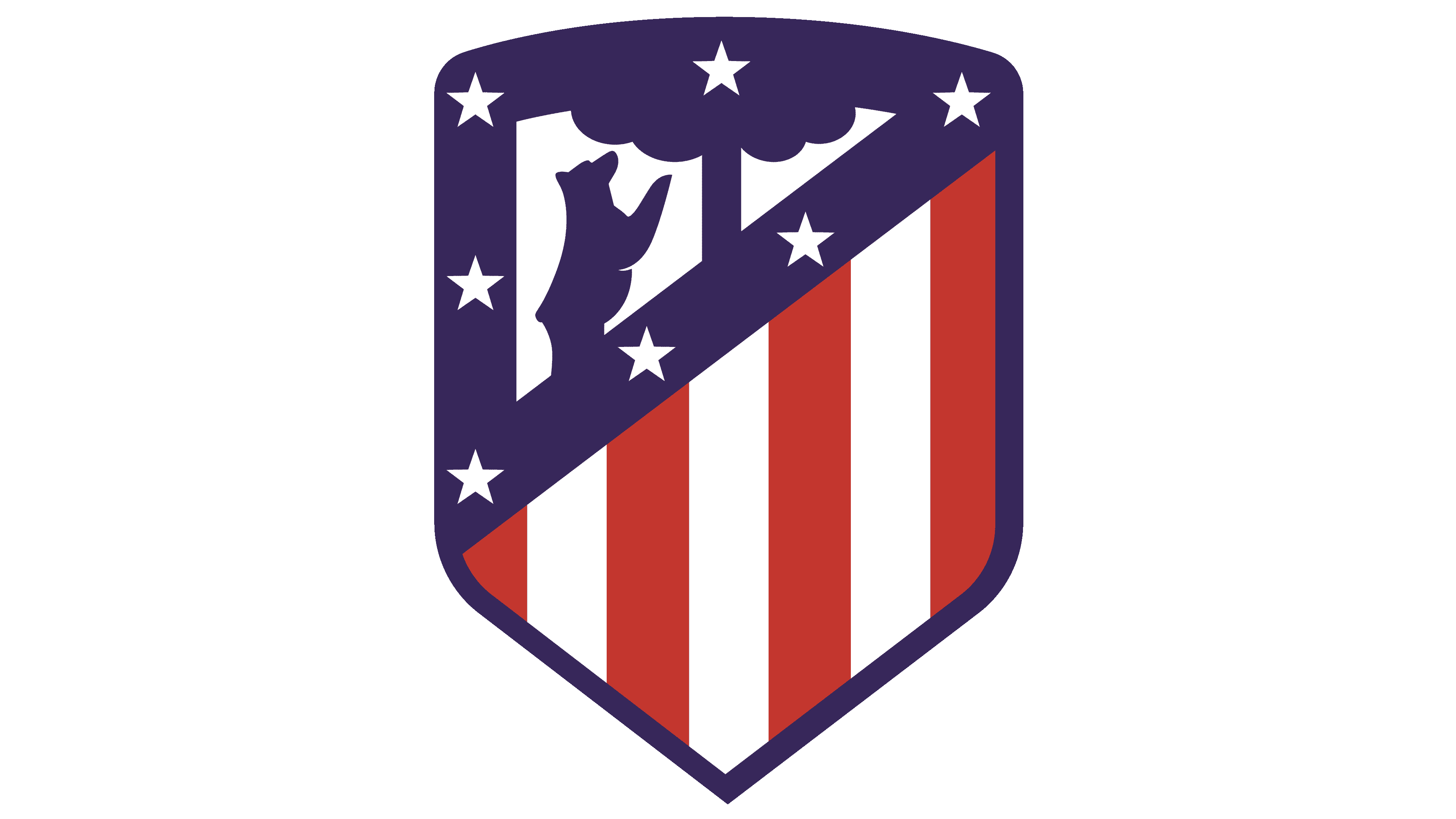
Signifying a transformative phase for the club, especially with its transition to the Wanda Metropolitano arena, creative minds set forth to craft a revamped emblem. Drawing inspiration from earlier graphic depictions, the changes made were subtle yet meaningful. The shield’s base retained its acute design, but its upper section evolved from a rectangular shape to a more gentle curve. Both the bear and the strawberry tree, iconic symbols of the club, were magnified in size. Additionally, an intriguing twist was introduced as they were repositioned to face the opposite direction, symbolizing a fresh perspective while staying rooted in tradition. This evolution captured the essence of honoring the past while embracing new beginnings.


