Avengers Logo
Avengers are the group of fictional superheroes tasked with saving the world from various threats, designed and developed by Marvel for their comic books. They had first in the issue #96 published in 1972. But 40 years later, Marvel shot a movie called ‘The Avengers’.
Meaning and History
Avengers have been around for 40 years, and the exact composition of heroes changed. In the movies, they are: Iron Man, Captain America, Thor, Hulk, Hawkeye, Black Widow and other minor characters. There isn’t really an explanation as to why they are called ‘Avengers’, except for how great the name sounds.
2012 – Today
This is the general design they used for all of the titles below.
The letter ‘A’ noticeably has a lengthened left bar, while the right bar was on the same level with other letters. Minor nuances include the semicircle behind the letter itself and a little arrow where the middle bar would be. The entire thing is also tilted to the right a bit, and the font itself is tall and blocky.
2012 – 2015
The typeface of the entire lettering was made in a metal with an intention of looking brutal and serious. It was used in the following logos with some additions. Above this imagery, there was the name of the studio which made the movie – ‘Marvel’, with white letters on the red ground.
2015 – 2018
The same logo was used with the 2018 movie and got the monochrome red color instead of the metal gray. This one was used for the ‘Age of Ultron’ movie, the main topic of which was the many mistakes of Iron Man, hence the style.
2018 – 2019
In the year 2018 Marvel performed their new film about Avengers with the logo for it which had a few additions:
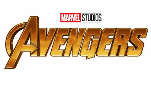
First, the lettering became more volumetric, and all the little nuances (such as the arrow bar) became more prominent. The ‘Marvel Studios’ inscription was placed on the top.
Also, the color was changed once again, this time to the dark yellow gradient color. That is the color of the Infinity Gauntlet – a central artifact in the movie.
2019 – Today
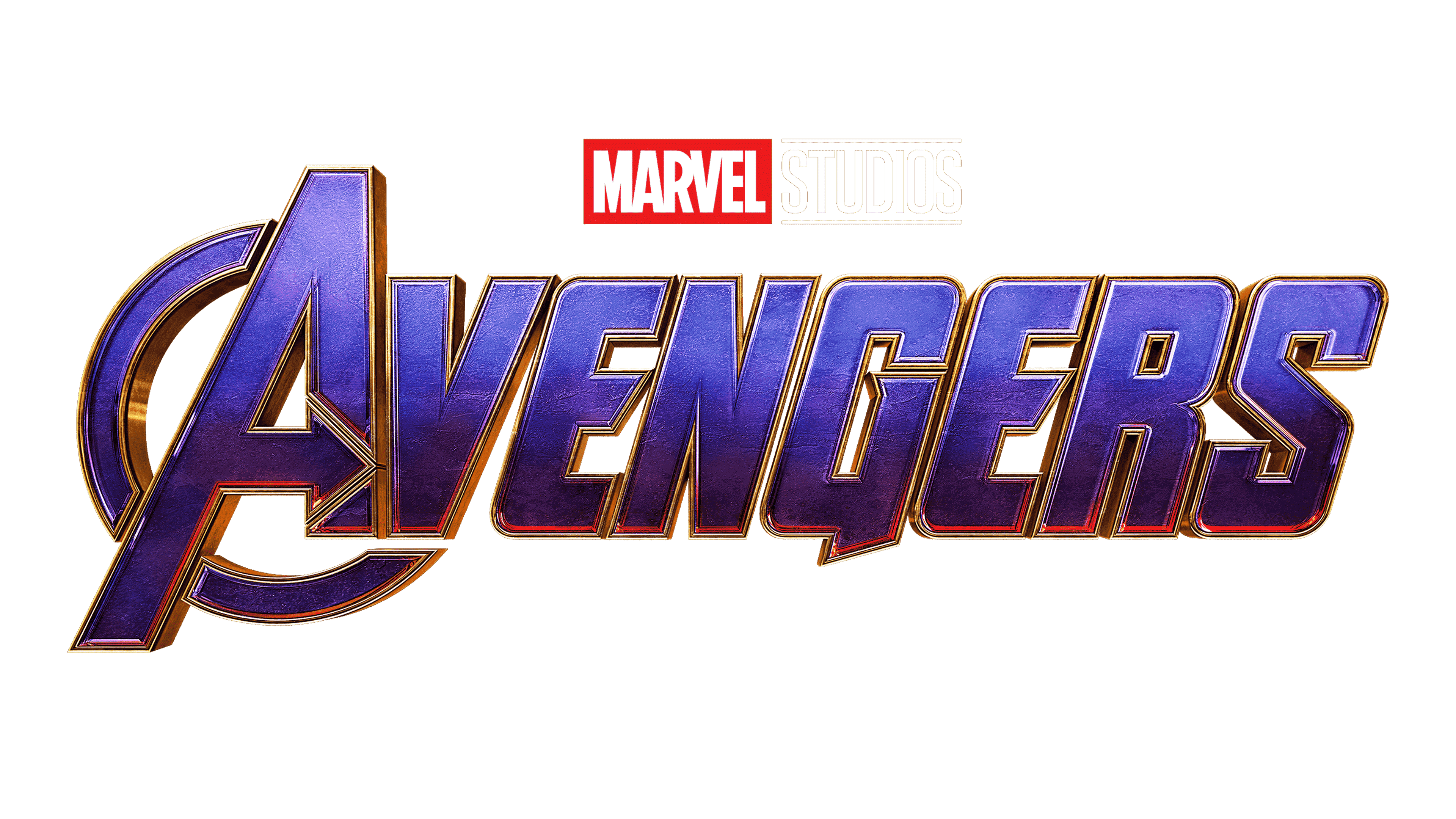
With their last movie in the series, Marvel introduced this logo. This one has changed its palette again, this time to the dark sky-blue with some black gradient. This one is colored so after the skin the main villain Thanos had in the film.
In addition, they changed several more minor details, such as returning the part of the semicircle they forgot the last time.
Emblem and Symbol
There is the second version of the logo which was used with Avengers: Endgame which has the glaciated lettering in dark blue, almost black color. Below it, there was a shorter name of the episode – ‘Endgame’, and the horizontal outline. It also didn’t have any semicircle behind the letter ‘A’. There wasn’t the ‘Marvel Studious’ inscription as well.
