Vodafone Logo
Vodafone is a British company that positions itself not as a cable TV or even a telecommunications operator. The company primarily positions itself as a mobile operator. Other services, such as the internet and television, are offered as additional services. Vodafone has always strived to stay at the top of innovation in the mobile world. Even the first mobile phone call made in the UK was done through Vodafone’s network. On January 1st, 1985, comedian Ernie Wise made a commercial phone call.
Meaning and History
![]()
The network was founded as a subsidiary of Racal Electronics Plc, the UK’s third-largest military radio manufacturer. After gaining independence seven years later in 1991, the company was called Vodafone Group Plc. The name itself comes from the phrase Voice Data Fone (phone). This name reflects the process of transmitting voice and other information through cellular networks, which is the main task of the company. In 2006, Vodafone and two other companies introduced the first where users could simultaneously watch TV, write an e-mail, and surf the internet. It was a real breakthrough at the time. The history of Vodafone is not only about the development of mobile communications, but also many steps towards consolidation, absorption of smaller companies, mergers with large ones, and conquest of territories. By 2013, it was the world’s third-largest telecommunications firm.
What is Vodafone?
The Vodafone Group is a British multinational telecommunications company. It is present in one way or another in more than 40 countries around the world. Vodafone is constantly expanding, so residents of Europe, Asia, and the CIS countries hear this name more and more often in recent years.
1981 – 1985
![]()
The original company name was printed in white bold letters without serifs. Each letter was placed on a red parallelogram background with rounded corners that repeated the angle of the italicized letters.
1985 – 1991
![]()
Voda Racal Telecom, the new name of the company, was placed on a light gray background. The first word was done in red and placed on the top line. The letter “V” was going slightly lower than the other letters, separating the other two words. “Racal Telecom” was printed in black using a simple, sans-serif typeface.
1985 – 1997
![]()
The new name, Vodafone, was printed in red. The letters were bold and had small, rounded serifs. Similar to the previous logo, the inscription had a thin white line going through the center of it. Moreover, it used exactly the same font as the “Voda” inscription in the previous logo, only this time all the letters were capitalized. It looked powerful, confident, and stylish.
1997 – 2006
![]()
A white quotation mark in a scarlet circle welcomes communication by opening and closing direct speech in the letters “O” of the name. The latter is printed in sans-serif, lowercase letters. A large scarlet circle with a white quotation mark was also placed above the name, representing the boundless communication possibilities.
2006 – 2017
![]()
The designers not only updated the font but also gave the emblem a completely new spin. It now looked more like a metallic three-dimensional round shield with a red quotation mark. It surely brought something fresh.
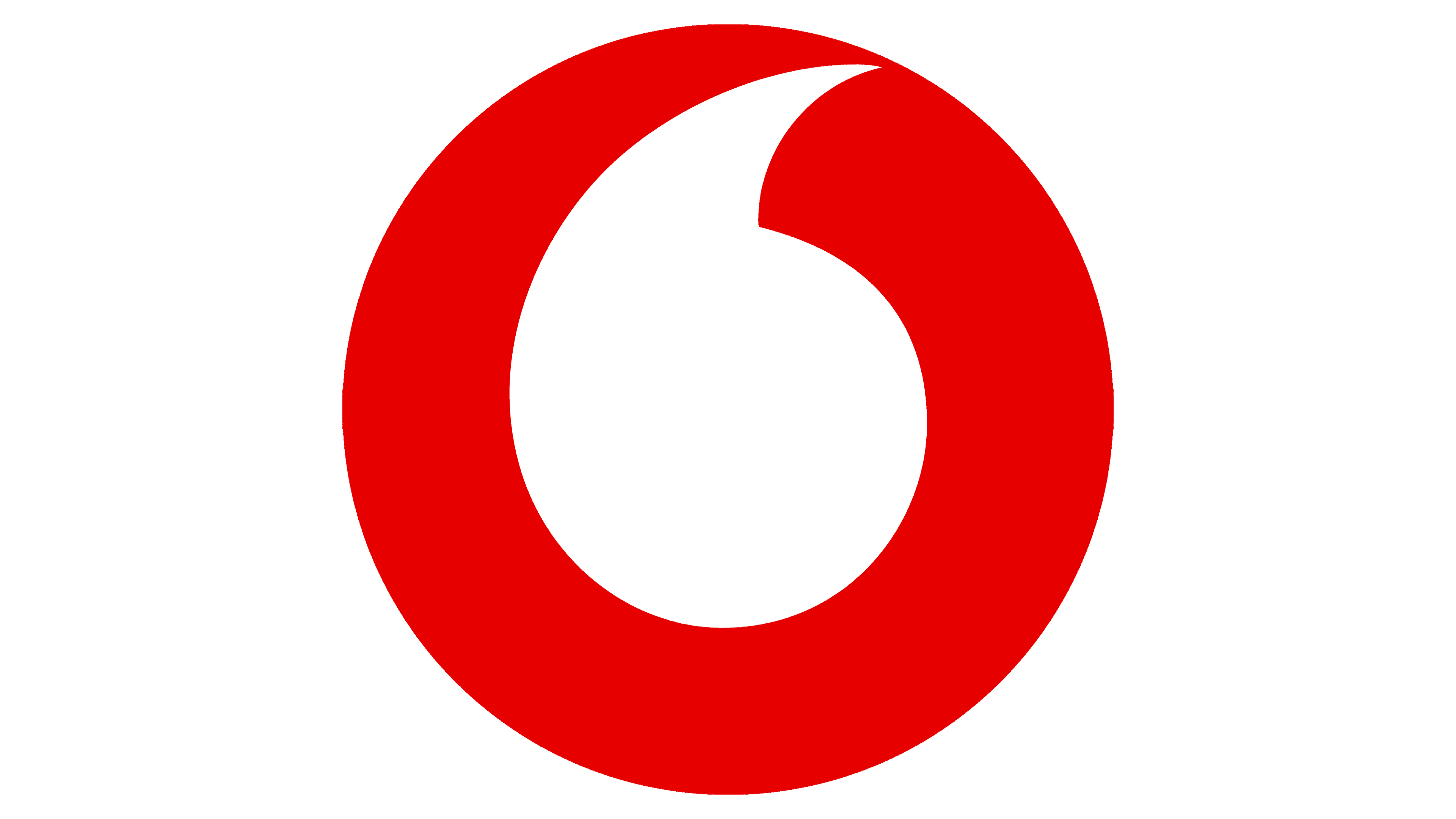
2017 – Today
![]()
The new logo features a different font, although there are more similarities than differences. It is not surprising, as both were designed by the same studio, although the latest version was customized specifically for Vodafone. The circle above the name was flat and red again with a white quotation mark. It looked more like the logo introduce twenty years earlier.
Font and Color
A logo used from 1985 until 1997 used a modified Crillee Extra Bold Italic font. Then, it was replaced by a modified ITC Avant Garde Bold font that has been designed by Saatchi & Saatchi. In 2006, the logo designers introduced the Ubuntu font, which was designed by Brand Union and modified to fit the vision of logo creators.
A custom font was created for the brand in 2017. It was called Vodafone Bold and developed by Brand Union. For the majority of the time, the brand used a white and red color palette. These colors were a perfect choice for a strong, energetic company that aimed for perfection all the time.


