Nickelodeon Logo
Nickelodeon is a legendary TV channel that broadcasts a large variety of children and teen shows, mostly animated. They’ve been around for a very long time, although the golden age was probably reached by the 90s, when it was pretty much watched by every kid in America and lots of people abroad.
Meaning and History
![]()
Nickelodeon grew from the sprouts of the show called Pinwheel, launched in 1977. The show got so popular that they basically renamed the channel where it aired to Pinwheel as well. That prompted the bosses to make Pinwheel into a fully-fledged TV channel. The name for the idea came from nickelodeons – cheap movie theatres back in the day.
1977 – 1979
![]()
Pinwheel had a simple black inscription for a logo. That being said, they did arrange the letters to look more childish, cartoony and unruly. As a result, there are almost no straight lines or aggressive angles, nor are there simple shapes – everything is waving and twisting all the time.
This design partially inspired the following logo designs for the Nickelodeon proper.
1979 – 1980
![]()
The first Nickelodeon logo wasn’t what you’d expect. It’s much more serious that a previous childish style. The letters, for instance, were black, blocky and thick. You would usually find these on the newspaper fronts. In addition, they also put a plain serif beneath the main writing – it said ‘the young people’s satellite network’.
And to top it all, they added a black-and-white man randomly peering into the letter ‘N’. They actually wanted to redesign the logo to feature a comical scene but were short on time.
1980 – 1981
![]()
This time, they actually inspired somewhat from the Pinwheel experience. It was again just a name inscription written in black. The font was much thinner this time around, and the letters weren’t as chaotic and twirling. Instead, it was a type of a fluid serif with soft, fluid components.
It seems that this one too didn’t resonate with the channel’s purpose, and so was scrapped.
1981 – 1984
![]()
The 1981 design is much closer to what you’d expect from a teen-oriented channel. They basically took the brand name, inflated the letters to look like balloons and gave them different bright colors. From the left-most letter to the opposite end, they gradually changed from yellow to purple to green.
They also put a polished metal ball behind the main logo, but sometimes they just wouldn’t use it.
1984 – 2009
![]()
In 1984, we’ve finally reached a familiar style – orange letters written as if with paint. It literally looked as if they painted it in strokes: the edges are rough and the letters are written at will. Still, they are soft, evenly thick and attractive. Interestingly, though, all of them are uppercase – the first letter is just slightly bigger.
2009 – 2023
![]()
In 2009, some changed were made, although the concept pretty much stayed the same. They are still orange letters written in a childish manner. This time, however, they aren’t painted, but inflated into balloon-like shapes. They are once more very fluid, soft and lack aggressive shapes completely.
The notable change is that, this time, they are all lowercase – including even the first letter.
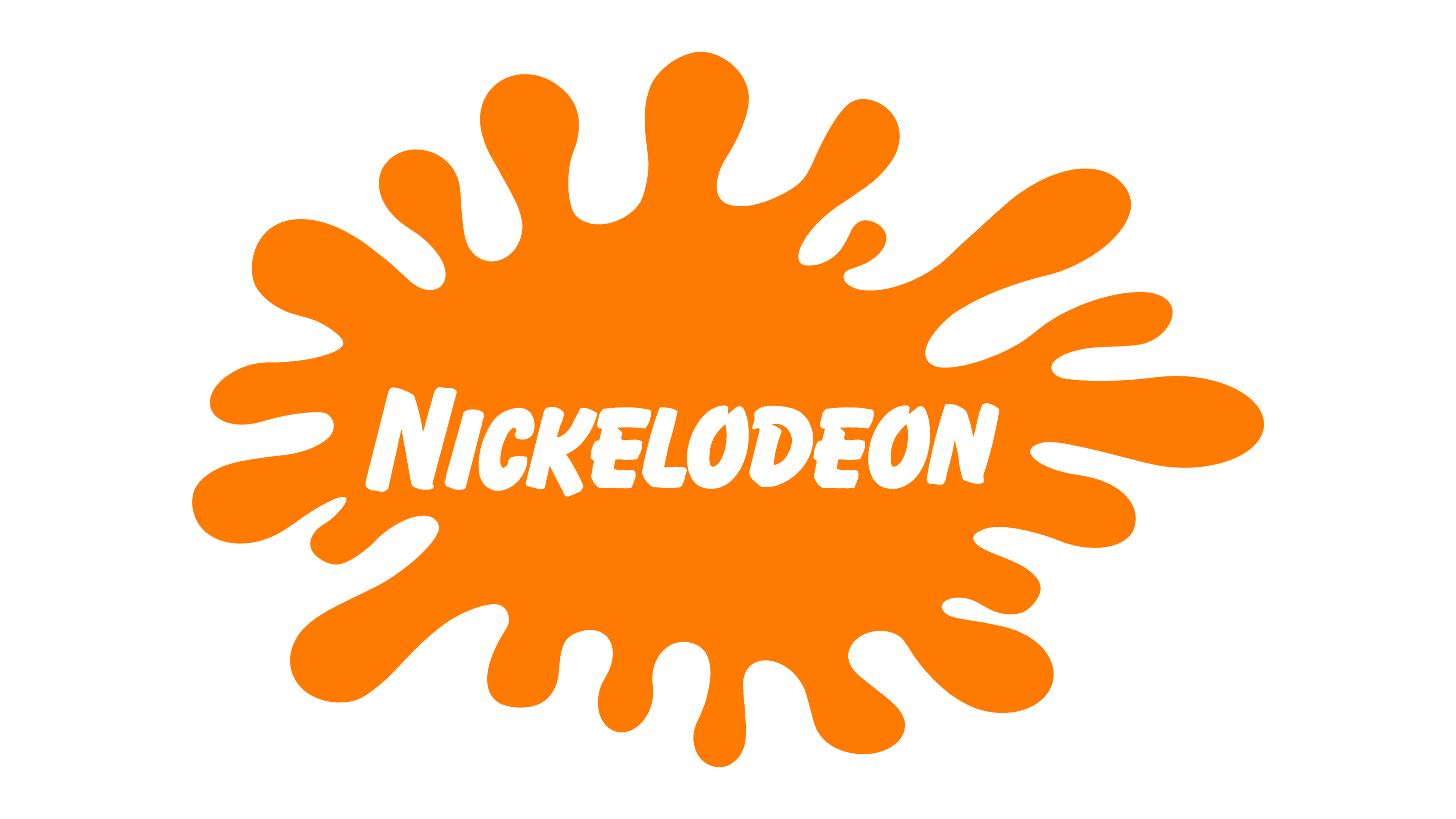
2023 – now
![]()
The logo captures immediate attention with its striking orange hue, set against a pristine white backdrop. At its core, the word “nickelodeon” is presented in a playful, rounded typeface, radiating youthfulness and energy. The letters are whimsically integrated within an abstract, amorphous orange splash, which appears as if it has been freshly splattered onto the canvas. A couple of distinctive loops and curls emanate from the splash, further enhancing its dynamic nature. The overall design resonates with creativity and spontaneity, embodying the channel’s spirit of boundless imagination and fun.
Emblem and Symbol
For a very long time, the channel uses the paint blots in conjunction with the logo. It was more common with the 1984 design, seeing how aesthetically matching it was. They basically colored the logo white and put it against an orange blot of paint. It could be in different shapes, but the usual variant is an oval-like smudge with paint bursts.


