AXA Logo
AXA is a leading global insurance and asset management firm. Currently, its core operations encompass life, health, and property insurance, along with investment management. With a significant presence in Europe, North America, and the Asia-Pacific region, AXA caters to millions of clients. While it’s a publicly traded company on the Euronext stock exchange, many shareholders contribute to its ownership. Emphasizing digital transformation and innovation, AXA continually adapts to meet the evolving needs of its customers in a dynamic financial landscape.
Meaning and history
AXA, a global insurance giant, traces its roots back to 1816 when it started as Mutuelle de L’assurance contre L’incendie in France. Over the years, it underwent multiple transformations, both in terms of ownership and operations.
The brand “AXA” emerged in 1985, chosen as a name that could be easily pronounced by individuals of any language. This marked a pivotal step towards its global vision. In the 1990s, AXA expanded aggressively, acquiring companies like the Equitable, a prominent American insurer, and UAP, France’s largest insurer, solidifying its position as a world leader.
Under the leadership of Claude Bébéar, the firm transitioned from a small mutual insurer to a global powerhouse. His successor, Henri de Castries, further propelled AXA’s global ambitions.
Strategically, AXA divested from several business lines to sharpen its focus. The sale of its UK life insurance business and the traditional investment unit exemplify this direction.
Currently, as a testament to its adaptability, AXA is navigating the digital age, emphasizing innovation and customer-centric solutions. Over its rich history, AXA has metamorphosed in response to market needs while retaining its core ethos of protecting clients against risks.
1978 – 1985
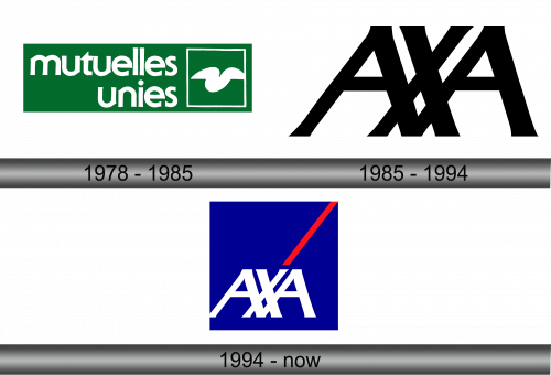
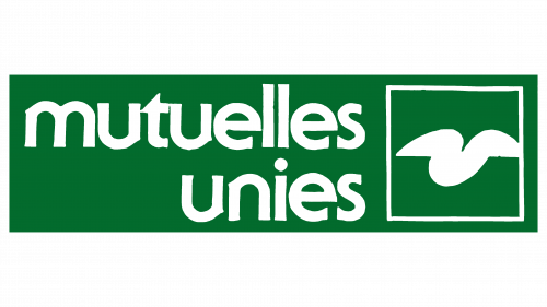
Tracing back to 1816, AXA’s journey started, though it adopted its present moniker only in 1985. Before this, its name underwent several changes, reflecting its growth strategy of absorbing other insurance entities. In 1978, a significant acquisition was Mutuelle de l’Quest, leading it to be rebranded as Mutuelles Unies. This change manifested in its emblem, featuring a white inscription to represent the new identity. This title, structured in two lines, leaned towards the right and was crafted in a pronounced, sans-serif typography.
The label “mutuelles unies” spanned a majority of a vertical, dark green rectangle. Adjacent to it, on the right, was a white-bordered square housing a unique icon. This emblematic figure bore a resemblance to either an abstract checkmark or perhaps the spread of bird wings, symbolizing trust or freedom.
1985 – 1994
The logo embodies simplicity, with a design centered around the intricate fusion of three letters – AXA. This intertwining subtly underscores the intertwined values of commitment, unity, and teamwork. The characters lean to the right, sporting uniformly trimmed upper edges. The bases of the “A”s seamlessly unite beneath the “X.” In its initial rendition, the dark-hued letters stand out against a pale backdrop, symbolizing clarity, vision, and the foundational ethos of the brand. This elemental design reinforces the brand’s commitment to simplicity, transparency, and focused direction.
1994 – Today
Following the makeover, the emblem took on a contemporary flair. The creators transitioned the lettering to a pristine white, setting them against a vibrant blue backdrop shaped as a square. Atop, they introduced a crimson linear highlight – a sleek streak originating from the “X”’s base, extending towards a corner. The addition of slanted visual elements infuses the logo with a sense of motion and zest, suggesting forward momentum and the brand’s penchant for innovation and energetic pursuits. The amalgamation of these elements speaks to the brand’s evolution and its commitment to staying relevant and spirited in a changing landscape.
