Bank of America Logo
Bank of America Corp. is an American financial holding providing services to legal entities and individuals. It is included in the top four largest US banks. The history of Bank of America is a century-long story of mergers and acquisitions of various financial institutions. Ups and downs, periods of prosperity and financial hardships that were happening in the country were closely reflected in the history of this American bank.
Meaning and History
Initially, the company was founded in 1904 by Amadeo Giannini and was called the Bank of Italy. The bank provided financial services to immigrants. Then, in 1929, the bank merged with the Californian Bank of America. Targeting the middle class and small depositors helped the bank survive during the Great Depression. Nearly 60 years later, the Bank of America merged with NationsBank in 1998 and the company took on a familiar image. In 2016, Bank of America became the largest in the US in terms of assets.
What is Bank of America?
Bank of America is a financial conglomerate that provides a wide range of services to individuals and legal entities. It was the Bank of America specialists who created the Visa card and the American checks system.
1930 – 1969
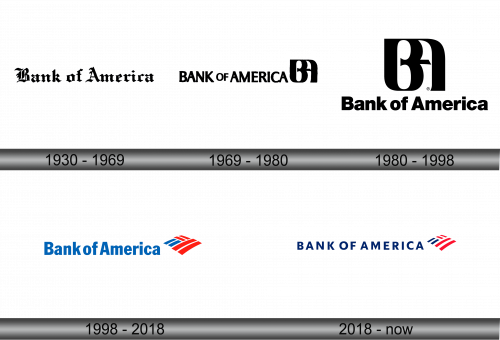
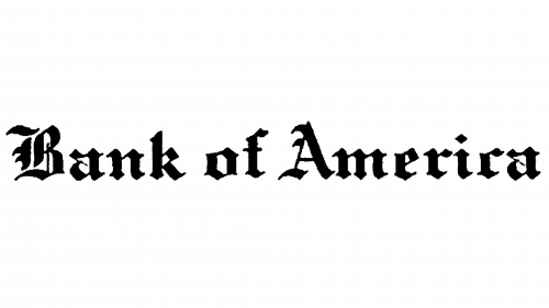
From 1930 to 1969, one of the United States’ largest banks adopted a logo featuring bold black lettering in a Gothic typeface. The emblem prominently displayed the name “Bank of America,” which exuded an air of sophistication with its letters reminiscent of medieval Latin script. This choice of font, known for its fractured appearance resulting from ancient scribes lifting their pens from the paper, conveyed depth, seriousness, and stability. To recreate this vintage logo, one can utilize a contemporary font reminiscent of the era, such as the Archive Black TitleFont Family from Archive Type, which captures the essence of that historical design.
1969 – 1980
The name of the bank was done in simple black typeface. All the letters were capitalized and bold with the word “of” being smaller than the other two words. To the right, there was a very intricate black monogram that consisted of bold letters “B” and “A”. They had rounded lines and joined in such a way that the letter “A” was partially hiding behind the “B”.
1980 – 1998
The monogram from the original logo was set in the center and looked significantly bigger. Under the monogram, there was the name of the bank. The letters were kept simple, so the bank used Helvetica font. There were no other elements. The logo looked exquisite and timeless.
1998 – 2018
The bank has changed the logo a lot. It still featured the name of the bank, but it was done in blue color and the font looked a bit different. The blue color stood for trustworthiness and loyalty. There was an emblem that looked like a rhombus. One half was done as two red stripes, while the other half had two blue stripes that were going in parallel to the red ones, but they were half as long. The top corner had red stripes that were going perpendicular to the other lines. The emblem, which was done in American colors, further supported the notion that this is the bank of America. Some versions had the emblem under the wordmark or to the side of it.
2018 – Today
The wordmark was changed to a deeper shade of blue. All the letters were capitalized. The design of the emblem was kept almost the same. The colors got deeper and the lines looked thinner, so there was more white space between the lines. An alternate version featured a larger emblem above the wordmark.
