Slipknot Logo
Slipknot is one of the most successful metal bands in history. A distinctive feature of the group is the presence of frightening masks in which the musicians appear in public. Stage images are an unchanging attribute of their live performances. Shawn Crahan was the first to come up with the idea, so other members made their own masks. An interesting fact is that Corey Taylor’s dreadlocks are made from his hair, which he cut and built into the mask. Although most of the band members have already appeared in photos without masks, they wear these because they decided not to depend on our names or faces after nobody seemed to care about their music in Des Moines. Slipknot wants all the focus to be on the music they perform.
Meaning and History
![]()
The American band Slipknot was formed in Des Moines, Iowa in 1995 when drummer Shawn Crahan and bass player Paul Gray decided to combine their creative efforts. Their band was named The Pale Ones. In December of the same year, the group played its first concert. By that time, though, they changed the name to Meld. In 1999, the renewed team released their second album, which they called Slipknot. Later, Jordison suggested naming the band after one of their songs, so the musicians changed their name to Slipknot. Immediately after the release of the album, Slipknot began to play concerts. The band had great achievements afterward, but there were also sad times when they lost their original members.
What is Slipknot?
Slipknot is an American band that defines its own playing style as “nu-metal”. The albums of this group have repeatedly become platinum both in the United States and other countries. The group not only gives performances, but also has its own merch that includes T-shirts, outerwear, and accessories.
1996 – 2014
![]()
Initially, the band used a star that had nine points, each of which was numbered. They were meant to represent each member. The star has a double circular frame going around it. In the center, there is a stylized initial of the band. It also has nine “thorns” that stand for all the members of the band. Although some associate their emblem with a Satan symbol, the group members explain it as a symbol of unity and resistance against the fake world. Underneath, the black and white logo features the full name, which is printed using an interesting, messy typeface. The font not only has a very uneven edge and small perforated dots, which give an impression that it was painted with a brush on a rough surface, but also features letters that do not seem to have any rhyme or reason to them. Their size and position on the line vary.
2014 – Today
![]()
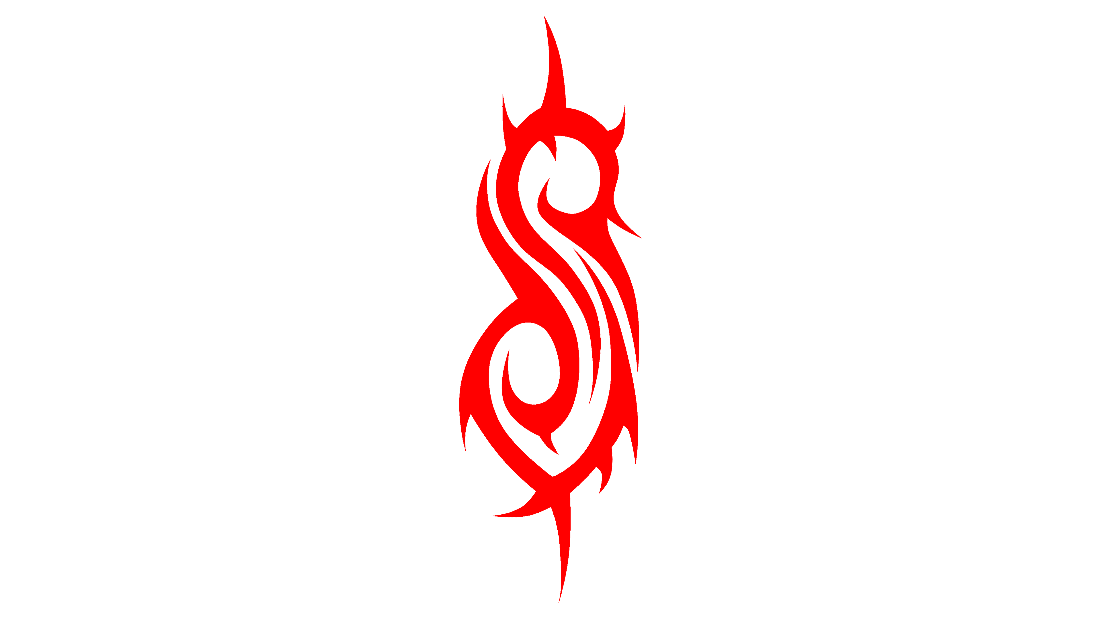
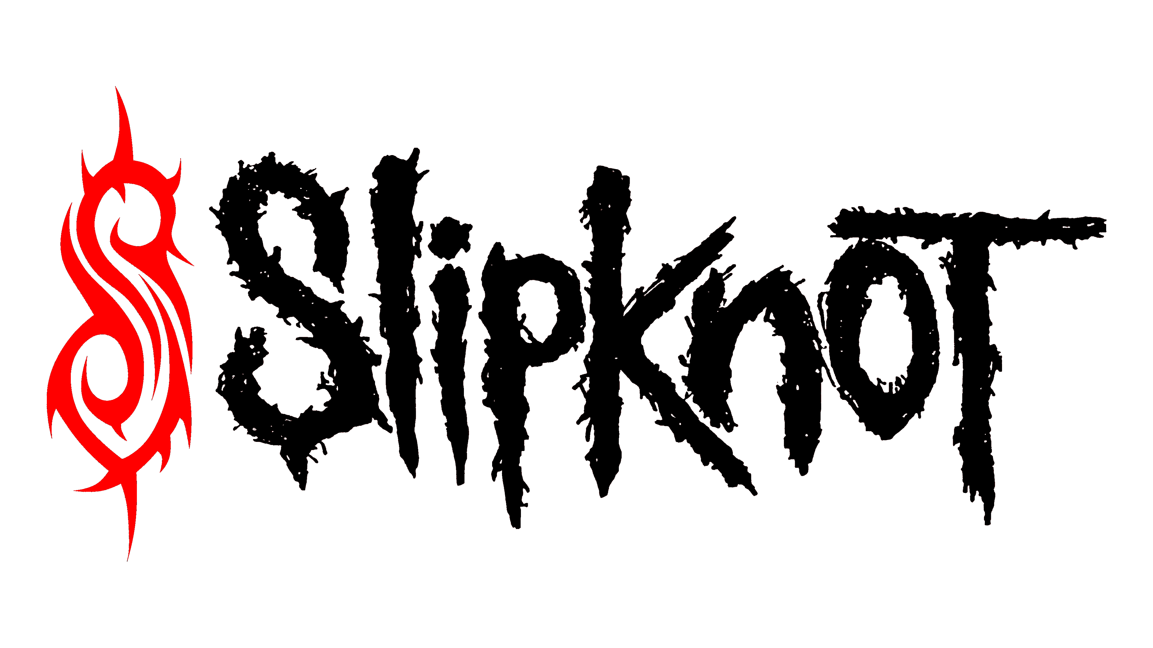
The logo of the group is another unique feature of the group, just like their style on the scene. It is a great reflection of its values, its songs, and the appearance of the group members during their performances. The band decided to do without the controversial star emblem and used only the name potion from the original version. One can see a black as well as a red version of this logo. The band also uses the stylized “S” from the first logo separately but in red. This is a simple, yet memorable and timeless emblem.
Font and Color
The red color used in the logo gives the impression that the group used it to reflect their energetic performances along with confidence, rage, aggression, and other strong emotions. The black color, which is also featured in the Slipknot logo, can also be used as a representation of fear, darkness, evil, and even death. The white background makes these colors look even bolder and stronger.
A horror typeface used for the inscription in the logo is a great match as well. It resembles a Sickness font family, which is created by High Logic.