Bayern München Logo
Bayern Munich is Germany’s premier club and has consistently achieved international success. Its popularity is due to the corporate style of the game, which attracts a large number of football fans. There are always many stars in a team who represent different teams.
Meaning and history
Bayern was created in 1900 in the city of Munich, Germany. The name itself means ‘Bavaria Munich’, which already denotes it as the foremost club in this region of Germany. What’s more, it’s regarded as the best football club in the country overall, claiming 6 UEFA wins and many other awards.
The club found its international acclaim in the 70s, when it started getting continuously high spots in the German Bundesliga, as well as winning a consecutive streak of victories in the UEFA from 1974 to 1976. Their latest victory came in 2020, and they are the only German team to win an UEFA Champions Cup this century.
What is Bayern Munchen?
FC Bayern Munchen is the football club from Munich, Germany. It’s considered the greatest German club at the moment, and one of the most successful brands to come from Bavaria. They’ve won all 3 UEFA Championships Germany claimed in this century, although it still lags behind Real Madrid and Milan in the overall ranking.
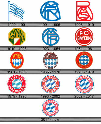
1900 – 1901
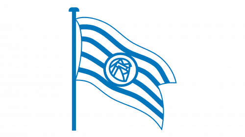
Bayern played the first season under a logo with a blue flag painted on a flagpole. The flag is painted in white and blue colors, in the center of the flag there are letters from the abbreviation of the name of the club.
1901 – 1906

In 1901, the logo was simplified, the letters from the flag were preserved in it with the same principle of intersection, the rest of the details were removed.
1906 – 1919
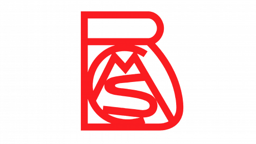
In 1906, the colors changed to red, the principle of the intersection of letters changed. They were now inscribed in a large B.
1919 – 1923
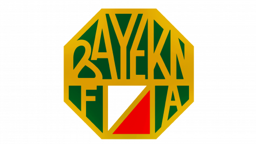
In 1919, the logo was adopted, which used a dark green background, in which the name BAYERN was inscribed in yellow letters. Also on the emblem there is a square, divided diagonally, one part of it is white, the other is red.
1923 – 1954
The club was founded in 1923, the first logo was a combination of letters from its abbreviation – FCBM. Interestingly, the largest was the letter C, inside which the rest of the letters were inscribed.
1954 – 1961
The second version of the logo was a red circle with a white border. The letters are inside, F.C. at the top, Bayern at the bottom.
1961 – 1965
In 1961, the emblem was improved, instead of a circle, a vertical oval was used. The name of the team has been preserved in the upper part, in the lower part there is a white background with a grid of blue rhombuses.
1965 – 1970
The essence of the logo has not changed, it is the same oval, but made in a different style. The proportions, colors have changed, the border of the circle has become as narrow as possible.
1970 – 1979
In 1970, a logo was created, which is the prototype of what exists today. The emblem became round again, at the top of the name BAYERN, at the bottom of the city of MUNCHEN. The blue diamonds on the white background now represent the inner circle.
1979 – 1996
The rhombuses and the background have changed places, the resulting white rhombuses have become much more oblong.
1996 – 2002
The background for the inscription has been changed, it has become paler, and the letters themselves are clearer, the readability of the inscription has increased.
2002 – 2017
All three club colors – white, blue and red – began to be used equally. The circle is outlined in two layers, outside blue, inside white. The rest has not undergone significant changes.
2017 – Today
In 2017, minor changes were made to the emblems. The interior now consists of white and blue rhombuses that form a single structure. More saturated colors have been chosen for decoration.
Color and font
The inscriptions are made in a simple and understandable font, which at the same time has good recognizability. The base is a red circle with white inscriptions, inside there are white and blue rhombuses, which also managed to become the symbol of the team.
