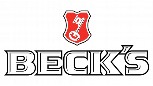
Beck’s Logo
Beck’s is one of the most profitable beer breweries in Germany. Located in the Northern city of Bremen, it’s also the biggest brewery there. They’ve been making their brand of beer for a long time now, although their independent years ended in 2001, and 2008 they were firmly in the hands of InBev.
Meaning and History
This brand (and, simultaneously, the brewery) was created in 1873 by Heinrich Beck and two of his associates, hence the name. In the 20th century, they’ve become the leader of beer production in Northern Germany, and by the time they became part of the Anheuser-Busch InBev conglomerate, they were still in top-5.
What is Beck’s?
Beck’s is a renowned German brewery that specializes in the production of beer. Established in 1873, Beck’s is known for its high-quality and distinctive brews, offering a range of lagers and pilsners that are popular worldwide.
2000 – today
The logo of the modern Beck’s (they didn’t have any before) was adopted in 2000 following the company’s effort to revitalize the brand. The resulting logo featured the brand’s name, ‘Beck’s’ in big capital letters. The colors were mostly white, although there were grey inlays in each of them.
Above, was the Bremen’s city crest – the white key of Saint Peter put onto the red shield. It was also twice outlined – first by white, then by grey.
Emblem and Symbol
The logotypes as seen on the labels of bottles and cans are actually a bit different. The crest is a bit further up, and the writing is put in the middle of a black rectangle, as a rule. All of it is put onto the silver oval shape, encircled by a red ribbon that has the words ‘Brauerei Beck & Co’ above and ‘Originated in Bremen, Germany’ below.


