BMW Logo
BMW AG is a leading developer and maker of premium cars although it has models for all market segments. Along the way, it also makes motorcycles and even bicycles. They are in demand not only in Germany but far beyond its borders. BMW AG went through downtimes and times of prosperity and grew into an outstanding brand. It introduced automobiles that are innovative and form trends in the automotive world.
Meaning and History
The story begins in 1917 when Carl Rapp and Gustav Otto found their own aircraft engine factory called BMW. The three famous letters are derived from the phrase Bayerische Motoren Werke, which can be translated into English as Bavarian Motor Works. To expand the enterprise in 1928, the company acquired automobile plants in Eisenach. During the war, the company steered away from automobiles and made aircraft engines. The first post-war car was made in the early 50s. In 2011, BMW AG founded a new division that specializes in hybrid and electric vehicles.
What is BMW?
BMW is a German car manufacturer that is recognized almost everywhere. Its automobiles have long become a symbol of luxury and sports style as well as great quality and reliability.
1913 – 1916
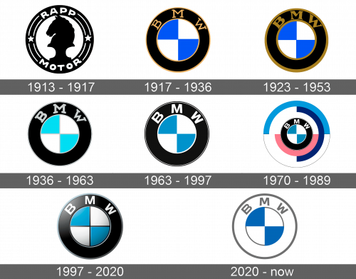
Before the well-known BMW was born, it was known as RAPP Motoren Werke, which was written at the top and bottom of a round emblem. The words were separated by two parallel white lines with a star on the left and right. The uppercase white letters popped against a black. The white center had a black horse chess figure silhouette that was facing left.
1917 – 1933
The name change required a new logo. It was still a round emblem with a wide black border that had the name at the top. The letters were done in yellow, which complemented a thin outline on both sides of the black border. The company used a classic font with serifs. The center circle had four sectors in blue and white. It is believed that it reflects the national flag of Bavaria.
1923 – 1953
A little update turned yellow into golden. The letters as well as the golden outline were much thicker. The letters got not only bolder but also more elegant thanks to varying thickness.
1936 – 1963
The golden was changed for silver. The font had minor variations. The silver outline, though, was much thinner. It was also added between the four sectors in the center. Lastly, the darker blue color now changed to sky blue.
1963 – 1997
The company stayed true to the image it developed over the years. The silver color was replaced by white. The outer outline was placed slightly inward, so it looked as if there was a double border. The letters were kept bold, but lost serifs. The blue color was changed again and was no longer as bright.
1970 – 1989
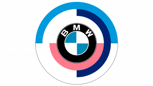
The new logo looked a lot different and more colorful than before. Three colorful borders were placed around the previous logo. The first ring was half white half pink. The second was white and dark blue, while the third had white and lighter blue. It was unique and captivating.
1997 – Today
The logo used for over 25 years since 1936 was given a new spin. Every element was given a 3D look with shadows and highlights placed in appropriate spots. In addition, there were black lines between the four sectors and around the circle in the center, which further enhanced the 3D appearance.
2020 – Today
The emblem introduced in 2020 looked exactly the same as the one used for many years. The color change, though, made a dramatic difference. The familiar black color was changed for white, making it almost completely white. The only other colors were light gray outlines and a name as well as two blue sections.
Font and Color
The color palette throughout the years was predominantly black/gray, white, and blue – the Bavarian colors. During the 1917 – 1953 period, the logo also had a golden color used for the outline and name. There was, though, a more colorful emblem during the 70s and 80s. The designers used the same Helvetica Condensed Black font since 1953. Initially, the letters had serifs, which were removed to give them a more modern look.

