Boost Mobile Logo
Boost Mobile is a telecommunications brand that designs and manufactures wireless communication devices aimed at the youth market. In their online store, individuals can purchase products from brands such as HTC, Samsung, Apple, Sony, and many others. Boost Mobile is also a popular cell phone service provider. It has relatively cheap plans and some nice perks. Boost Mobile is one of the strongest MVNOs when it comes to international service.
Meaning and History
Boost Mobile is a provider of mobile phones and services that has been founded in 2000 in Australia and New Zealand. It also operates in the United States since the early 2000s. Boost also has stores, including an online store, and dealers that specialize in the sale of mobile electronics. Individuals can buy mobile phones, as well as chargers and accessories for them. New items in the world of mobile electronics hit the showcase almost the next day. In 2020, the company was acquired by Dish Network for $1.4 billion.
What is Boost Mobile?
This is a communications service provider in the US, Australia, and New Zealand. It also sells phones starting from lower-cost quality to premium devices and all the accompanying accessories, making it a one-stop shopping experience.
2001 – 2008
The logo consisted of a wordmark and a bright orange element above it. The latter was a resemblance of two triangles with one rounded outside corner. Inside, they had smaller white triangles. These two triangles were positioned side by side with one lower than the other, so a diagonal line was created between the two. The wordmark was done in black and written in two lines. All the letters were lowercase and italicized, which went along great with the dynamic shapes of the triangles above. The typeface was simple and had rounded shapes and straight lines and corners. The first word is significantly larger.
2008 – 2020
The orange triangle shapes have been redrawn, so the rounded corners were even rounder and two corners were curved inside, connecting the two shapes. There were no more white triangles inside. The wordmark has also been updated. The letters were no longer italicized and had thinner lines. all the letters in the first word were barely touching. The font has also changed but looked similar to the previous one.
2020 – 2023
Along with the acquisition of the company by the Dish Network, its logo has also been adjusted. The triangles now looked like an interesting geometric shape, they were completely joined and only one corner of each remained pointy. Inside, the image had a white circle at the top with three half-moons underneath that increased in size. This resembled a connection signal sign. The wordmark was kept the same. Overall, the company’s logo has not changed much in the first 20 years of its history.
2024 – Today
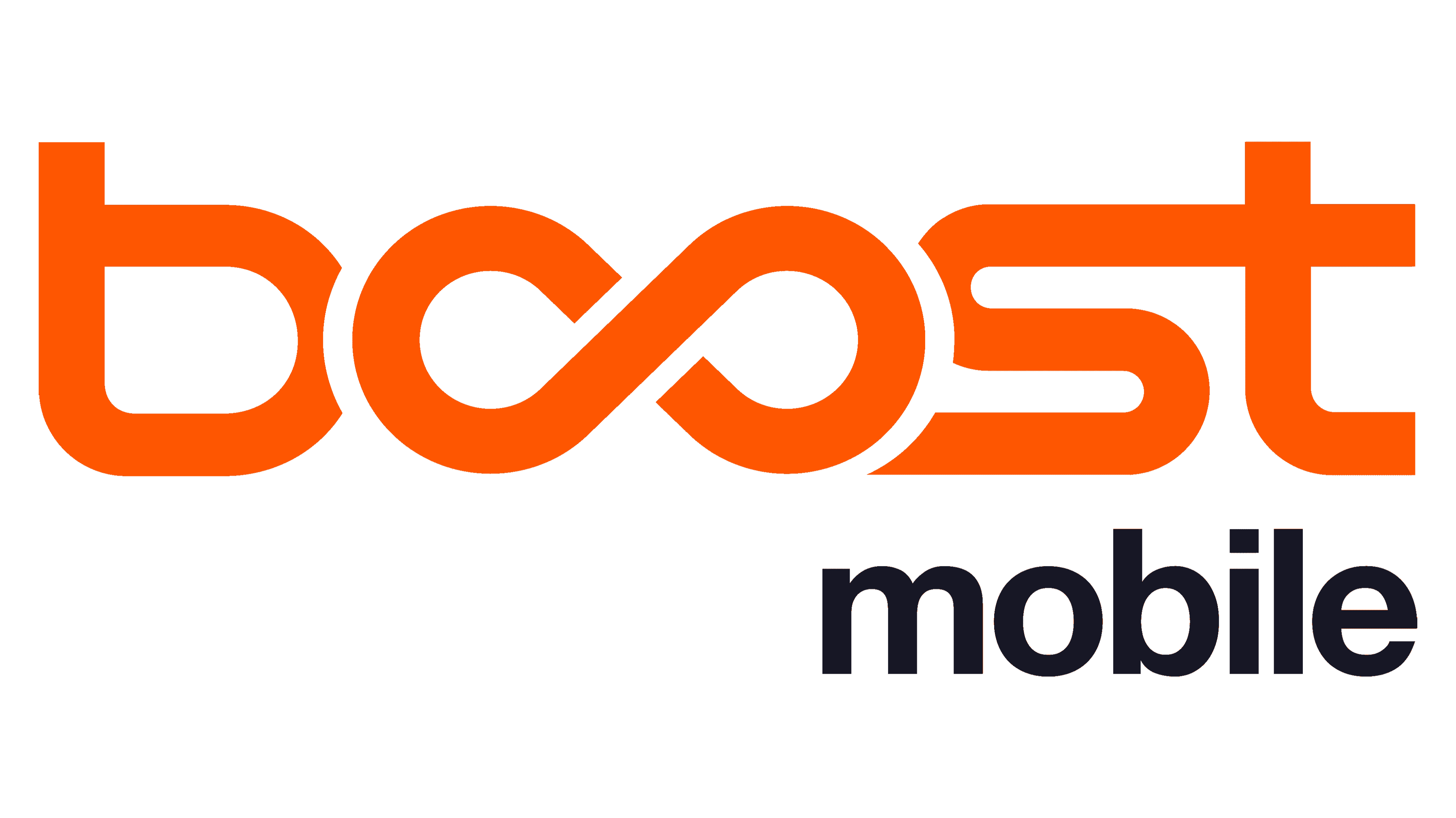
The redesign of 2024 has introduced a minimalistic and progressive version of the Boost Mobile visual identity, keeping the recognizable orange-and-black color palette, yet changing the style of the composition. Now the main element of the badge is an extended and bold lowercase lettering with the two “O”s drawn as a horizontally oriented infinity symbol. The wordmark is underlined by a simple black “Mobile” in a more traditional style.


