BT Logo
BT (British Telecommunications plc) is a leading UK-based multinational company specializing in telecommunications services. Currently, BT offers a diverse range of products, including broadband internet, fixed-line services, digital television, and IT services. It primarily serves customers in the United Kingdom but also has operations in around 180 countries globally. The company is publicly traded on the London Stock Exchange, making it owned by a wide array of shareholders. BT’s commitment to innovation and customer service makes it a key player in the telecommunications sector.
Meaning and history
BT’s roots trace back to the Electric Telegraph Company, founded in 1846, pioneering telegraphy in the UK. In 1912, it became part of the General Post Office (GPO), handling UK’s telecommunication systems. Post-World War II, the GPO modernized the telephone network, introducing crossbar switching. In 1981, British Telecom was created as a distinct entity from the GPO. Privatization began in 1984, with British Telecom becoming public, and entering the FTSE 100. The 1990s saw BT’s international expansion, forming ventures in over 30 countries. In 2006, BT introduced its digital TV service, BT Vision. The acquisition of EE in 2016 expanded BT’s mobile network reach.
What is BT?
BT, or British Telecommunications plc, is a prominent multinational company based in the UK, specializing in telecommunications services. It offers a broad spectrum of products, including broadband, fixed-line services, digital television, and IT solutions, catering to customers globally. BT’s commitment to innovation and technological advancement positions it as a leader in the telecommunications sector.
1969 – 1975
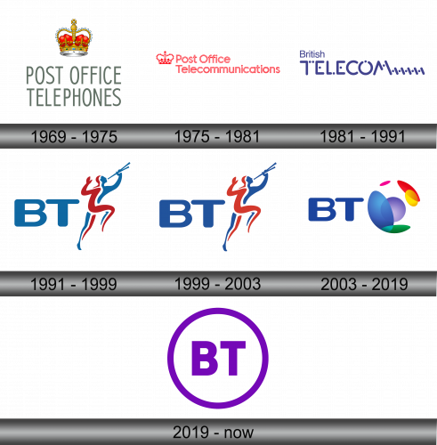
The logo presents a regal crown, resplendent with jewels and a rich red velvet cap, symbolizing heritage and authority. Below the crown, the words “POST OFFICE TELEPHONES” are spelled out in a clean, classic sans-serif font. This stark typography contrasts with the ornate crown, emphasizing a blend of traditional service and the straightforward nature of the telecommunications they offer. The crown, a symbol deeply rooted in British identity, conveys the official state-run nature of the service during that period. The choice of grayscale for the text suggests reliability and simplicity, hallmarks of the brand’s communication ethos.
1975 – 1981
The logo depicts a striking combination of a regal crown and the words “Post Office Telecommunications” in a bold, sans-serif typeface. The crown is located on the left, intricately designed with stylized elements, suggesting a connection to heritage and authority. The text is rendered in a vibrant red hue, resonating with energy and prominence, contrasting with the simplicity of the white background. This design encapsulates the blend of tradition and modernity, a hallmark of this historical British institution.
1981 – 1991
This logo, representing a later era, showcases the name “British Telecom” in a bold, dynamic font, with the ‘T’ notably stylized to include communication waveforms. The design is monochromatic, using a deep blue hue that conveys reliability and professionalism. Unlike its predecessor, this logo opts for a minimalist approach, doing away with any emblematic symbols and instead focusing on the typography to convey the brand’s identity in the telecommunications landscape. It’s a visual leap towards modernity, reflecting the technological advancements and forward-thinking ethos of the company.
1991 – 1999
The BT logo features a stylized figure, drawn in a harmonious duo of red and blue, symbolizing swiftness and connectivity. The figure, reminiscent of Mercury, the Roman messenger god, conveys rapid communication, gesturing skywards with a trumpet, representing the spread of information. The ‘BT’ initials are in a substantial, plain blue type, grounding the logo with a sense of stability and reliability. This image marries the concept of traditional messaging with the modernity of telecommunication, encapsulating BT’s essence as a historic yet forward-looking provider.
1999 – 2003
In this rendition of the BT logo, the hues have deepened, imbuing the design with a more pronounced gravitas. The blue now carries a richer, more substantial weight, while the red has gained intensity, enhancing the visual impact. This subtle but effective shift in shade brings a stronger presence to the logo, suggesting a company that is both established and authoritative in the telecommunications field. The darker tones suggest a maturation of the brand, reflecting a solidified identity and a steadfast commitment to service and connectivity.
2003 – 2019
This logo departs significantly from its predecessor, embracing a vibrant spectrum and organic shapes. Gone is the human figure, replaced by a colorful ‘connected world’ orb, symbolizing global communication. The ‘BT’ initials remain in solid blue, now more modern and streamlined, signifying stability amidst the evolving, dynamic sphere of technology. This globe of overlapping colors represents interconnectivity and the merging of diverse networks. It’s a bold step into the digital era, reflecting BT’s expansive reach and its role in the colorful tapestry of global connectivity. The logo suggests innovation, diversity, and a more interconnected future.
2019 – Today
The logo has undergone a striking transformation, adopting a bold, singular color scheme. The intricate globe motif is replaced by a minimalist purple oval encircling the letters ‘BT,’ which are also in purple. This design choice signifies a shift towards simplicity and clarity, focusing on the brand’s initials. The use of purple, a color often associated with creativity and wisdom, marks a new chapter for BT, reflecting a refined vision for the future. The darker shade of purple suggests depth and sophistication, while the enclosing oval may symbolize global reach and unity. This logo represents a modernized BT, streamlined yet encompassing its expansive influence.
