Byju’s Logo
Byju’s is a popular educational service in India. It provides free access (with payable features) to multiple educational courses for the usual school subjects taught in this country. The service was developed in 2011 by an Indian entrepreneur Byju Raveendran, hence the brand’s name.
Meaning and History
![]()
Byju’s is an Indian edtech company founded by Byju Raveendran in 2011. It has gained significant recognition and success over the years. Byju’s provides online educational content through its mobile app and has revolutionized the way students learn in India. The company offers interactive video lessons, personalized learning paths, and adaptive assessments across various subjects.
Byju’s has achieved remarkable milestones since its inception. In 2017, it became the first Asian company to be backed by the Chan Zuckerberg Initiative. Byju’s has also acquired several educational platforms, including TutorVista and Aakash Educational Services, expanding its reach and market presence.
As of now, Byju’s is one of the world’s most valuable edtech companies, with a valuation exceeding $16 billion. It serves millions of students across India and has expanded its operations to international markets like the United States, the United Kingdom, and the Middle East. Byju’s continues to innovate and redefine education through its cutting-edge technology and comprehensive learning solutions.
What is Byju’s?
Byju’s is an Indian edtech company that offers online learning programs for students. It provides a comprehensive platform with interactive video lessons and personalized learning experiences, making education engaging and accessible. Byju’s has gained significant popularity and is one of the world’s most valuable edtech companies.
2011 – 2017
![]()
These logos are reused as icons for the service’s mobile versions. Thus, the emblems use square figures as foundation. This one has a rounded square figure colored purple and with some glint effect. The center is occupied by the brand’s wordmark written in big white letters. The writing below says ‘the learning app’ in a similar fashion.
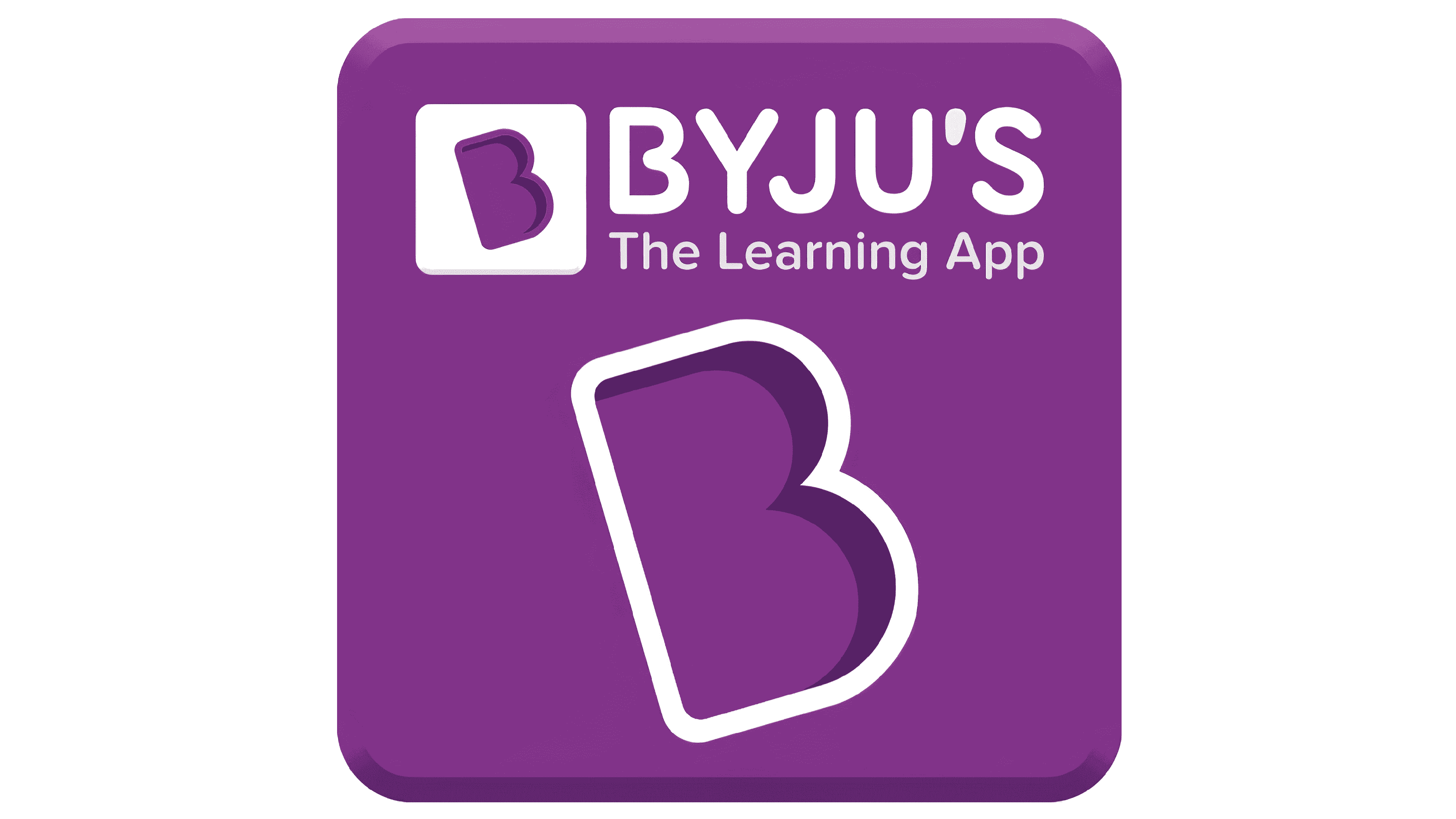
2017 – today
![]()
This time, they made the purple coloring darker and got rid of the lighting effect. The text parts barely changed, although they quit being the logo’s central piece. Instead, a new symbol was developed – the rotated capital ‘B’ put inside a square. In most versions, this shape is put in the middle of the main square with some white outlining.
Emblem and Symbol
The rotated ‘B’ symbol is used extensively even outside of the main logotype. In fact, Byju’s mobile apps use this design as an icon instead of the full emblem. Besides that, there are more versions of full logotype that uses wordmarks, emblems and other elements.