Capital One Logo
Capital One, a diversified banking giant, offers a broad spectrum of financial products and services, chiefly focusing on credit cards, banking, and savings accounts. Currently, it operates predominantly in the United States, with a significant presence in Canada and the United Kingdom. The company, listed on the New York Stock Exchange, is owned by a myriad of shareholders and is led by CEO Richard Fairbank. It’s known for its innovative and consumer-centric approach, blending technology and finance to craft solutions catering to varied financial needs.
Meaning and history
Capital One has a dynamic history marked by innovation and customer-centric approaches in the financial sector. Founded in 1988 by Richard Fairbank and Nigel Morris as a credit card subsidiary of Signet Banking Corp, it leveraged information technology to stratify consumers, offering personalized credit products. In 1994, it emerged as an independent entity following a spinoff, with a relentless pursuit to diversify its portfolio. It delved into retail banking with the acquisition of Hibernia National Bank in 2005 and North Fork Bancorporation in 2006. The acquisition of ING Direct USA in 2012 was pivotal, marking its foray into digital banking, and it rebranded the entity to Capital One 360.
Throughout its journey, the ownership has been characterized by public shareholding, with Richard Fairbank at the helm as CEO, fostering a culture of innovation and technology-driven financial solutions. The company has continually evolved its services, focusing on varied financial needs, ensuring it stays relevant in the ever-changing financial landscape. Its commitment to leveraging technology has enabled it to remain resilient and progressive, adapting to the evolving needs and preferences of its diverse customer base.
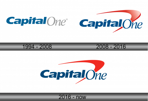
1994 – 2008
The previous emblem featured the words “Capital One,” merged in a unique design. A separation between the two words wasn’t created through spacing but was ingeniously achieved using varied hues and typefaces. The word “Capital,” displayed in a striking shade of blue, was positioned directly above “One,” represented in a subdued gray tone. This design choice allowed for a seamless yet distinct presentation of the company’s name, encapsulating both elements while maintaining a coherent visual identity. The meticulous blend of color and typography highlighted the company’s attention to detail and its innovative approach to branding.
2008 – 2016
In 2008, the financial conglomerate embraced a transformative approach regarding its brand identity: it colored the latter word in blue and incorporated a curved tick mark to the emblem, positioning it to the left of the “O.” This additional component exhibited a gradient transitioning from red to white at its center. According to evaluations by Brand New, this emblem was categorized as one of the least successful creations of 2008. This incorporation aimed at infusing modernity and dynamism into the brand, emphasizing its commitment to reliability and positive customer interactions, although it received mixed feedback regarding its effectiveness and aesthetic appeal.
2016 – Today
Despite facing backlash, the financial institution opted for maintaining the existing design. The only adjustment made was the elimination of the white gradient, rendering the checkmark entirely in red, while preserving all other elements intact. This decision underscored the bank’s steadfastness in its branding choices and a commitment to its identity. The subtle alteration was perceived as an attempt to refine and simplify the logo, focusing on minimalism and clarity, while still upholding the essence and the foundational elements that are recognizable to its diverse customer base across various platforms and interactions.


