DBS Bank Logo
DBS Bank, headquartered in Singapore, is a leading financial services group in Asia. Renowned for its innovative approach, the bank offers a comprehensive range of services including personal, business, and corporate banking. DBS is a dominant player in Southeast Asia, with significant operations in China, South Asia, and Southeast Asia. It’s largely owned by Temasek Holdings, a Singaporean state-owned investment company. DBS is praised for its digital transformation, positioning itself as a bank of the future.
Meaning and history
Founded in 1968 as a catalyst for Singapore’s industrial development, DBS Bank initially served as a financial pillar for the nation’s growing manufacturing and industrial sectors. This government-established institution gradually broadened its scope, transitioning into a versatile bank offering diverse services.
DBS’s journey into international markets began in the late 20th century, marked by strategic expansions and acquisitions across Asia, notably in China and Southeast Asia. This expansion was instrumental in integrating the financial ecosystems of these varied markets and in reinforcing the bank’s presence in the region.
The dawn of the digital era saw DBS at the forefront of banking innovation. With substantial investments in technology, the bank redefined itself as a digital pioneer, adapting to the evolving needs of a digitally-savvy customer base and the shifting global financial landscape.
A notable aspect of DBS’s evolution has been its commitment to sustainable banking. The bank has undertaken numerous initiatives to promote responsible banking and invest in green finance, earning international accolades for its efforts.
DBS’s evolution mirrors the dynamic economic transformation of Asia. From its early role in Singapore’s economic growth to its current status as a leading Asian financial services group, DBS exemplifies resilience and adaptability. Today, it is celebrated for its safe, innovative banking practices, and its unwavering dedication to the economic development of Asia.
What is DBS Bank?
DBS Bank, a Singapore-based financial powerhouse, is renowned for its innovative and customer-centric approach in banking. As a leading financial institution in Asia, it blends traditional banking with digital innovation, serving a diverse clientele across multiple Asian markets. DBS stands out for its commitment to sustainable finance and its pivotal role in driving economic growth within the region.
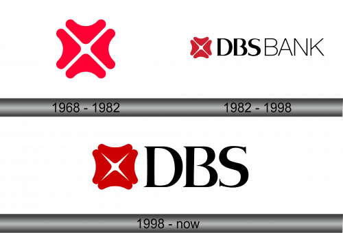
1968 – 1982
The logo is a striking fusion of simplicity and symmetry, featuring four interlocking red brackets that converge to form an abstract four-petal motif. Each petal, identical in shape and size, radiates outward from the center, symbolizing unity and strength. The bold red hue of the design exudes confidence and energy, while the negative space at the core creates an implicit cross, hinting at connectivity and intersection. The design’s balanced proportions and minimalist aesthetic lend it a modern and dynamic feel, encapsulating the essence of a progressive entity. This emblem is both a visual anchor and a statement, representing the organization’s foundational principles and forward-thinking approach.
1982 – 1998
The logo encapsulates a modern and clean design ethos, featuring a distinctive red motif resembling a blossom, signifying growth and innovation. This emblem is paired with the bold, uppercase letters of “DBS BANK,” which convey solidity and trustworthiness. The typography’s sleek, sans-serif font projects a contemporary and professional image, resonating with the bank’s forward-thinking identity.
Comparing it to its predecessor, the red emblem remains a constant, a nod to the bank’s enduring values, while the textual component has been streamlined for a more contemporary look. The color palette is limited, maintaining a crisp contrast between the emblem and the text, emphasizing clarity and recognition. This evolution in design reflects the bank’s journey from a traditional institution to a dynamic player in the global financial arena. The logo’s transformation aligns with the bank’s progressive embrace of digital innovation and global expansion, while still honoring its heritage and the foundational principles upon which it was built.
1998 – Today
The logo showcases a bold red, abstract emblem, accompanied by the capitalized letters “DBS” in a solid, serif font. The emblem, with its soft curves, implies adaptability and human-centric service, while the sharp inner cross symbolizes precision and interconnectedness. The serifs on the letters add a touch of classic elegance, reflecting the bank’s enduring legacy and professional integrity.
When compared to the previous iteration, the text “BANK” has been removed, signifying a shift towards a more global, streamlined brand identity. This simplification suggests a modernizing ethos, with the bank moving towards a more concise and impactful representation. The use of a serif typeface for “DBS” provides a contrast to the sans-serif modernity of the previous design, injecting a sense of tradition and stability into the brand’s visual identity.
This logo evolution represents DBS Bank’s ongoing transformation, balancing its rich heritage with the agility to navigate the future of finance. The design speaks to a refined focus, shedding peripheral elements to highlight the core of the brand—reliable, yet innovative banking solutions.


