Changan Automobile Logo
Changan Automobile is a Chinese automotive giant, born as a military workshop before pivoting to car manufacturing. Rooted in Chongqing, China, it was established by visionary pioneers aiming to drive China’s mobility into the future. Changan excels in producing a wide range of vehicles, from economical cars to luxury SUVs, and is a frontrunner in electric vehicle innovation. Its mission: to offer smart, eco-friendly transport solutions worldwide, showcasing China’s prowess in the automotive industry.
Meaning and history
Changan Automobile, headquartered in Chongqing, China, embarked on its journey in 1862, initially as a military workshop. Transitioning into the automotive industry, it started producing vehicles in 1957. This marked Changan’s shift towards becoming a key player in China’s car market. By the 1980s, it ventured into passenger cars, expanding its portfolio. In 2001, Changan established significant joint ventures with Mazda and Ford, enhancing its global footprint. It’s known for pioneering in electric vehicles (EVs) and smart technologies in the 2010s. Changan stands as a symbol of innovation, leading in China’s automotive evolution, with a strong commitment to sustainable and intelligent mobility solutions.
What is Changan?
Changan Automobile, emerging from the heart of China, stands as a testament to innovation and sustainability in the automotive world. With roots stretching back to the 19th century, this pioneering brand has sculpted a legacy through its commitment to green technology and smart mobility solutions, navigating the future of transportation with a blend of tradition and futuristic vision.
1957 – 1998
The logo displays a bold, stylized lettering of “CHANGAN” in uppercase, asserting confidence and modernity. The emblem features three red arcs forming an abstract open pyramid, representing dynamism and an upward trajectory suggesting progress and innovation. The red, often associated with energy and passion, contrasts starkly with the solidity of the black text, symbolizing a blend of tradition and forward-thinking in the brand’s identity. This emblem encapsulates Changan’s drive to ascend in the global automotive arena.
1998 – 2010
The logo transforms, now featuring a metallic sheen that conveys sleekness and modernity. The emblem is a silver triad of arcs within a circle, symbolizing unity and technological harmony. Below, the word “CHANGAN” emerges in a striking blue, a color representing depth and stability. This design iteration reflects the brand’s evolution, embracing a future-focused ethos while retaining its iconic character. The silver and blue color palette merge to project a vision of innovation, precision, and trustworthiness in the realm of automotive excellence.
2010 – 2013
This logo showcases a minimalist yet sophisticated design. At its core is the letter “V”, executed in a stylized manner that suggests motion or a checkmark, often symbolizing excellence or selection. It sits within a circular boundary, which could represent a wheel, highlighting the automotive nature of the brand. Surrounding this is an elegantly detailed mesh pattern, giving the impression of a grille on a vehicle, suggesting quality and attention to detail. The overall metallic sheen of the logo, with gradients of silver and subtle blues, conveys a premium, technologically advanced brand. Below the emblem, the word “CHANGAN” is written in a strong, uppercase font, which grounds the logo with authority and prominence.
2013 – 2016
The logo maintains the central “V” motif within a circular medallion but with a bolder presence. The “V” appears more pronounced with sharper lines, emphasizing a more dynamic and assertive brand image. The surrounding ring is thicker and adopts a deeper shade of blue, enhancing the logo’s visual impact and the sense of reliability. The metallic textures are refined to be more subtle and sophisticated, suggesting a maturation of the brand’s image. The word “CHANGAN”, while still in uppercase, appears to have a slightly updated typeface with increased spacing between the letters, contributing to a more modern and accessible look.
2016 – 2019
The logo now boasts a bolder, encapsulated design with a prominent ‘V’ symbol nested inside an oval, suggesting both a shield and victory. The metallic gradient and blue hue deepen, reflecting sophistication and depth, while the surrounding silver oval adds a touch of elegance. “CHANGAN” is written in a confident, sans-serif typeface below, its blue matching the emblem’s core, reinforcing the brand’s identity with coherence and strength. This evolution embodies the company’s drive towards a triumphant and innovative future in the auto industry.
2019 – 2020
In the logo, the overall shape remains consistent with the earlier versions, preserving brand recognition. However, there are notable evolutions in its styling. The circle enclosing the “V” is sleeker and devoid of the previous textured details, moving towards a cleaner, more minimalist aesthetic. This could represent a shift in the brand’s focus to simplicity and core values. The shade of blue is more pronounced and vibrant, potentially reflecting a refreshed brand vision.
2020 – Today
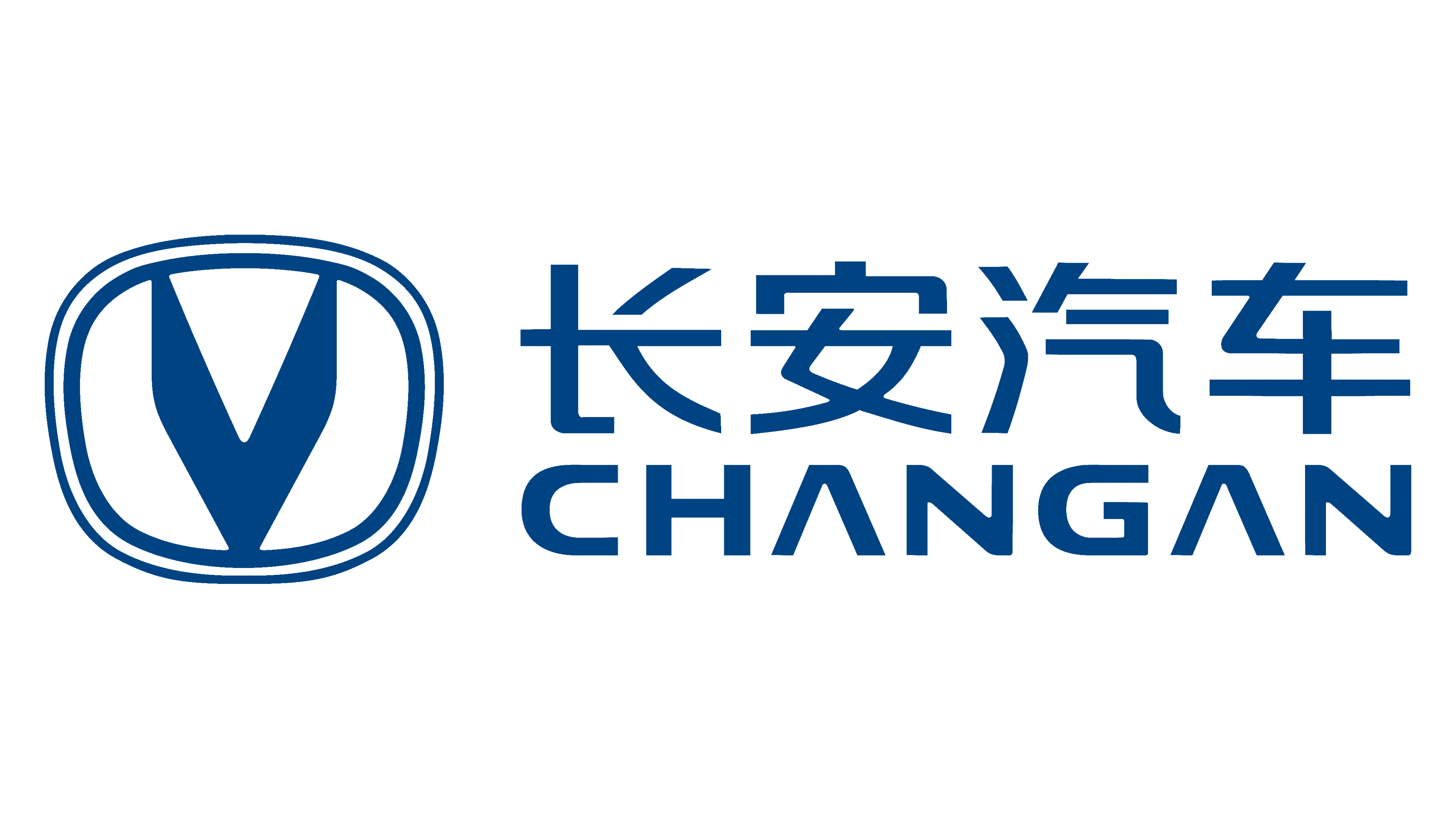
The new logo keeps the ‘V’ and oval but in a striking, uniform blue, dropping the gradient effect. Chinese script now joins the “CHANGAN” mark, symbolizing its international reach and cultural origins. It adopts minimalism, with clear, monochromatic design. This design merges a contemporary global image with respect for its Chinese heritage.
