Chicago Bears Logo
Chicago Bears is a major American football team. They compete on behalf of Chicago, as clear from the name. They are largely regarded as one of the overall ‘good’ teams in the Midwestern States. A lot more people are interested in the progress of the Chicago Bulls (the basketball team), however.
Information
Chicago Bears is one of the oldest professional American football teams. They were founded in 1919 in the city of Chicago. The original name was Decatur Staleys, after the company that financed them and its owner, respectively. The name was quickly changed to Chicago Staleys, and eventually to Bears.
They were originally a feared team – member of NFL since 1920, and its second-most successful member until the 1970 reorganization. They were also part of the NFC Central since 1970 and of NFC North since 2002. They’ve been a force to be reckoned with all throughout 20s, 30s and 40s. They’ve stalled by the 50s, winning their last cup of the NFL in ’63.
In the Super Bowl era, they’ve only succeeded during the brief spell in the mid-80s. Under coach Ditka they climbed out of their long slumber and won the Bowl of ’86. It’s their only win until this point, although they also came close in ’06 under a new streak of competent coaches. Even so, they never came close after that.
They are currently one of the more obscure teams on the roster. Much of their following is concentrated in the city of Chicago, as well as surrounding areas. They are very unlikely to appear in any coming Super Bowls, although they are still reportedly enjoyable to watch.
They are famous for being bitter rivals with the Green Bay Packers, an animosity that dates back to their founding years. Their matchup every year is looked forward to by millions.
Meaning and History
![]()
The team was founded in 1920, earlier than most American football teams. Nevertheless, they weren’t called what they are until 1922. Before, they were Decatur Staleys and Chicago Staleys. In the move of pure narcissism, Staley was the sponsor of the team, and he seems to have insisted on this name.
1920 – 1921
![]()
The first logo was introduced in the time when they were still Decatur Staleys. It was a bicolor circle (upper half orange, lower half purple) with the purple letter ‘S’ on top and the words ‘Staleys Decatur’ in two different white typefaces before. The ‘Staleys’ part (and the ‘S’ above) were written in the usual ‘athletic’ font, while the other word was strongly cursive.
1921 – 1940
![]()
In 1921, they were renamed ‘Chicago Staleys’, but it’s unclear whether this one was released after that. It only features the word ‘Staleys’ in the usual athletic typeface with the pink coloring and purple outlining.
Above, they put one of the symbols of APFA (NFL back then) – a brown football with the association’s name inside it and the year 1920 written in the middle.
1940 – 1945
![]()
The team changed the name to Bears in 1922, although they seemingly stuck with the previous logo even though it wasn’t relevant anymore. Only by 1940 did they produce a relevant logo – a realistic black bear leaping upwards with an orange ball in its right paw.
1946 – 1973
![]()
In 1946, they toned down on realism a bit and opted for a more simplistic depiction of a black bear clawing a giant (proportioned to the animal, at least) orange ball. They decreased the realistic features in regards to the bear, which allowed them to make the cartoonish features they introduced here more acute and aggressive.
1962 – 1973
![]()
This secondary-turned-primary logo was use on occasionally by the team for some time. It’s a combination of the letter ‘C’ (for Chicago) and a shape of a football. There is a weird pointy bit on the left, but they probably added it to highlight what the shape is supposed to be even more.
1973 (proposed)
![]()
A contoured profile image of a bear in the Chicago Bears helm with the recognizable “C” on the side was proposed as the official emblem of the club in 1973, but the proposal was denied. However, it was quite a cool emblem, which looked very modern and this feeling was emphasized by a massive futuristic sans-serif inscription.
1973 – 2023
![]()
That’s the logo most people know Bears by – the same emblem as before, but with a rich orange part inside. It doesn’t go all the way up to the borders, there is some white left from before.
2023 – Today
![]()
Sporting a vibrant blend of blue and orange, the bear head emblem, which once shared the spotlight with the renowned wishbone “C” symbol, has ascended to be the sole principal logo of the squad. This shift signifies a novel phase in the Bears’ visual representation, harmonizing with contemporary design trends yet preserving the classic hues that have historically defined the franchise. The depiction of the bear’s head captures the team’s tenacity and combativeness, acting as a beacon of renewed dedication to forthcoming endeavors. As the team moves forward, this emblem serves as a constant reminder of their relentless spirit and ambition.
Emblem and Symbol

The lettering used by the team as a secondary logo features just their name written in very bold, wide letters of the color orange (their primary color now, alongside black). They mostly use the ‘C’-emblem to identify the team, but if they need to identify the brand really clearly, it’s down to this wordmark.
Helmet
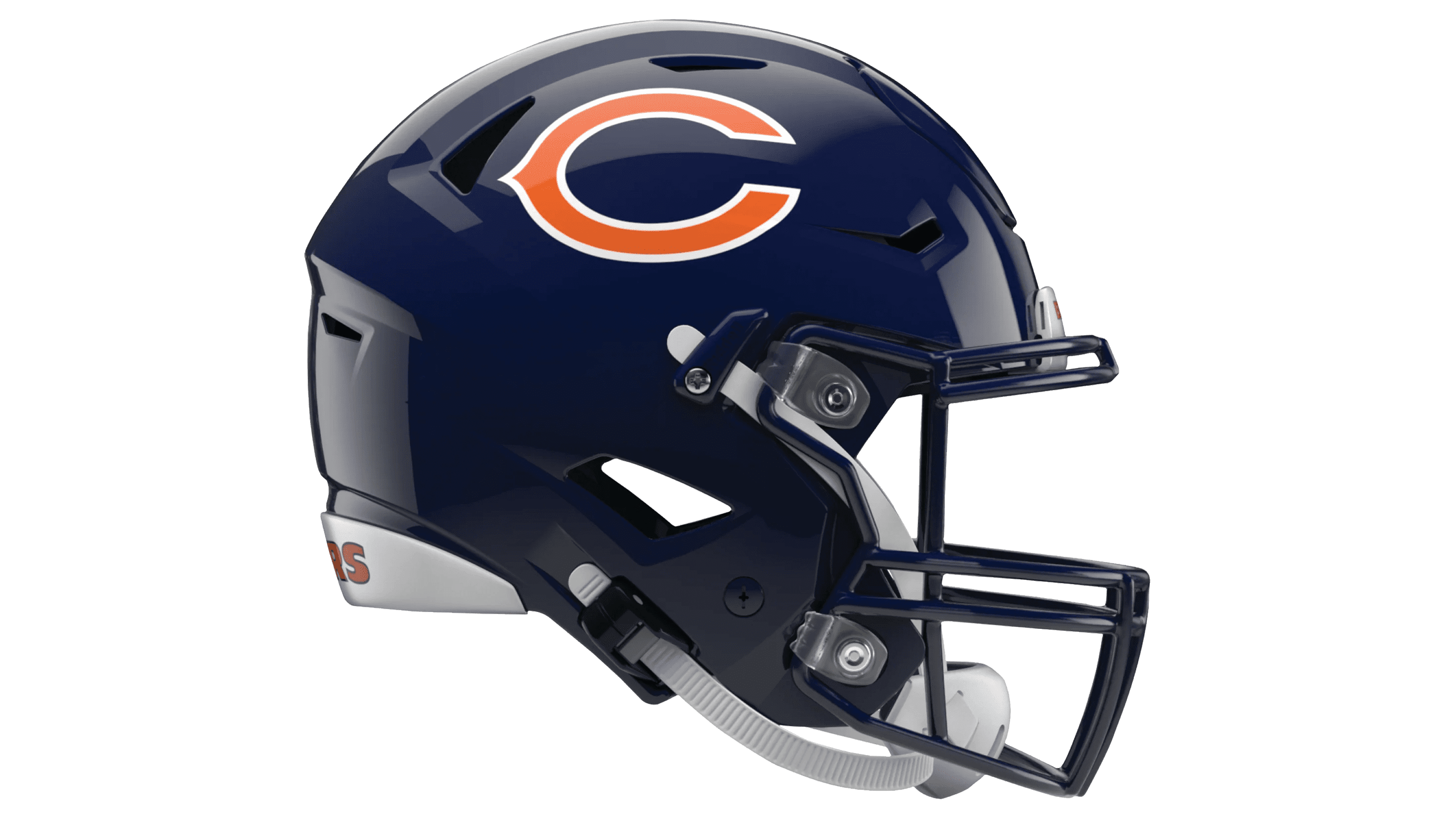
The Bears mainly utilize two types of helmet in their games. One is the usual dark blue hard shell with faceguard of the same color. The only other colors on it are the white and orange used for the team’s symbols on each side of the headwear – the elongated orange ‘C’ with white rims in the shape of a football.
The other helmet is used rarely. It essentially paints the symbols black, and the hard shell – orange. They’ve only used it a couple of times recently, mainly in practice. There have also been other orange varieties, created for the same purpose.
Uniform
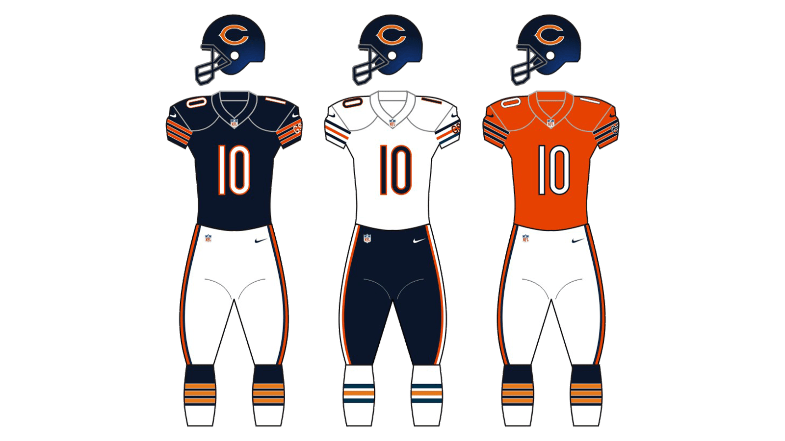
The Bears largely play with dark blue jerseys and white pants on most occasions. These uniforms also sport orange stripes with thin white stripes on the sides (for the jerseys), and stripes of orange with equal blue rims.
The other form has these colors reversed – white jerseys with blue pants. They are used commonly enough. You are also likely to see the alternative version, which uses the orange jerseys with white pants. The helmets paired with this variety are also orange. These are often used for training matches or to stand out from the other team.