New York Jets Logo
The New York Jets is a well-recognized football team that is part of the national league. Throughout all the games it has played, the main rivalries of the team were Miami Dolphins, New York Giants, and several others. The latter and Jets even share the same stadium, making them the only intracity rivalries in the league’s history. Although the club is ready to pay a high price for a contract with a player, the Jets have only one Super Bowl title on the list of their achievements.
Meaning and History
Since 1959, a new American football team has been playing as part of the league. It was called the New York Titans. Unfortunately, the team was facing bankruptcy, so it was sold to a new owner who named the team The New York Jets. The 1963 also marked the time when the team moved to a different stadium. It was not long before the jets became the first team in the American league to defeat an NFL club when they defeated the Baltimore Colts in 1968. There were more than ten playoffs and four AFC Championship games.
What is New York Jets?
The New York Jets is a football team with a long history and world recognition. Thus, it is not surprising that the team also has a large fan base and strong support systems.
1960 – 1962
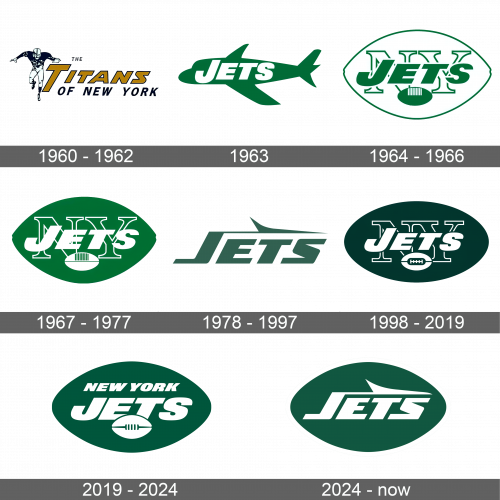
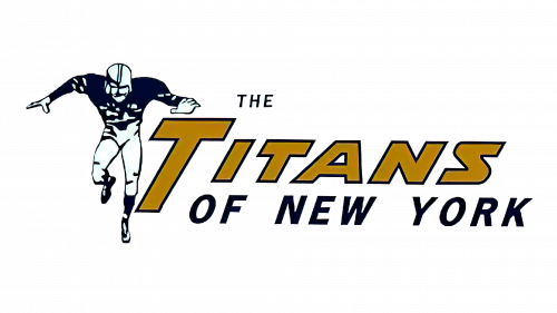
It all started with “The Titans of New York”. “The” was done in small, black typeface, while “Titans” was written in large, gold letters and for a contrast, a thin black outline was added. The first “T” extended slightly lower than all the other letters, creating a kind of a frame for the remaining words. The location part was also written in all capital letters, but the font was smaller and black. To the left, there was a very realistic image of a running football player. It was black and white.
1963
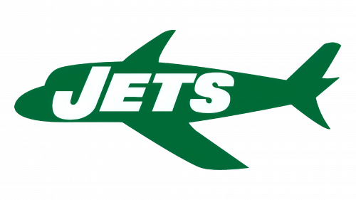
An airplane icon with smooth and simplistic lines done in green served as the base of the emblem. Across the image, it stated “Jets” in bold, large letters. The letters were white with the first letter extending below and above the other letters, which made it look like it was capitalized.
1964 – 1966
The team maintained the same color scheme. The team used the wordmark it already had but it switched to a green color and added a white outline. Underneath, it had an icon of a green football with grip lines colored in white. Behind it, there were two large capital letters standing for New York. Green served as an outline for completely white lines. The whole logo was also framed by a green border that resembled an outline of a football.
1967 – 1977
Not long after, the team switched the colors. Now, a dominant color was green, while white was used for “Jets” and an image of a football underneath.
1978 – 1997
A more stylish and simplistic logo was introduced in 1978. It was simply the word “Jets”. It used a completely different font that had italicized, uppercase letters. This, along with an airplane wing-like figure extending from the first letter above all the other letters, created a feeling of movement. The emblem had a darker shade of green.
1998 – 2018
The team brought back the emblem it had in the late 1960s. There were some adjustments, though. First of all, it was the color, which got darker. In addition, the football image inside the emblem has been redrawn, with the grip lines being in the center now. The emblem border was also a simple oval shape.
2019 – 2024
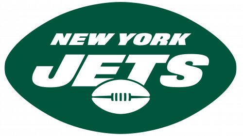
Another update in 2019 brought changes not only to the shape of the whole emblem, which now resembled a football, but also to the color. The logo also got lighter like it used to be. All the elements inside were white. The wordmark now spelled out the full name, with the word “Jets” being moved slightly down and even behind the football image to give space above for a new line. The football also changed its shape, but the grip lines were still in the center.
2024 – Today
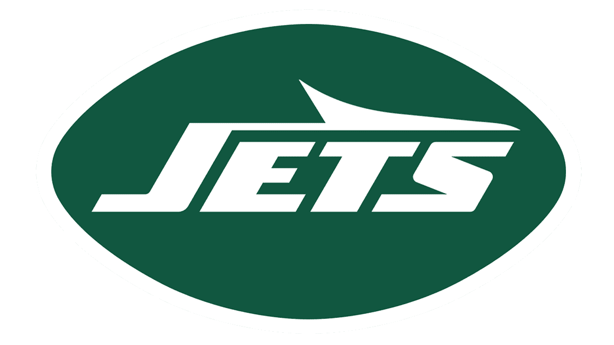
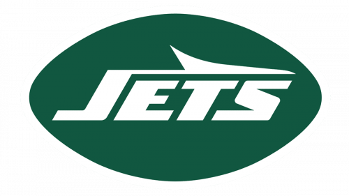
The logo presents a sleek and modern emblem that immediately conveys the essence of speed and dynamism. Central to the design is the word “JETS” which is boldly rendered in a unique, italicized font that seems to lean forward, as if caught in the middle of a rapid takeoff or sprint. The characters are white and styled with sharp, cutting edges on the “J” and the “T,” enhancing the logo’s aerodynamic feel. This text is encapsulated within a dark, hunter green oval that provides a strong contrast, making the lettering pop and allowing for instant brand recognition.
Further accentuating the motion inherent in the logo is a streamlined jet silhouette that cuts through the top of the lettering. This jet icon, depicted in the same white as the letters, has a simplistic yet stylized design. It is oriented so that it appears to be ascending from left to right, in alignment with the forward thrust suggested by the font’s slant. The jet’s pointed nose and swept-back wings contribute to the overall impression of speed and height, encapsulating the thrill and excitement associated with high-velocity aircraft.
The overall color scheme is one of simplicity and professionalism, with the deep green serving as a nod to the team’s traditional colors. It’s a minimalist palette that speaks to the team’s identity without the need for extraneous details or colors. The logo manages to balance aggression with elegance, suggesting a team that is forward-moving and determined, yet also rooted in a rich and storied tradition. The design conveys a sense of progression and modernity while honoring the past, embodying the team’s ethos and spirit in a single, impactful visual statement.
