San Francisco 49ers Logo
San Francisco 49ers is the American athletic franchise established in 1946. This is the nation’s most successful sports team, competing in the NFL. The team is trained in its hub Levi’s Stadium by the head coach Kyle Shanahan, while the 49ers’ president is Al Guido. They participated in numerous larger and smaller championships throughout their history. In 5 Super Bowls, 16 NFC tournaments, and a bunch of season games, they’ve made most of the National Football League’s bright records.
Meaning and history
The 49ers were founded by Tony Morabito in 1946 as a part of the All-America Football Conference. The team was named so in honor of the out-migrants who moved to the Pacific Coast during the California Gold Rush. Being the only prominent athletic brand to settle down in San Francisco, the team joined the newly formed NFL in 1950. There, they achieved their first success 7 years later.
During the 50s, the team organized the ‘Million Dollar Offensive Backfield’, structured from the club’s attackmen soon-to-be enlisted in the Hall of Fame for their contribution in the victories in matches. They were also the inventors of the shotgun tactic, in which the front players form a wall and make a single push against the enemy, while the quarterback stand back and watch the fronts.
The first Super Bowl was won in 1982 against Cincinnati Bengals with an impressive score of 26-21. In total, they had 4 more Super Bowl wins, encountered in 1985, 1989, 1990, and 1995.
What is San Francisco 49ers?
49ers are the NFL’s West Division franchise. It was established in 1946 and named after the migrants to California, who moved there after the 1849 Rush. Now, their home stadium is based in Santa Clara, California. The team is recognized as one of the most successful American clubs to play football due to numerous achievements. They’ve won 5 Super Bowls in the 1980s-1990s. The team is led by Kyle Shanahan as the main coach and Al Guido as the president.
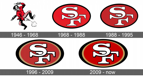
1946 – 1968
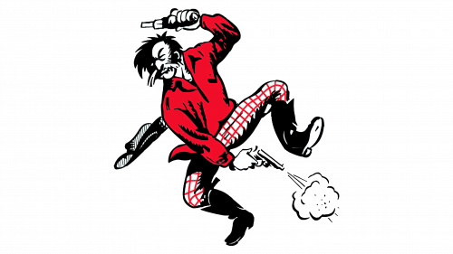
The very first watermark developed for the 49ers, probably depicted a cowboy character inspired by the mid and late 19th century migrants to the U.S. Wild West. It showed a smiling man with long mustache and hair. He stood on the right leg, while the left one was raised as like he danced or jumped. Probably, he did this because a revolver he held in the right hand was shooting between his legs. The shooter also had a bottle in his left hand, raised above his head. Moreover, the cowboy lost his hat as it came off his head. This logotype was outstanding for its time. Due to its somewhat crazy mood, it attracted people’s attention for more than 20 years.
1968 – 1988
The late 60s brought a new approach to visual identity of the 49ers. They dropped off the colorful image of a man with a pistol and created an oval emblem. It featured a bold frame with red fitting. The ‘SF’ acronym was located at the center of the shape. Some areas of the ‘f’ letter which were close to the ‘s’ were erased to feature that the ‘s’ was above the ‘f’. This ellipse looked delicate and distinctive, so the fans could easily recognize the team just by the badge, without even seeing the nameplate. The text caption, by the way, was also introduced with the new emblem. It was placed on the banners as well as some shirts and jerseys.
1988 – 1995
The following logotype hadn’t encountered dramatic changes. The designers just made the frame thinner and added a slim outline for the monogram.
1996 – 2009
A new look at the 49ers’ brand design appeared in the mid-90s. It showed the familiar oval, but with two contours. The eternal one was black and got fatter at the right and left poles, while the additional contour was colored beige. The characters became bolder, as well as their contours.
2009 – today
Among the changes in the latter crest, there is the brighter beige contour and even bolder monogram. The whole figure was made larger as well.
Color
Originally, the team’s logotype color palette consisted of red and white. This duo was used to describe the man from the original logotype. Since 1968, the 49ers have been using the black, white, and red combination, whereas black stands for authority and power, red symbolizes passion, while white reflects pureness and clearness, as well as adds some contrast. They also added beige to this equation in the 1996 crest.
Font
The 49ers’ name board has a simple yet recognizable typeface. It has block characters with prominent serifs and very small intervals in between. All symbols are capitals. This script is used for both the monogram and the text caption.
